- 日本語
- EN
Reprolife Corporate Website Rebranding & CG Assets

- ROLE
- Branding, Art Direction, Key Visual & UX/UI Design, Front-end Developing, Web Design, CRM Developing
- DELIVERABLE
- Responsive Website, Key Visual Assets, SNS Assets, Copyediting
- DATE
- Jul 2024
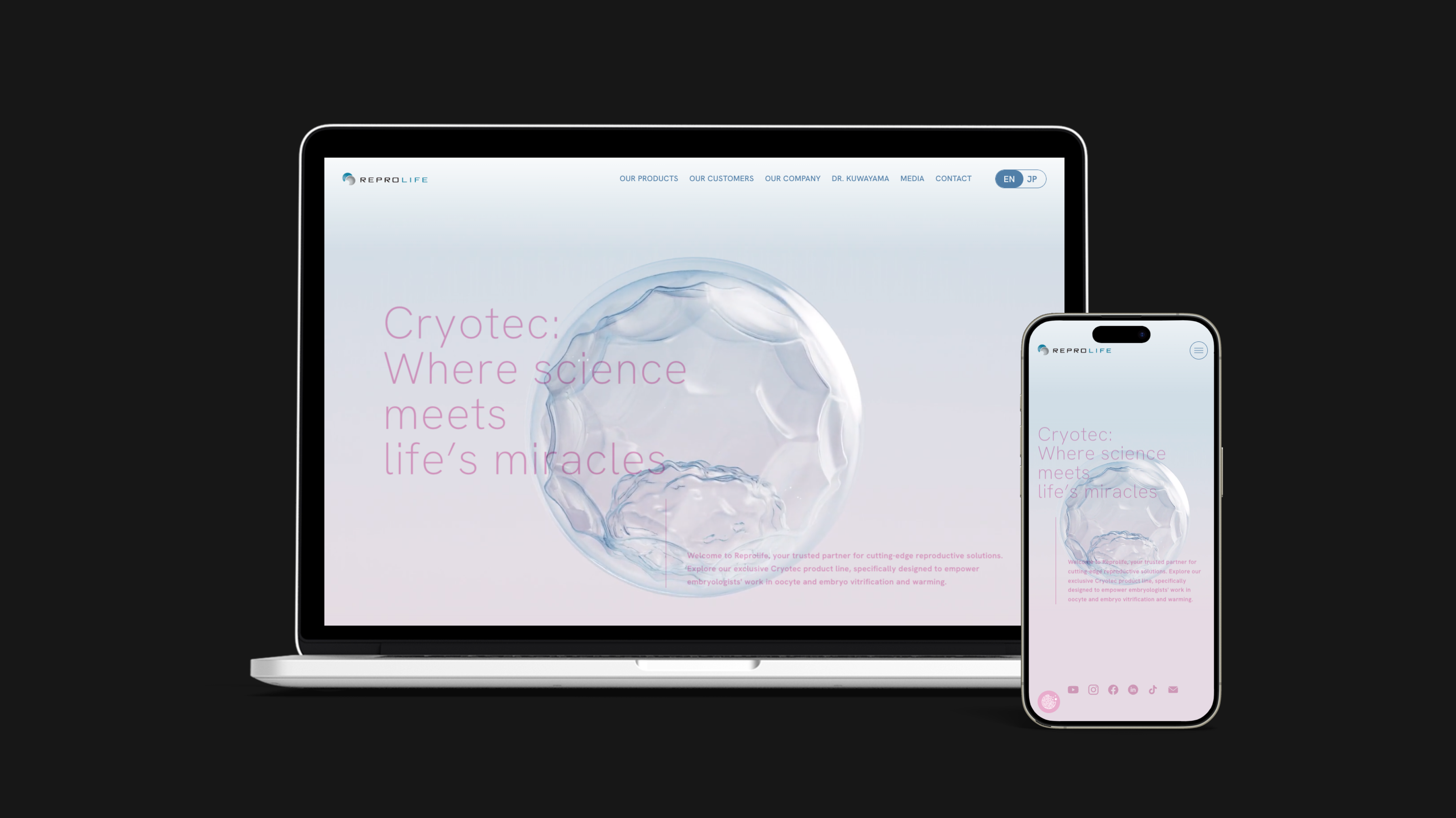
monopo Tokyo designed and developed the bilingual corporate website renewal for Reprolife, a global leader in assisted reproductive technology. Our team created a visually engaging and informative digital experience that captures Reprolife’s pioneering role in the field. The website redesign seamlessly blends elegance with trust, delivering a modern platform that embodies both innovation and reliability.
CLIENT BRIEF
Integrating websites that existed separately for each product brand, Reprolife’s respective corporate sites
Bilingual websites in Japanese and English
Creation of new design guidelines
OUR PROPOSAL
Information design to integrate disparate websites
Creation of a bilingual website that is easy to understand and attractive to site users, including clinics and embryologists
Creation of attractive visual assets and design guidelines using computer graphics
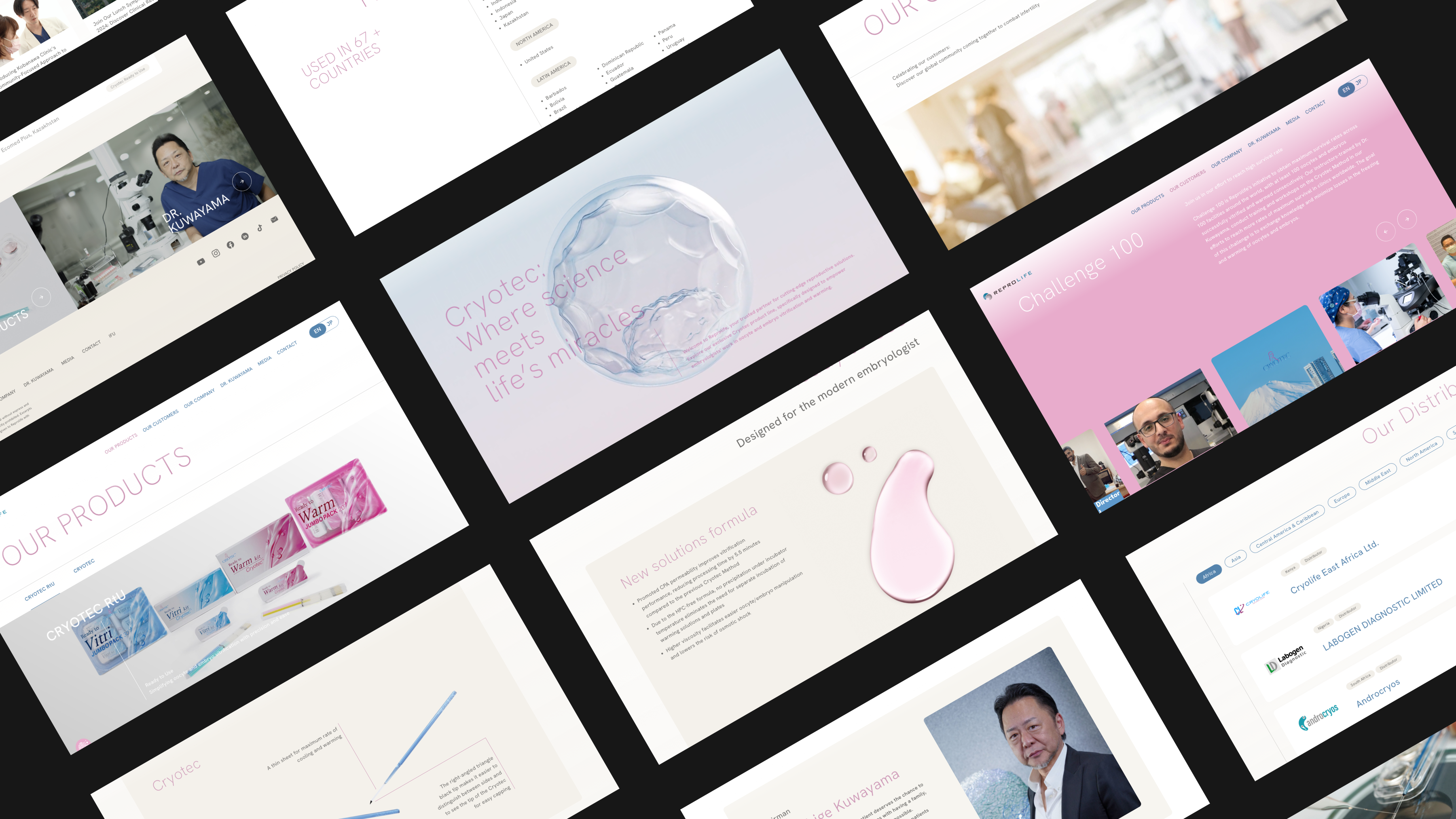
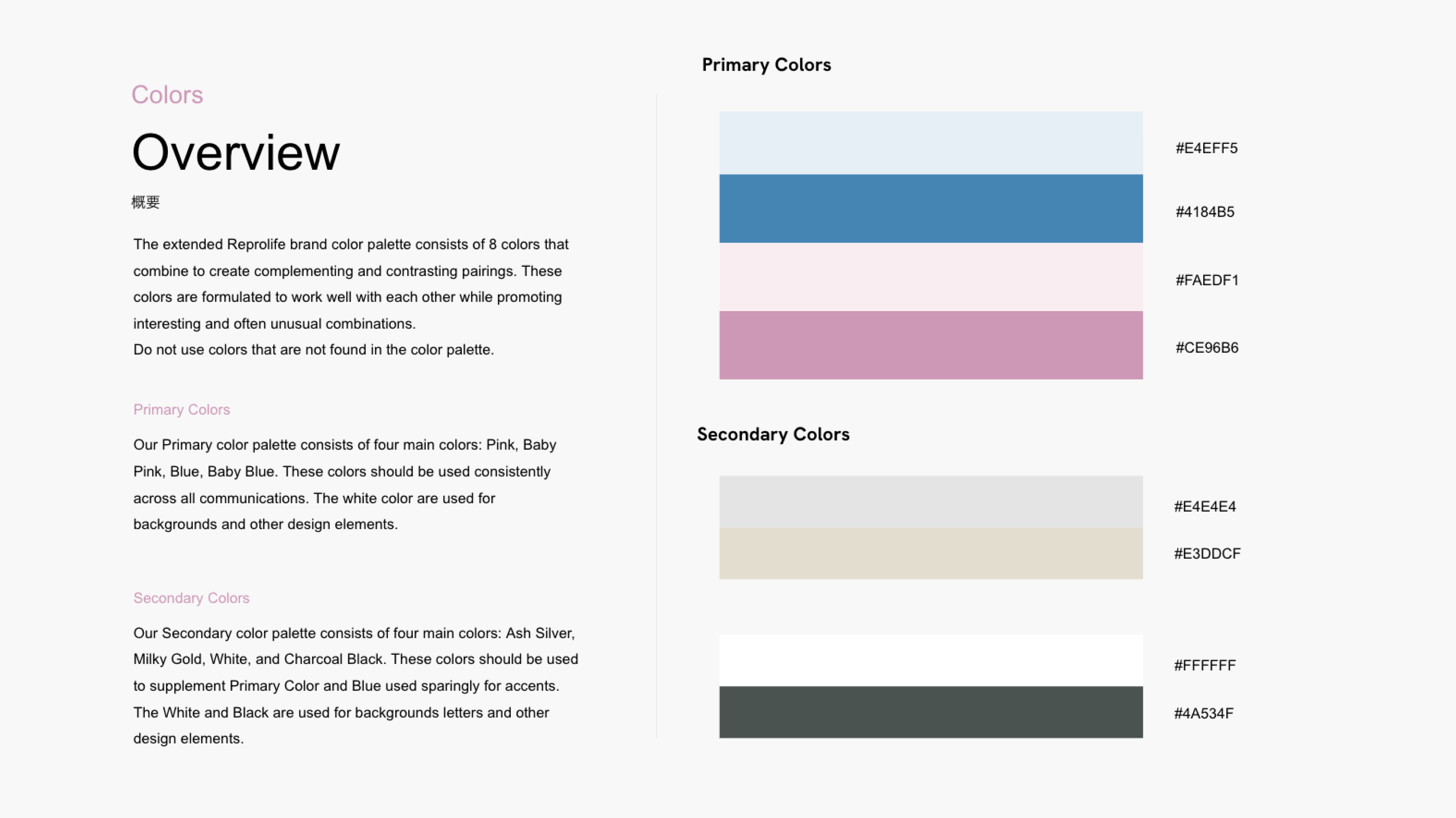
INFORMATION DESIGN
Information design and production made possible by monopo
Led by Dr. Masashige Kuwayama, a renowned expert in assisted reproductive technology, Reprolife stands as a global leader in the field. Their CRYOTEC product line, which aids embryologists in achieving high survival rates in cryopreservation, is used by professionals in over 67 countries worldwide. The CRYOTEC kits, designed for the vitrification and warming of oocytes and embryos, are developed, manufactured, and marketed by Reprolife, continually advancing fertility treatments.
When we inititally began consulting with Reprolife, we discovered that the company operated separate websites for each product and language, each with varying tones and operational costs. They sought to consolidate these disparate sites into one unified platform.
To address this, monopo thoroughly reviewed each existing website, along with the company's product materials, to design the information architecture from the ground up. Despite the challenge of inputting a vast amount of content in both Japanese and English, including highly technical terms, monopo's expertise in multilingual support made this task possible.
The final result not only ensured consistent and cohesive information design across the site but also involved meticulous oversight of the scientific text on every page to guarantee consistency between the Japanese and English versions. monopo also paid close attention to tone, making sure it remained consistent throughout. Additionally, we consciously used inclusive language, opting for terms like 'parents,' 'people,' and 'patients' instead of 'mothers' or 'mothers and children' to foster a more welcoming environment for all users."
ART DIRECTION
Building a welcoming worldview worthy of a pioneer in egg and embryo freezing
Reprolife has long been a leader in the field, and both parties aimed to create a digital experience that reflects the broader industry, rather than just serving as a typical company website. The goal was to craft a platform was both welcoming and also provided robust support for the vital work of clinics and embryologists worldwide. It was essential to not only convey Reprolife’s expertise through thoughtful information design, but also through carefully considered art direction that reinforces its prestigious position in the industry.
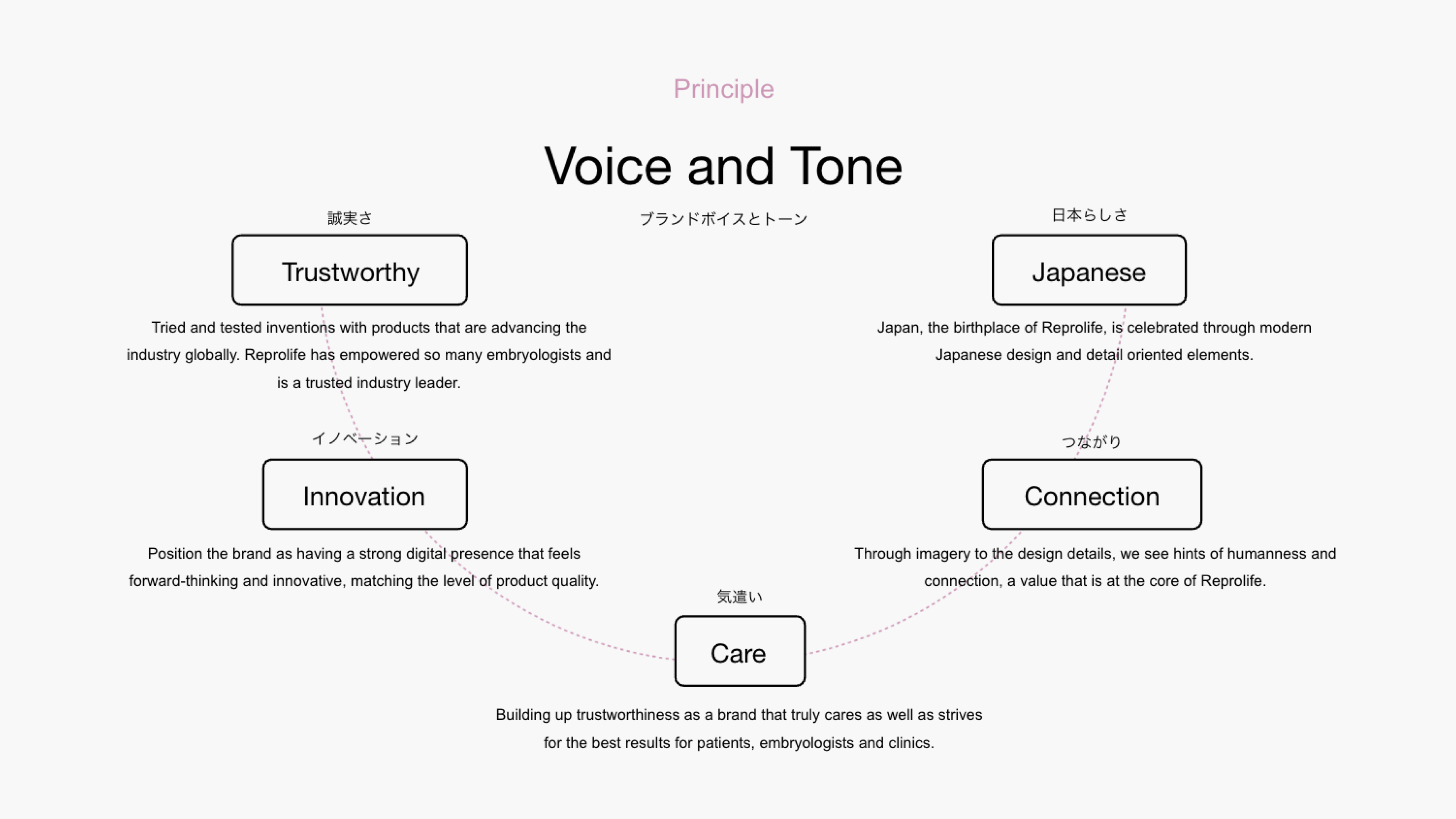
Excerpt from the actual design guidelines
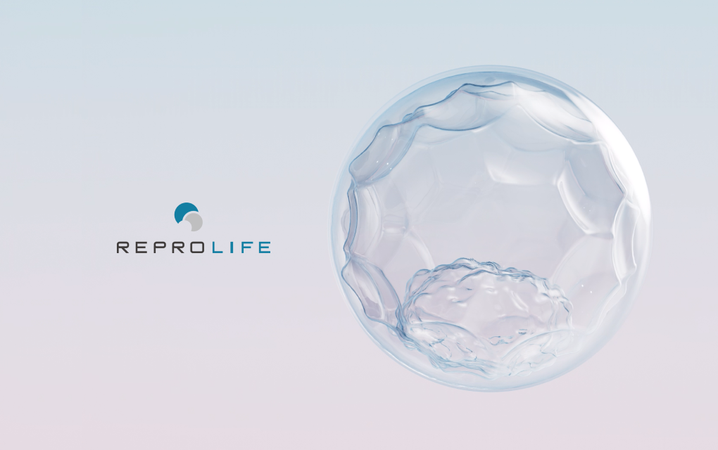
Building on the foundation of Reprolife’s existing logo and product color palette, monopo redefined the visual elements that shape the brand’s identity, creating a comprehensive set of design guidelines. The resulting design is clean, elegant, and inviting—ensuring to embody the passion of Dr. Kuwayama—chairman of Reprolife and leading pioneer of human oocyte and embryo vitrification. A key aspect of the design was to subtly reflect “Japaneseness” (日本らしさ) as a way to pay homage to the brand’s background in renowned technological excellence, meticulous attention to detail, and sophistication. This cultural influence was primarily expressed through the careful selection of brand colors and overall design approach.
These new design principles went beyond the website, gradually influencing the company’s social media presence and printed materials, ensuring a cohesive and consistent brand experience across all touchpoints.
Excerpt from the actual design guidelines
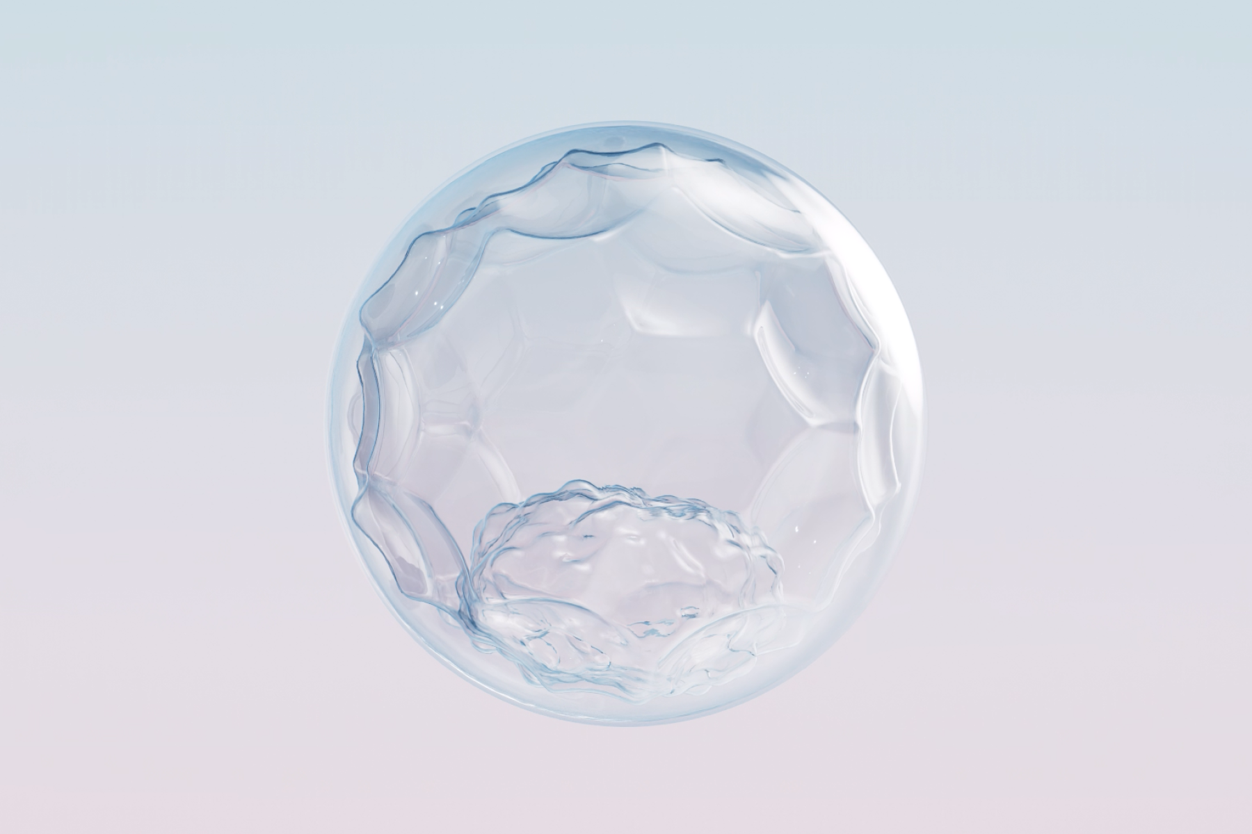
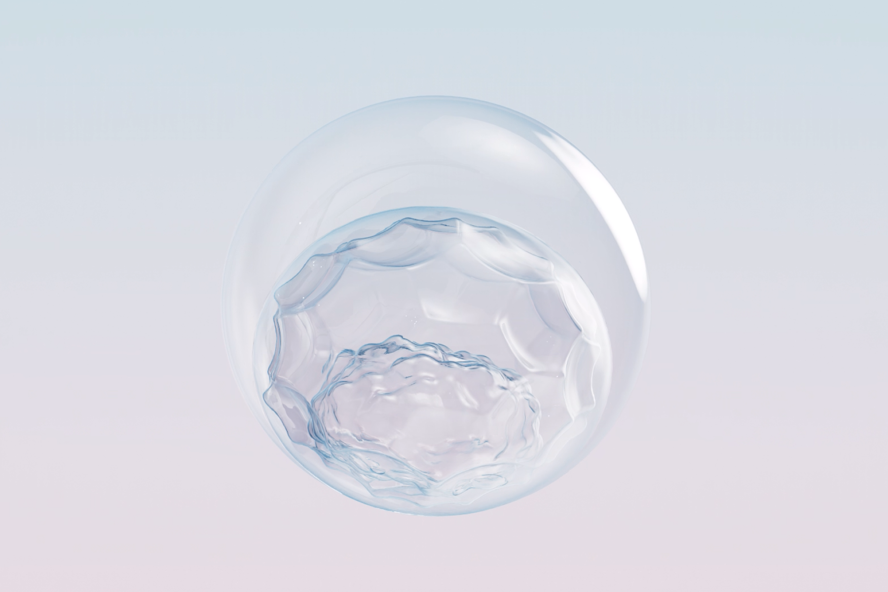
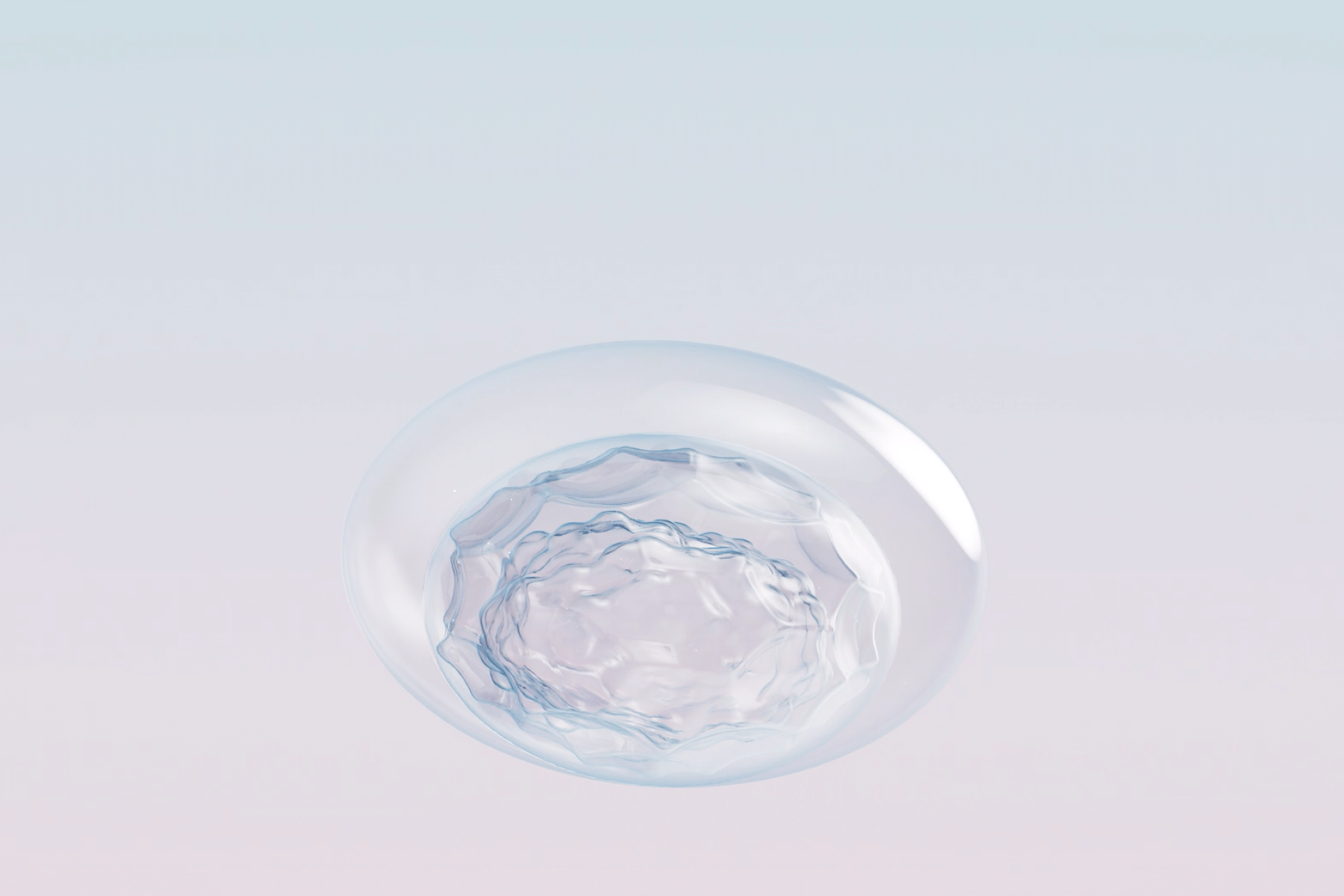
CG CREATION
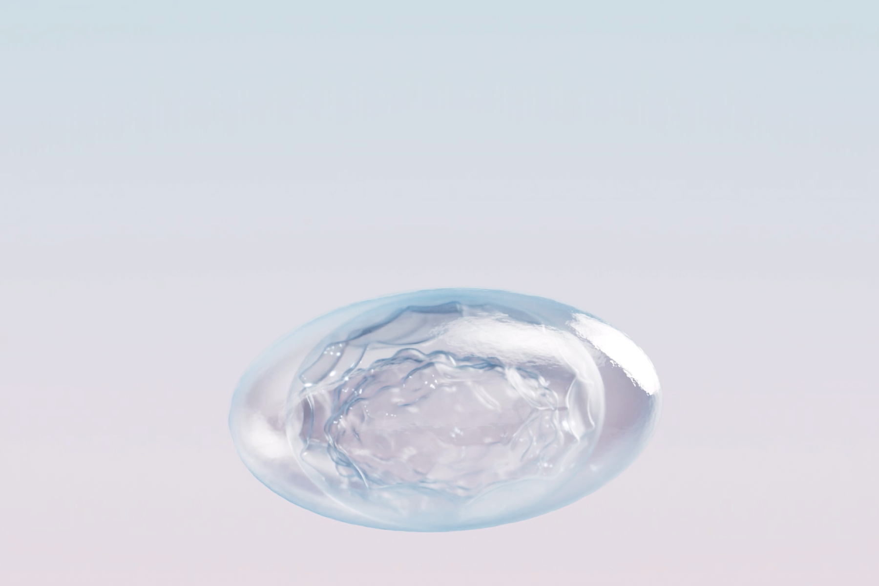
Egg freezing is beautiful
“‘Egg freezing is beautiful.’
These words, spoken by Dr. Kuwayama, Chairman of Reprolife, encapsulate the profound sentiment he holds not only for his life’s work, but also the respect he holds for embryologists worldwide. With this sentiment in mind, we sought to honor the work of industry leaders and embryologists by beautifully illustrating the very subject to which they dedicate their lives. To achieve this, monopo proposed the use of CG to depict the blastocyst in motion, as the key visual on the website’s mainpage. Given that actual blastocysts can only be captured under a microscope, we believed CG would allow us to showcase the process with greater clarity and beauty, capturing each step in a way that was both scientifically precise and visually stunning.
Our goal was to create a representation that not only adhered to the highest scientific standards but also conveyed a sense of hope and positivity—reflecting the purpose and passion behind the work of embryologists.
Crafting an image that was both scientifically accurate and visually beautiful proved to be a more delicate and challenging task than anticipated. Through ongoing feedback from the client and a meticulous process of refinement, we worked closely with CG artist Junjie Sun who ensured intensive and detailed adjustments to bring the vision to life. The resulting visuals, featured prominently on the homepage, have since become a defining symbol of Reprolife's aesthetics."
BRANDING
Communicate and lead the field of expertise in an attractive manner
Initially, our collaboration with Reprolife focused solely on the website and conveying information easily for all stakeholders and partners. However, the final design guidelines and CG assets were so well-received that they were also used to create video materials for their booth at a major conference, as well as printed materials for the event, further enhancing the new Reprolife branding. This opportunity allowed us to contribute meaningfully to their rebranding efforts and ensure that Reprolife continues to be viewed as a trusted industry leader.
At monopo, one of our greatest joys is using the power of creativity to communicate information clearly, leave a positive impression, and present scientific fields—like the Cellular Agriculture Society and Reprolife—in a way that is both approachable and compelling. Although Reprolife operates in the B2B space, it is Dr. Kuwayama's passion for egg freezing and the preservation of life that truly inspires us. This project wasn’t just about building a brand; it was about creating a connection—one that would link new lives to the warmth and trust fostered by this passion and the cutting-edge technology behind it. Our goal was to create a website to ensure clinics and embryologists could continue to feel empowered in the honorable work that they contribute to our world, everyday.

CREDITS
- CLIENT
- Reprolife
- ROLE
- Branding, Art Direction, Key Visual & UX/UI Design, Front-end Developing, Web Design, CRM Developing
- THE TEAM
-
Account Executive
Georgi Robertsmonopo TokyoAccount Executive / Creative Producer
Karin Kurodamonopo TokyoTechnical Director
Shun Okadamonopo TokyoArt Director
Mei Kanamotomonopo NYCUX/UI Designer
Toshika Kosakomonopo NYCUX/UI Designer
Tsubasa Kamiokamonopo TokyoDesigner
Claire Chenmonopo TokyoVideo Editor
Sakutaro Shiraimonopo TokyoCG Designer
Sun JunjieWeb Production
PRMO
MONOPO TOKYO MEMBERS
ON THIS PROJECT


OTHER MONOPO GROUP MEMBERS
ON THIS PROJECT


![]() LET’S COLLABORATE
LET’S COLLABORATE
TOGETHER 
Thank you for getting in touch with us.
You will receive a
confirmation email.