- 日本語
- EN
SMOLLAN Brand Identity Launch Website

- ROLE
- Art Direction, Design, Development
- DELIVERABLE
- Interactive Microsite
- DATE
- Feb 2021
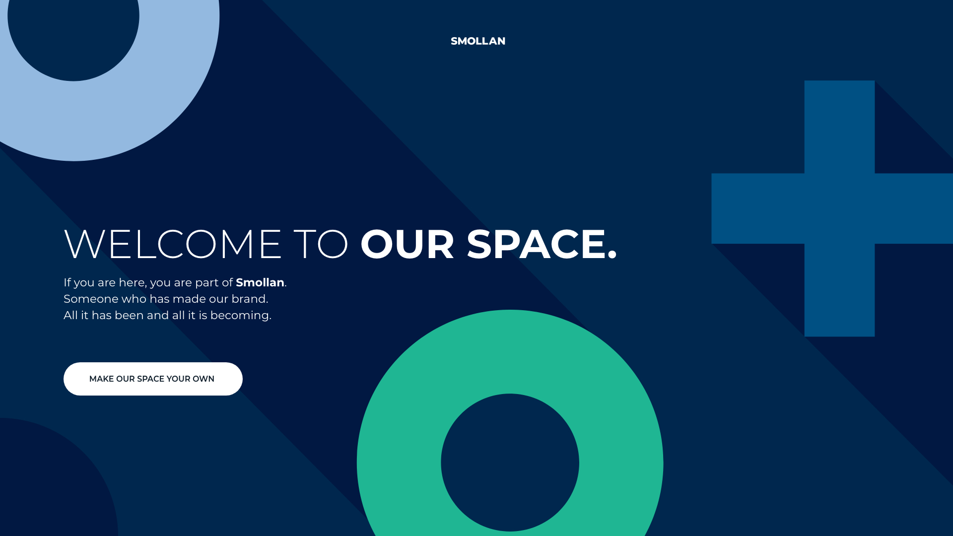
When launching their new visual identity to its 80,000 staff worldwide, Smollan wanted to make sure everybody truly understood the intentions behind the rebrand. monopo Tokyo devised an experience that helped people embrace the new identity system through play and interaction. A digital 3D space, telling the Smollan story and inviting visitors to make it their own.
CHALLENGE
Getting an internal audience of 80,000 worldwide staff engaged in a new visual identity, by letting them play with it
Smollan is a global leader in retail marketing, spanning more than 50 offices worldwide, with over 80,000 staff. At the start of 2021, Smollan was ready to launch their new visual identity but faced a recognizable challenge: how to get all 80,000 engaged? Sharing a brand guidelines PDF document didn’t quite feel like the answer. Instead, Smollan’s creative agency Known Agency approached us with an idea; to build a digital experience that represents the flexible visual identity system Smollan had devised.
EXPERIENCE
A space you can make your own, whichever mood you’re in
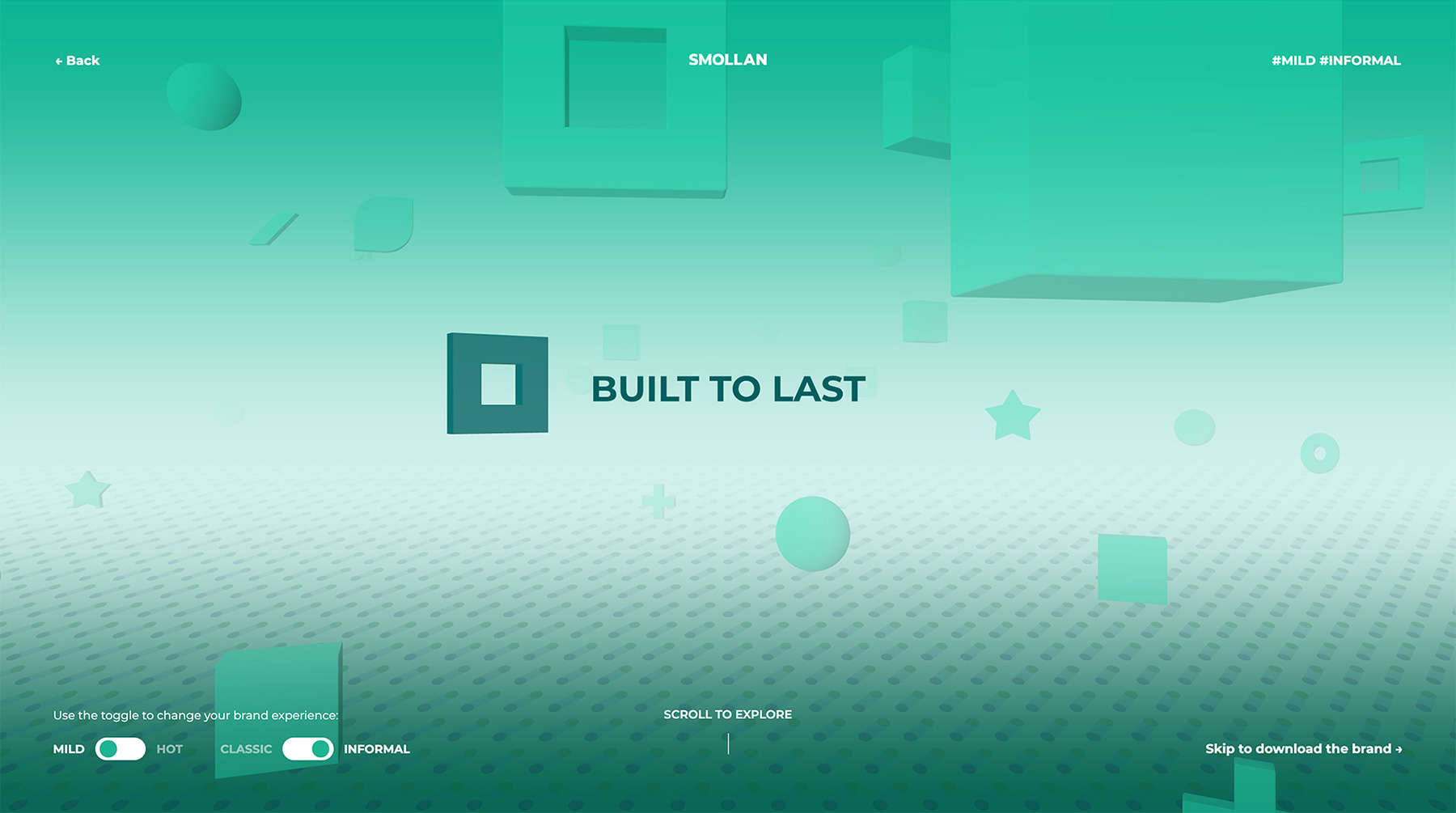
We created a digital space that tells the story of Smollan, from its early days to its vision for the future. Visitors could travel through the 3D-space and discover the story as they scroll.
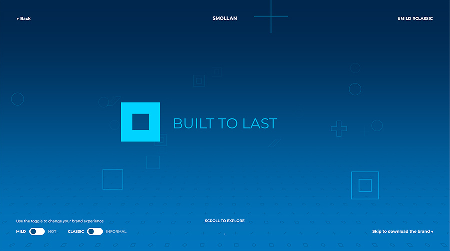
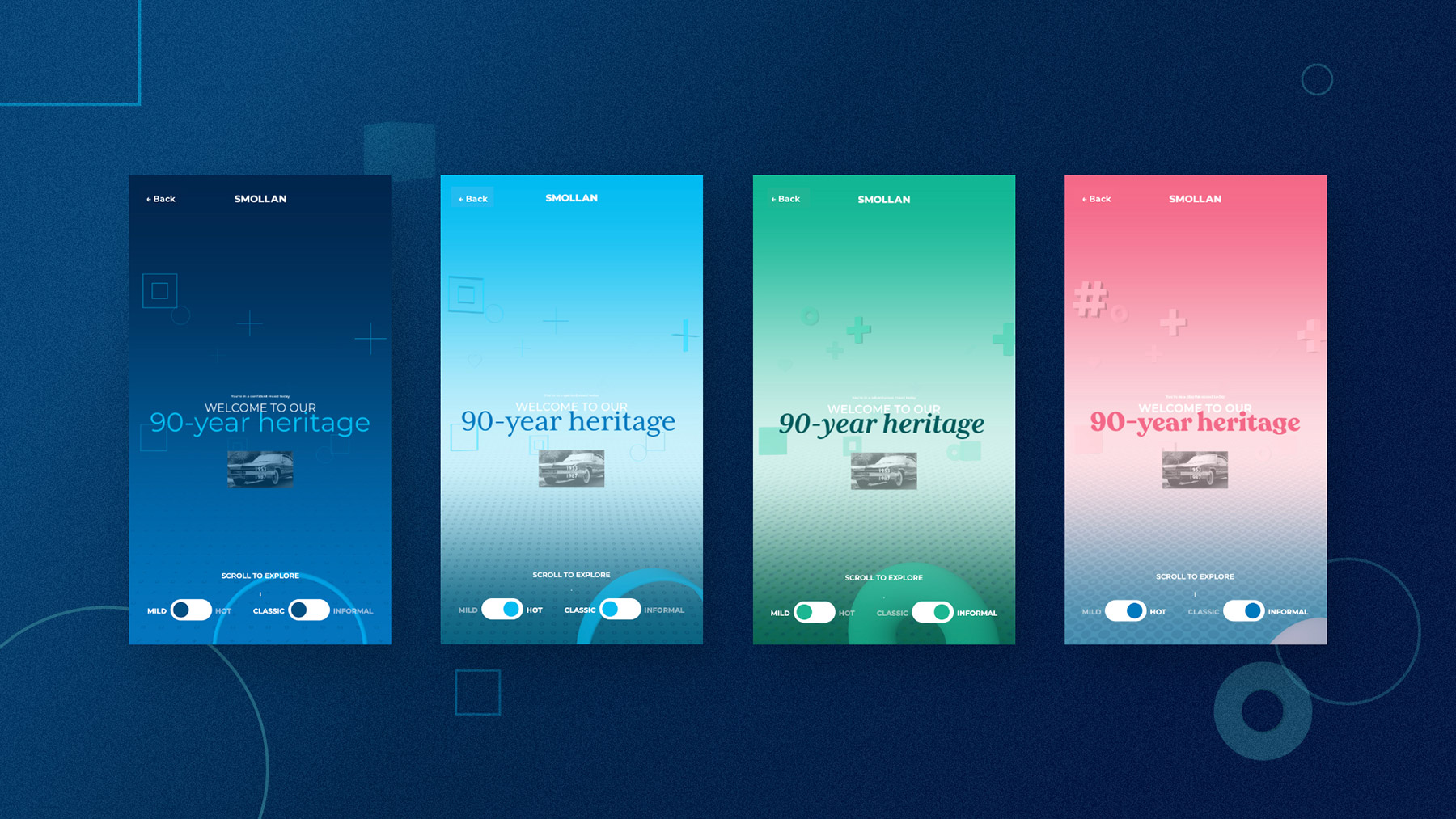
But Smollan’s new identity system was less linear than that. The system consisted of four “moods”. Four versions of the visual identity that allowed the brand to show up slightly differently depending on the context. From a more formal mood for annual reports to a very casual mood for internal comms.
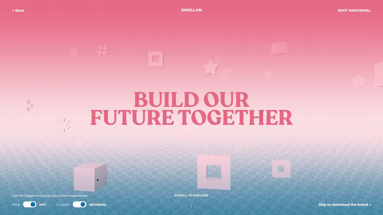
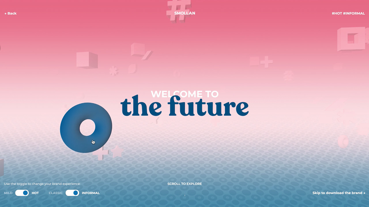
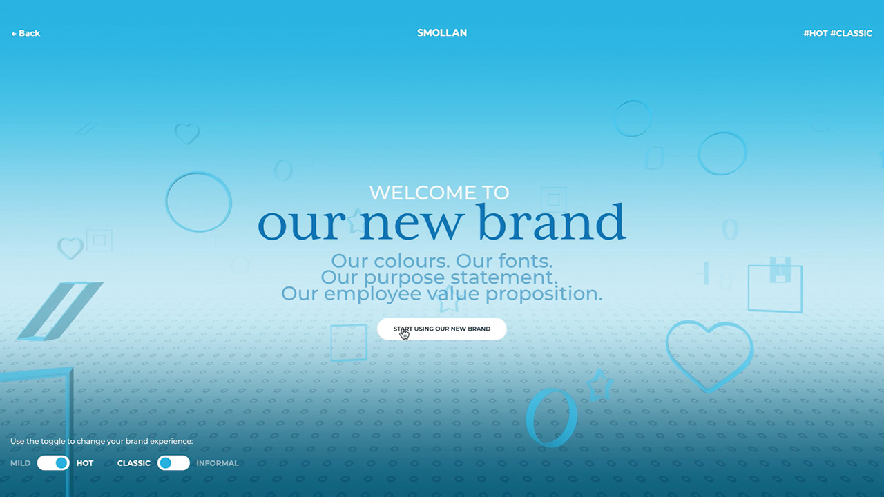
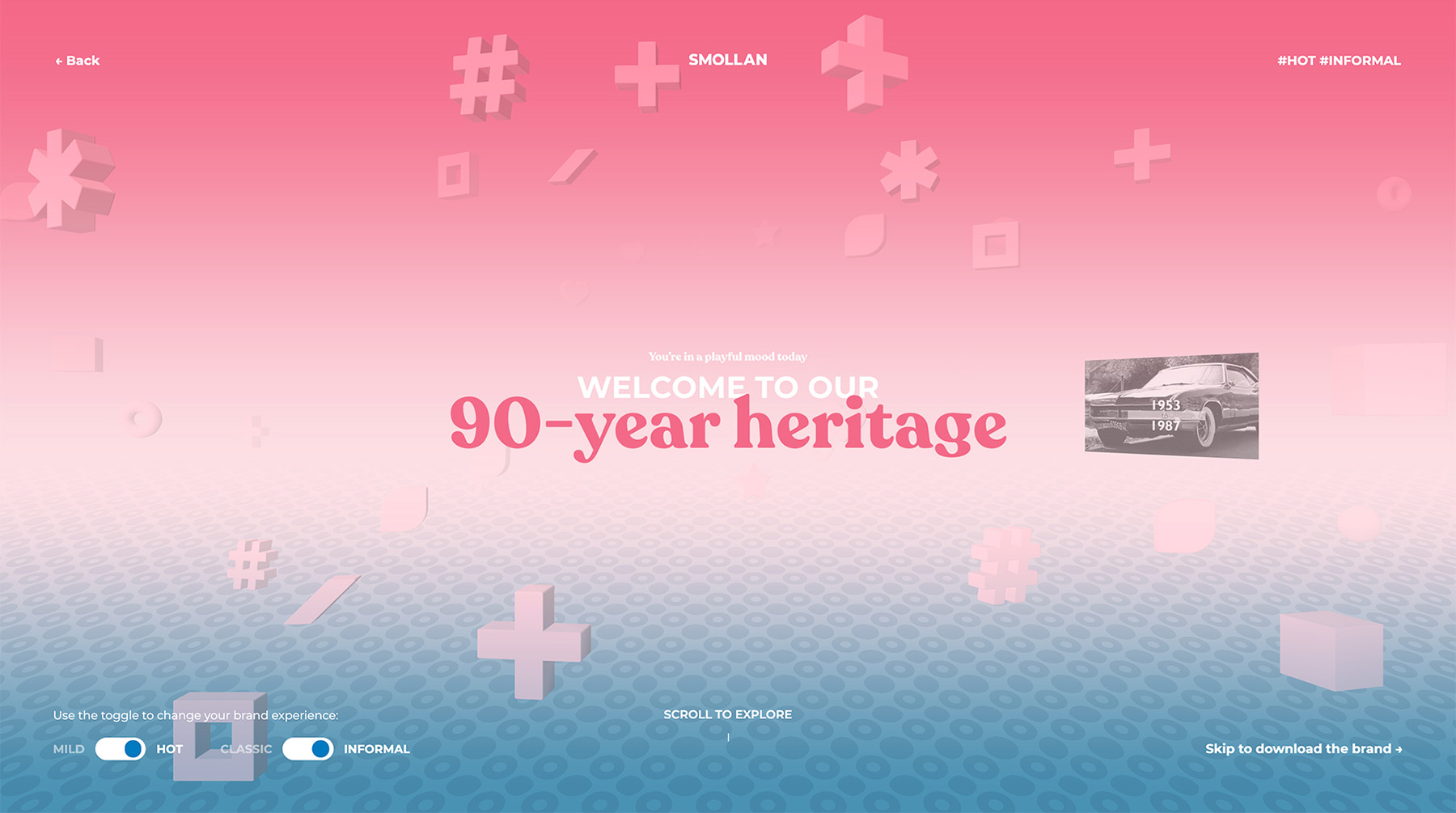
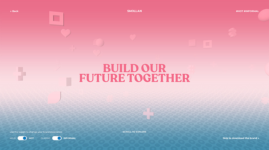
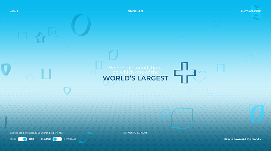
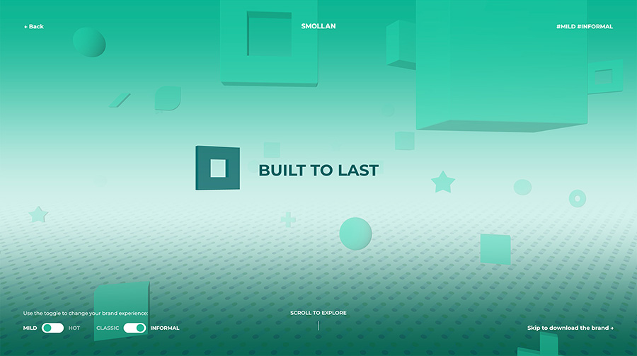
We devised the digital experience to replicate these four versions of the Smollan identity. Through toggles on the website, visitors could transform the digital space and make it their own. Keep it mild and classic, or flick the toggles to transform the space into a hot and informal environment. Four different combinations were possible, showing off a different version of Smollan’s visual identity every time.
Throughout the experience, we also hid easter eggs that allowed visitors to go even deeper into the story via full-screen pop-ups.
DESIGN
Four moods, four spaces
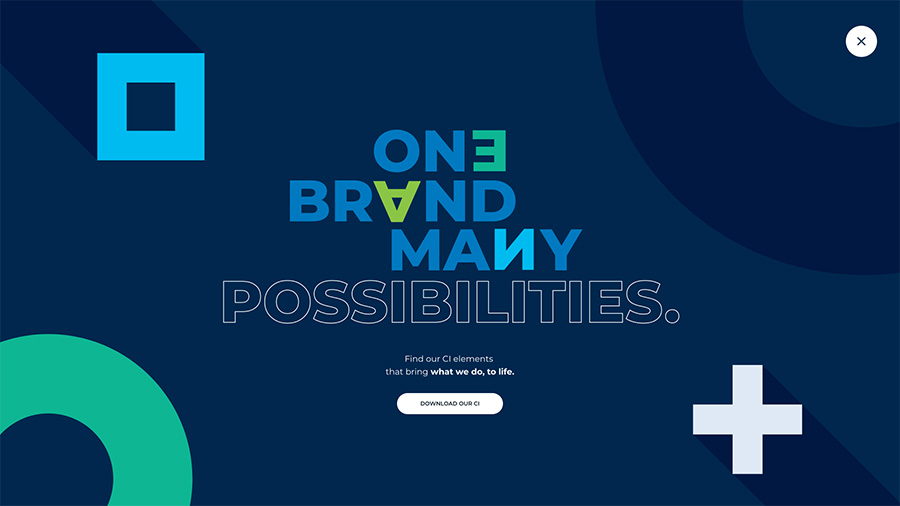
The design had to tread the line of following the new visual guidelines while also showing the richness of applications possible within the new brand system. We designed out four full narrative journeys, each following the same story but each showing off a different brand mood. To create the moods, we altered the color palettes, font treatments and visual elements. More playful moods used more vibrant colors and chunkier 3D elements, while formal moods had more toned-down colors and thinner, sharper visuals.


CREDITS
- CLIENT
- Known Agency, SMOLLAN
- ROLE
- Art Direction, Design, Development
- THE TEAM
-
Account Manager
Georgi Robertsmonopo TokyoWeb Director
Toshika Kosakomonopo TokyoInteractive Designer
Stella Grottimonopo LondonDeveloper
Misaki NakanoCreative Director
Mélanie Hubert-Crozetmonopo London


