- 日本語
- EN
CIRCULATION Website
- ROLE
- Creative Direction, Photography, Planning, UX/UI Design, Web Development
- DELIVERABLE
- Responsive Website
- DATE
- Nov 2019
monopo Tokyo was responsible for the renewal of both the brand and recruitment site of Circulation Co., Ltd. With their extensive database of working professionals and their achievements, Circulation solves corporate management issues by finding the right professional for every task. They call this service of matching professionals and clients “professional sharing.”
CLIENT BRIEF
OUR PROPOSAL
Create a site that conveys innovation and vision
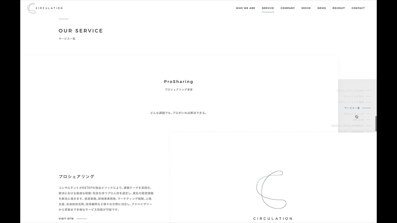
Along with a new brand slogan and brand story, Circulation needed to redesign the logo and the corporate website to convey the company’s vision. At the same time, it was crucial to create a visually intuitive and easy to understand explanation of their services. Our goal was to create a design with a clear brand vision that expressed the company’s position as a leader within their field. The design had to convey the company’s vision and services in-depth while also making it easy to access information.
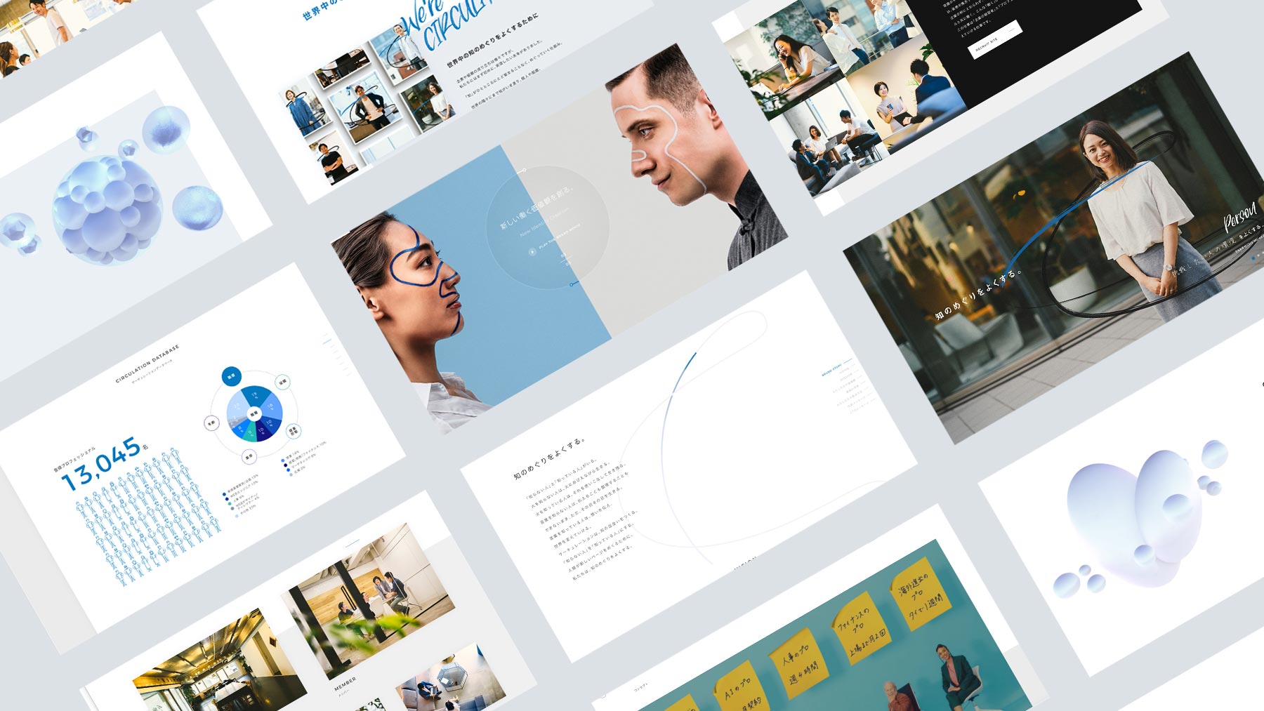
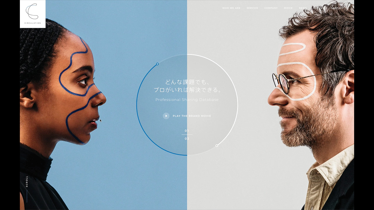
A main visual representing “professional sharing”
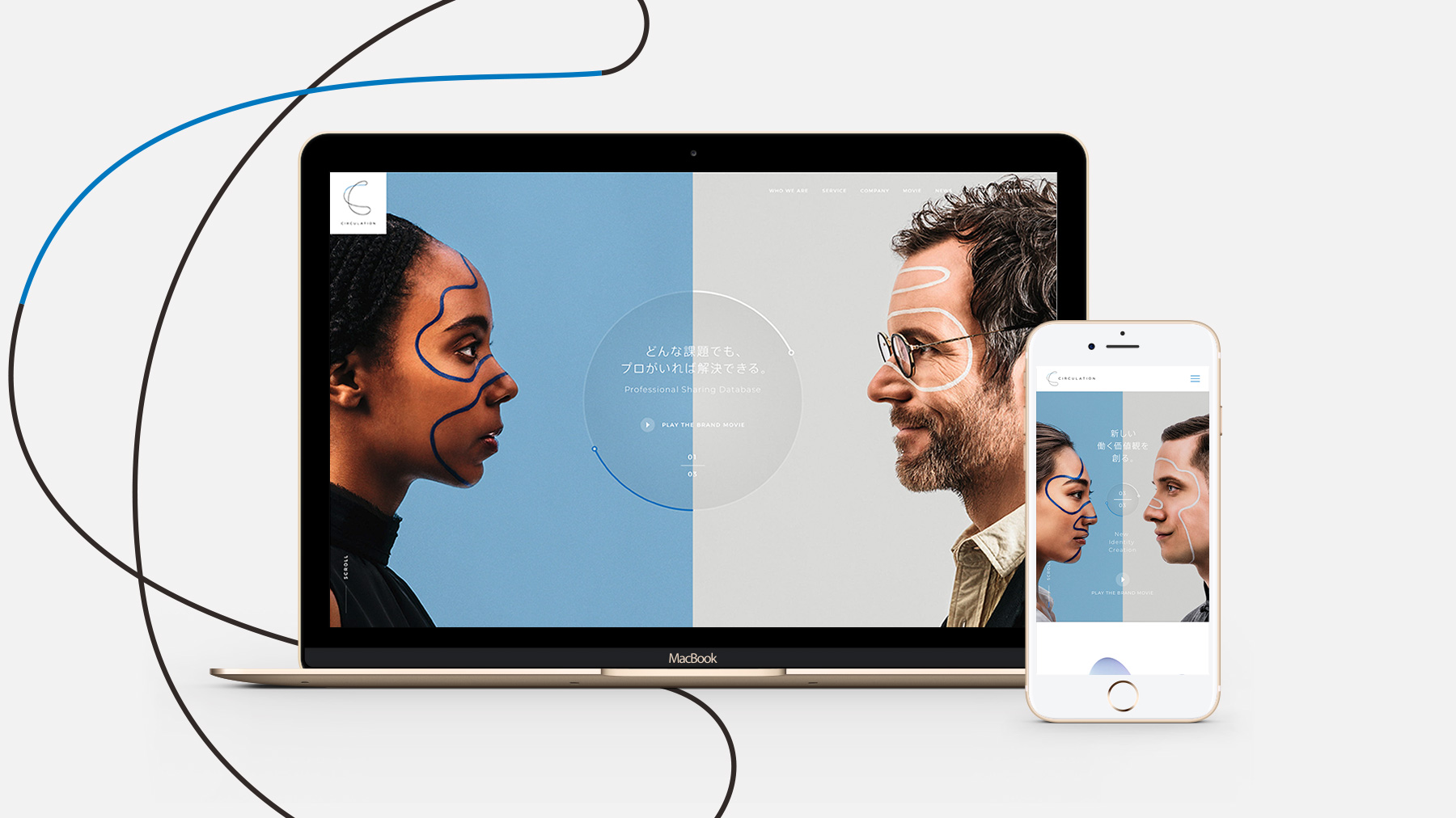
The main visual for the corporate web site features two people facing each other. On the left is a person representing the “professional” side and on the right is a person representing the “client” side, expressing how both sides can work together to solve the same problem. To represent Circulation’s vision and brand, we chose models who were diverse in terms of gender, age, and nationality. This decision represents a society where Circulation’s vision of professional sharing is widespread across the world. The hero element is inspired by the Circulation logo, with blue and white lines painted on people’s faces to represent the company's workflow. The passing of knowledge from the professional to the client is also illustrated by a circular animation in the middle. There are three key visual patterns, each with the following message: 1. “Any problem can be solved with a professional present” This shows the basic concept behind Circulation’s services 2. “Professional knowledge can be used for regional development.” This shows Circulation’s intention of solving the social issue of “regional development”. 3. “Create new working values” This illustrates Circulation’s mission to transform the existing labor and human resources market.
Original UI that blends corporate innovation with human emotion
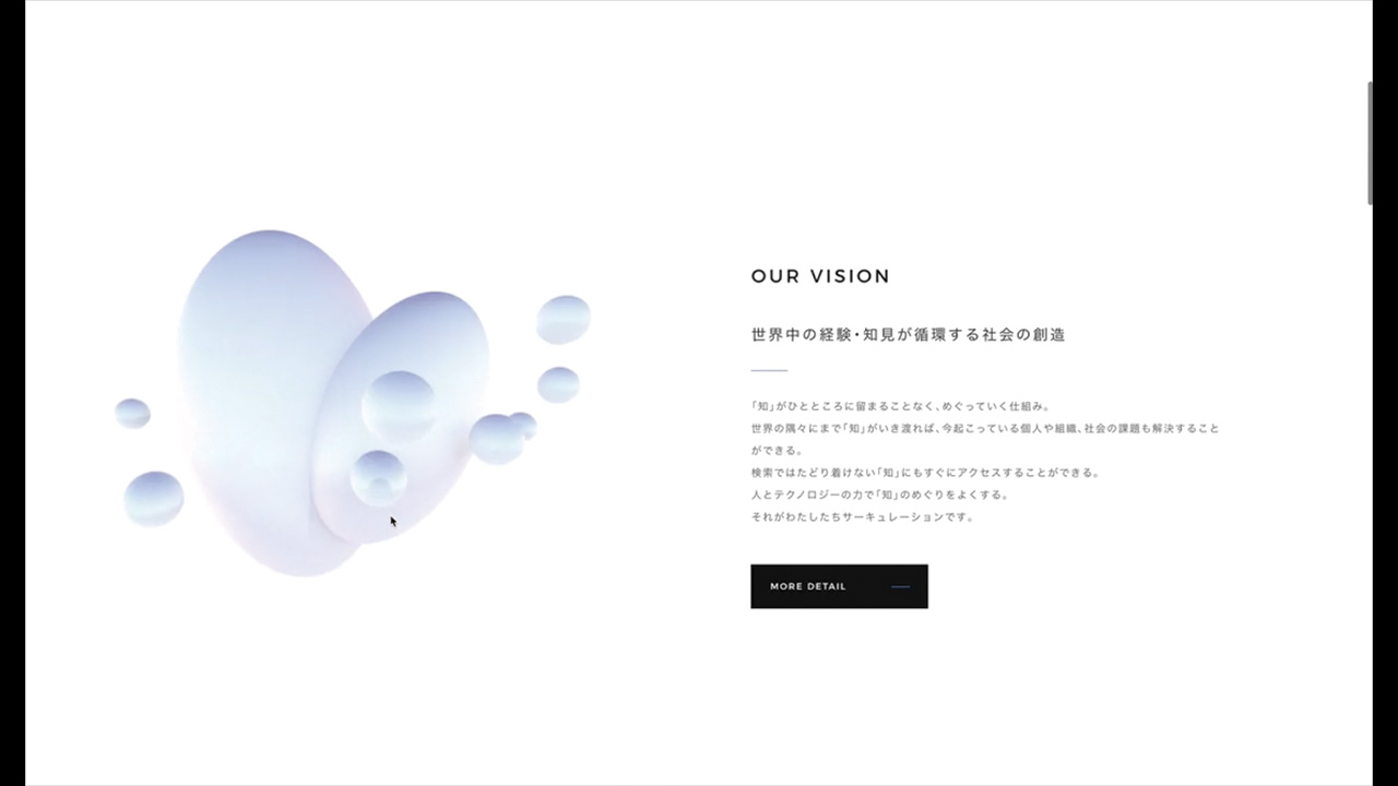
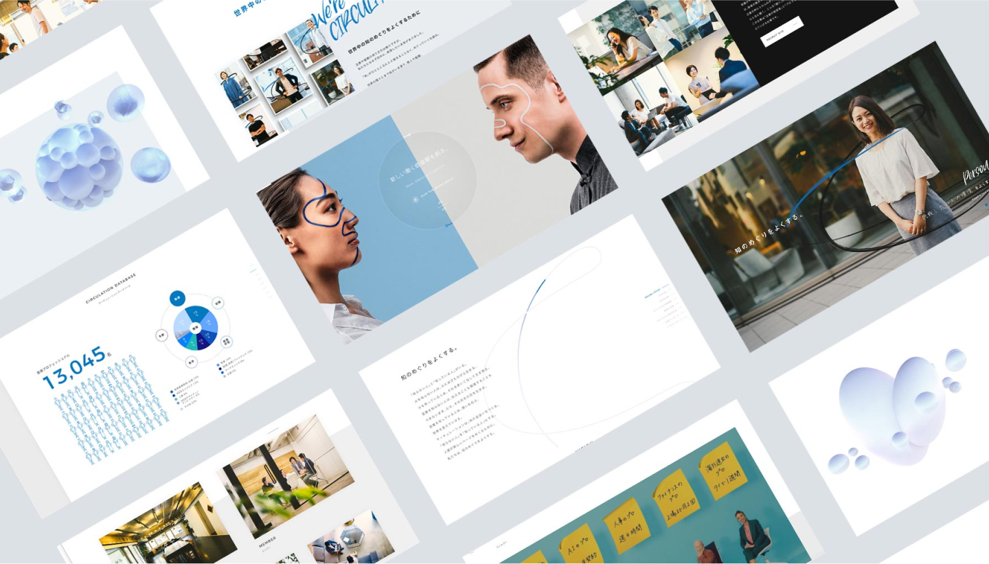
We designed an advanced UI that considers the speed and depth of the user’s understanding of the brand’s vision and services. The top page features a 3DCG embodiment of the concept, using an actual person to represent the world view of “knowledge” and how it “circulates” through the body. To add warmth and a human touch to the visuals, we edited photographs of the office and employees to resemble film photography. Our goal was to create a unique web design that was unlike anything before while conveying Circulation’s passion and warmth. We also created several pictogram illustrations that also follow the theme of the blue/white lines in order to convey the business’s strengths and background.
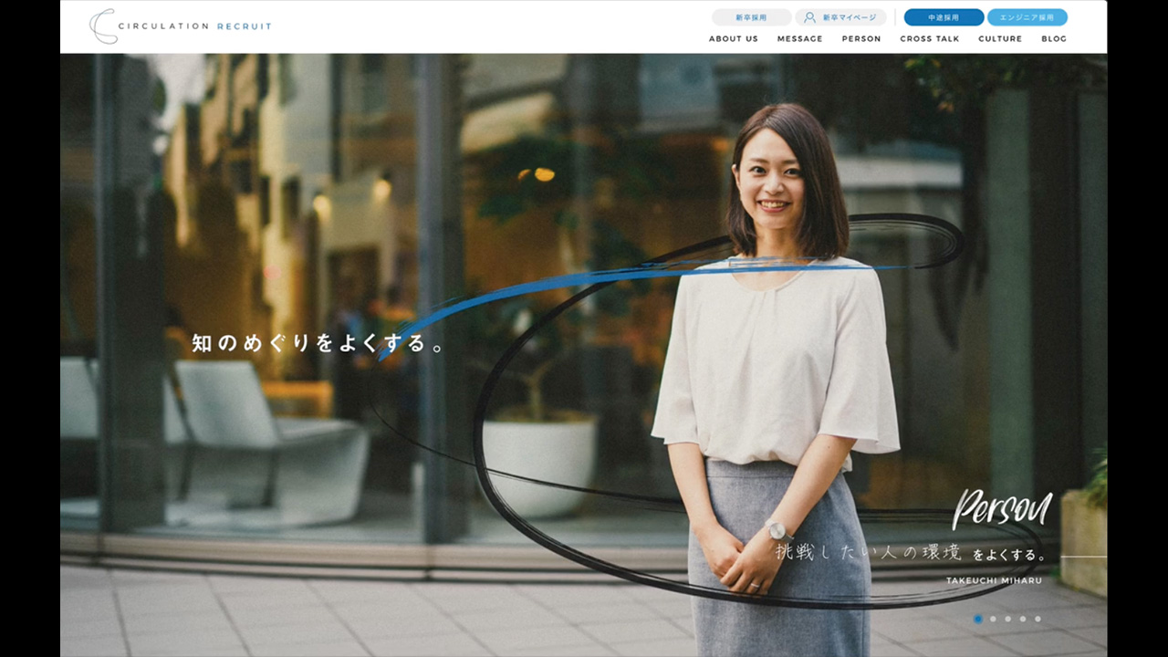
A recruiting website that aims to empathize with the aspirations of its members
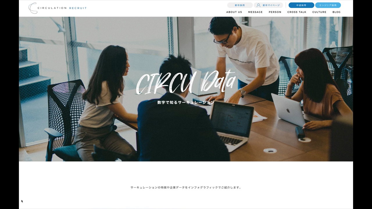
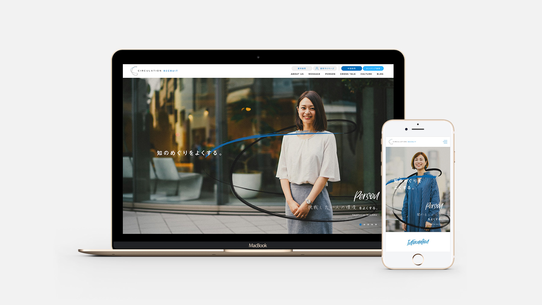
The corporate website was designed to communicate the company’s vision and services. However, the recruitment website was designed to help job seekers experience the aspirations of Circulation members. This page also contains information such as the history of Circulation, interviews with the managing members, and various discussions. For the main visual, we used photographs of five Circulation employees with specially designed graphics of their logo to express their vision of working towards improving the circulation of knowledge. The use of colors and handwritten fonts adds a fresh and lively tone to help job seekers visualize the corporate culture of Circulation employees.
CREDITS
- CLIENT
- CIRCULATION
- ROLE
- Creative Direction, Photography, Planning, UX/UI Design, Web Development
- THE TEAM
-
Account Executive
Kiyoshi Nagaya (adot)Account Manager
Nanami Kudou (adot)Copywriter
Tetsuji Hasegawa (噂)CI/VI Designer
Tatsunori Murayama (噂)Creative Director / Producer
Ryo Miyakawamonopo TokyoProject Manager / Planner
Tomoki Inagumamonopo TokyoArt Director
Joe Yanagita (syncity)Designer
Keisuke Tominaga (syncity)Front-end / Back-end Engineer
Daichi OobaKV / OFFICE Photographer
Kenta HoshinoMEMBER Photographer
Kai TamakiRetouch
Jeremy HanniganCast
Asian, Jeremy Hannigan, Kenichirou Ikeda, Eigo Tanaka, YUKI, WilliamMakeup
Takkyu, IkuyoStylist
Joe YanagitaArt Director
Hayato Iida (adot/SUPERSUPER)


