- 日本語
- EN
MAISON SPECIAL Branding & Website
- ROLE
- Brand Positioning, Branding, Art Direction, UX/UI Design, Web Development
- DELIVERABLE
- Logo, Brand Regulations, Clothing Tags, E-commerce Website
- DATE
- Mar 2019
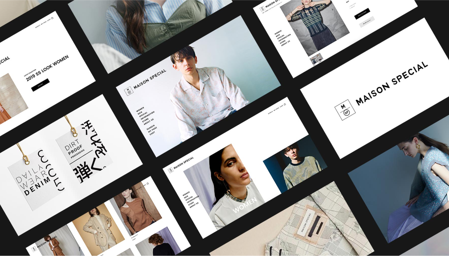
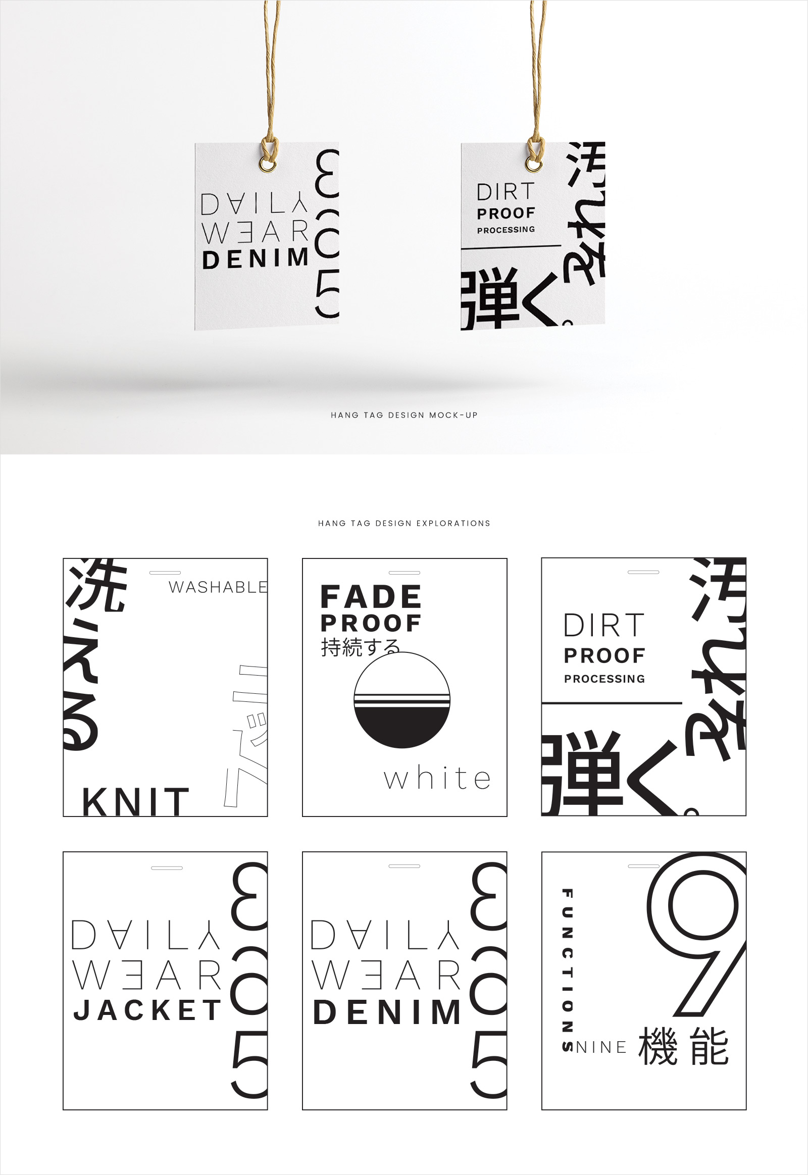
monopo Tokyo accompanied ”MAISON SPECIAL” in their birth as a new fashion brand. MAISON SPECIAL lives at the intersection of quality material and advanced design. Based on this, we developed the brand identity from positioning to branding and hang tag design, to the design and development of the e-commerce website.
Positioning MAISON SPECIAL as a craft fashion brand.
As a first step into the creation of MAISON SPECIAL, we worked together to define the brand strategy, brand philosophy and mission statement. Why does MAISON SPECIAL exist and what is its contribution to the world as a brand?
We create our lives through the choices we make: the work we do, the places we go, the things we curate. Each day brings a fresh opportunity to choose and to create, starting with the outfit we assemble to take on the endeavors of the day. With full reverence of this ritual, MAISON SPECIAL works closely with a dedicated craftsman to design tailored tools to create your day.
MAISON SPECIAL exists to empower modern individuals to walk their walk and talk their talk. They celebrate each individual’s creative spirit—to mix, match, construct the best version of themselves to take on the day. The collection is the foundation and framework to support individuals in their daily endeavors.
A geometric identity inspired by Bauhaus
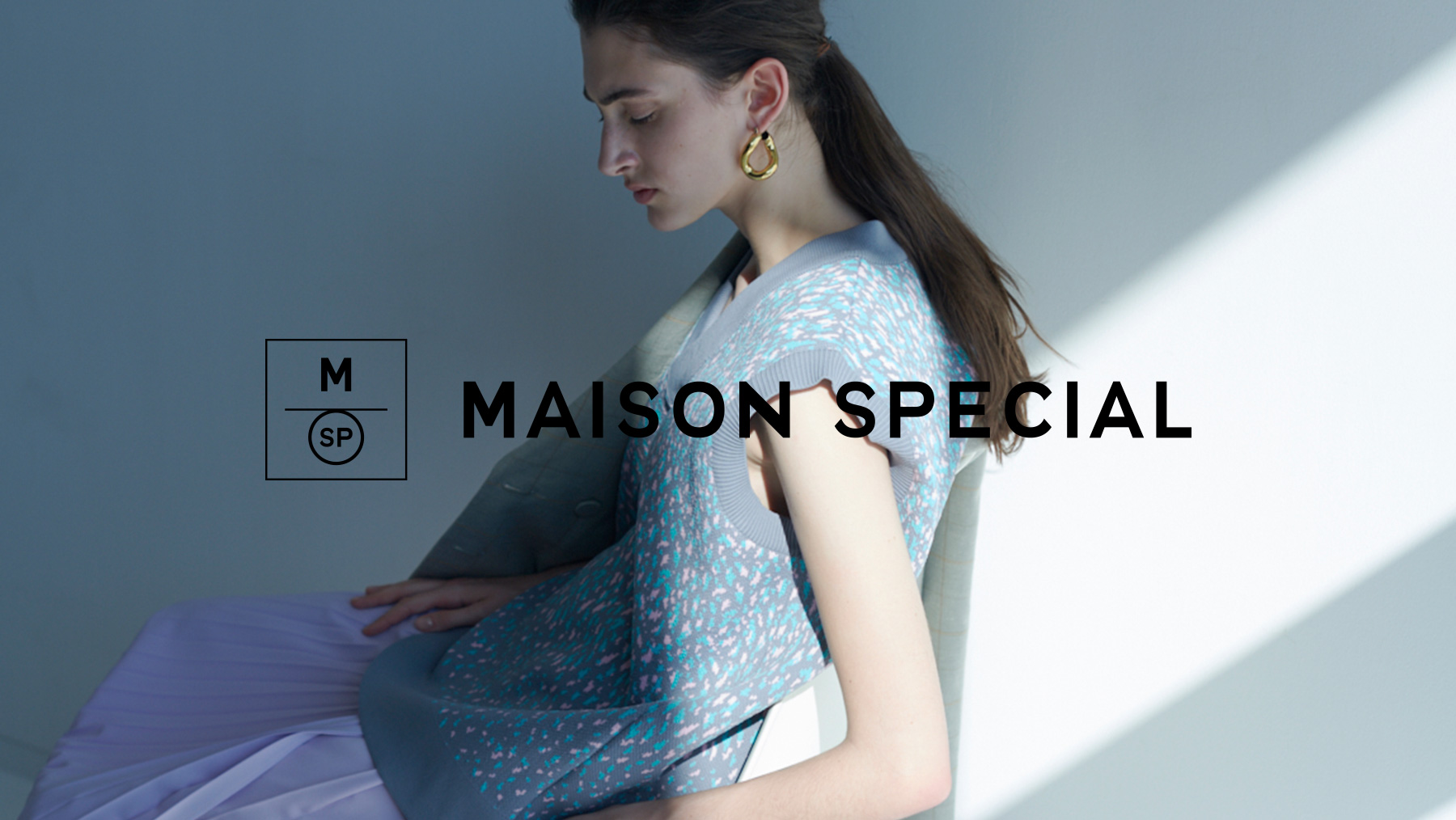
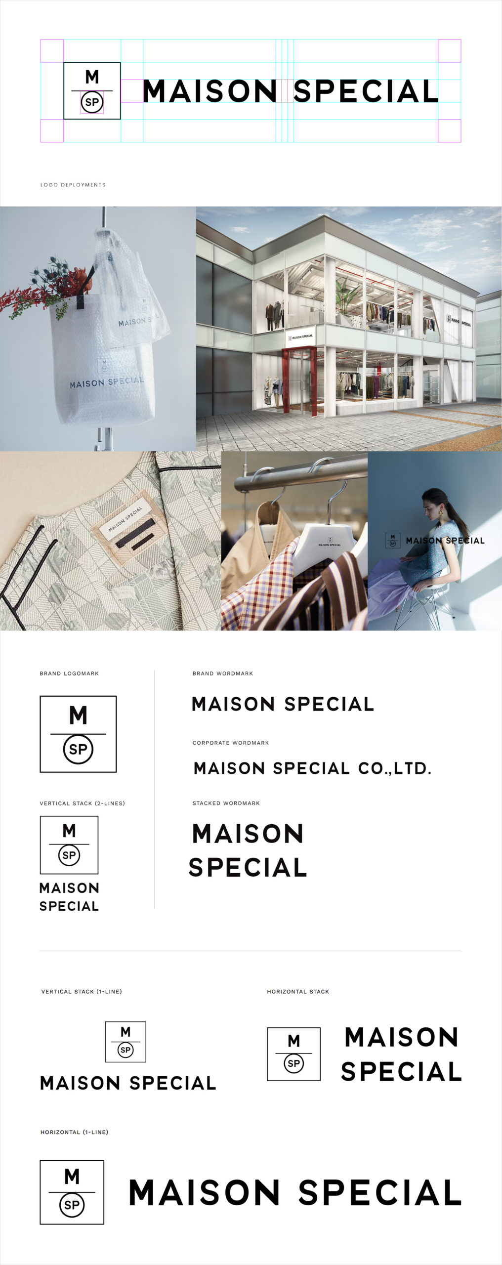
To visually communicate the vision and purpose of the MAISON SPECIAL brand, we designed a symbolic logomark in the visual brand identity system. This logomark represents the assembly of key elements that influence their philosophy in creating apparel. It is our sartorial formula to craft something special. From top to bottom, the design creates visual balance to show the synthesis of the brand's influences of high quality meets high fashion to create craft fashion.
The geometric shapes of the logomark are inspired by the minimalist design traditions of Bauhaus—combining craft and fine arts. The circle is a symbol of unity and brings focus to the key element of our fashion philosophy: SPECIAL. It is adjoined to a horizontal stroke to mimic the way a piece of clothing adorns a hanger.
Elegant, minimal and edgy for a young fashion brand
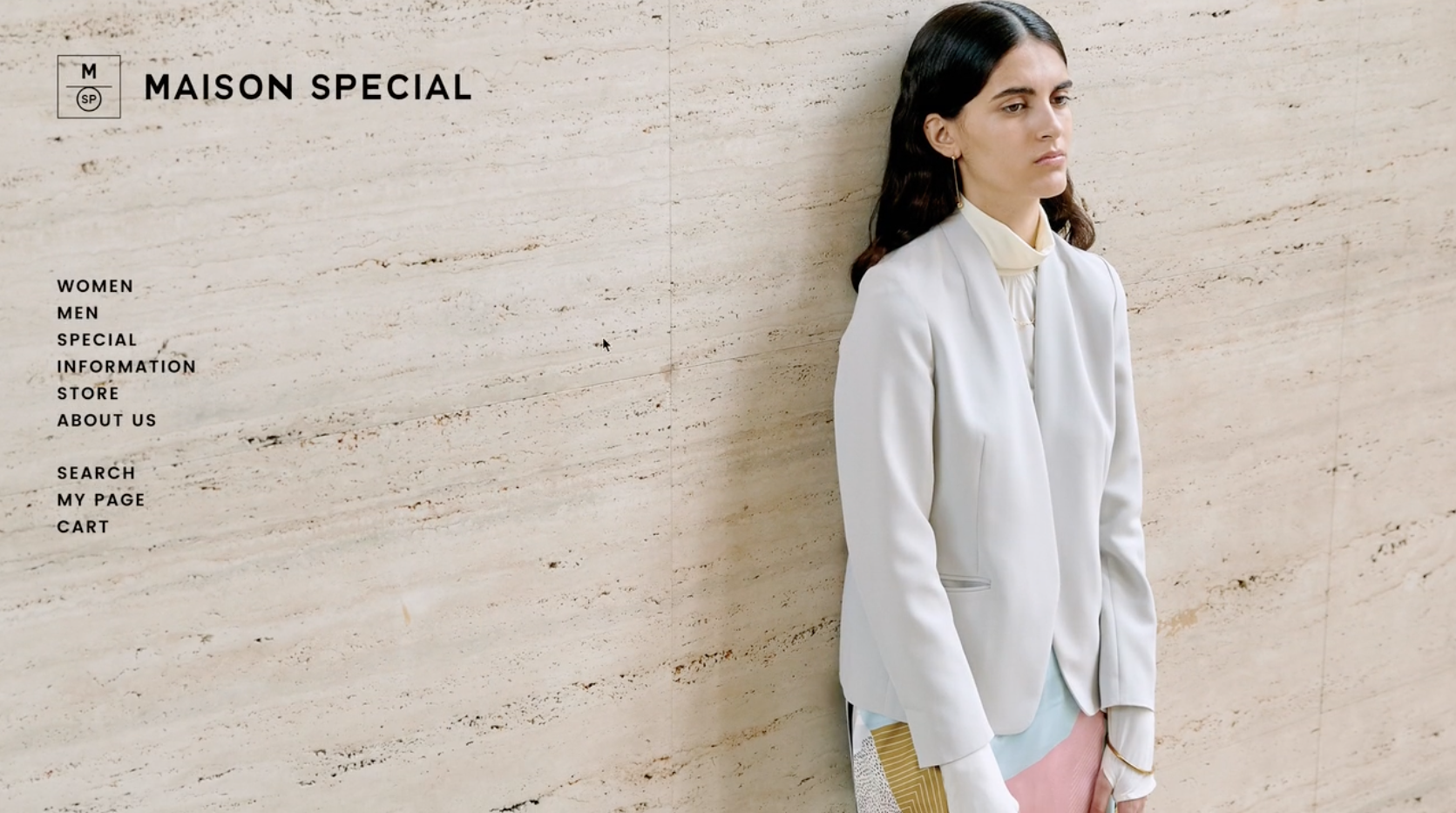
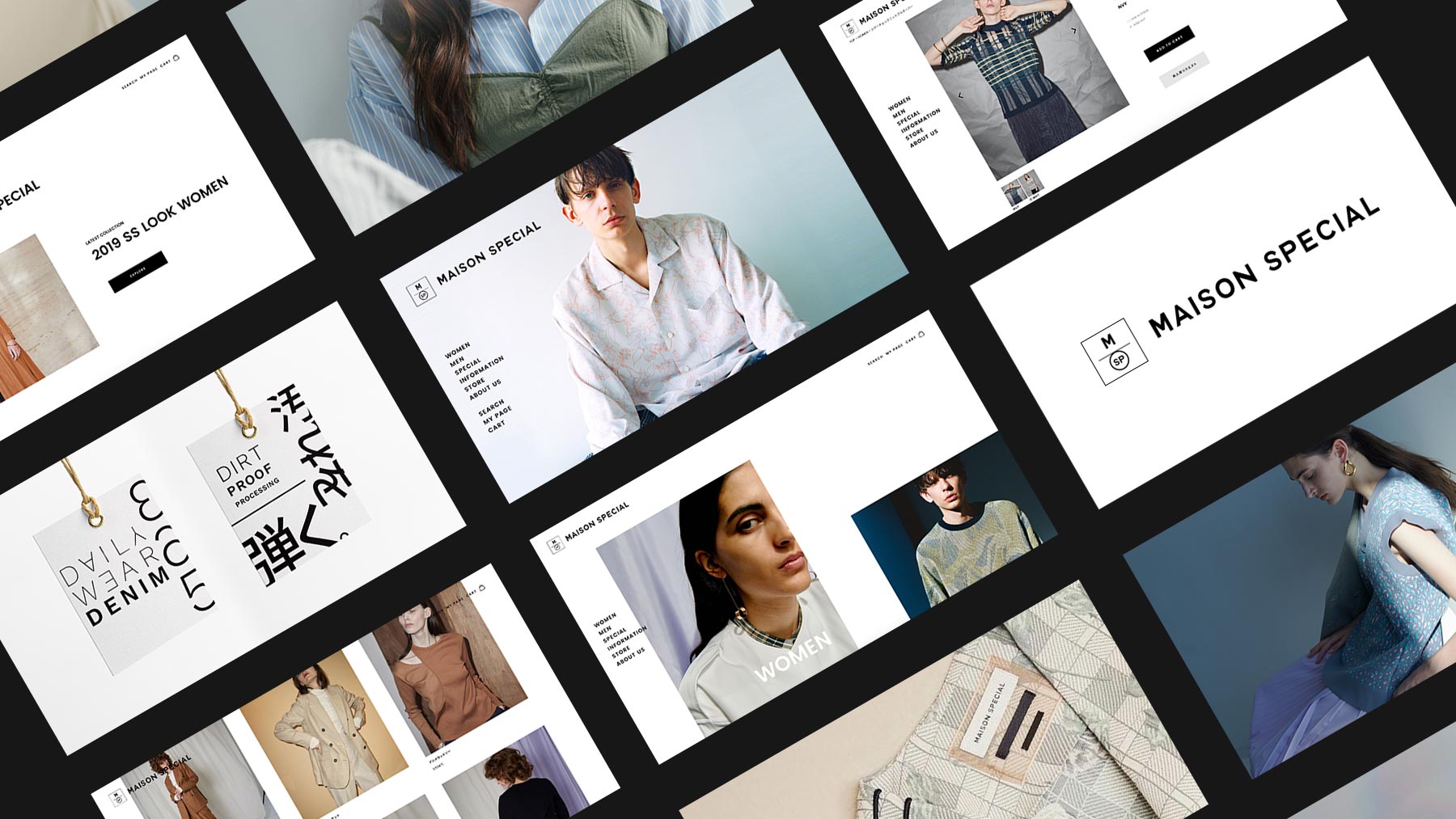
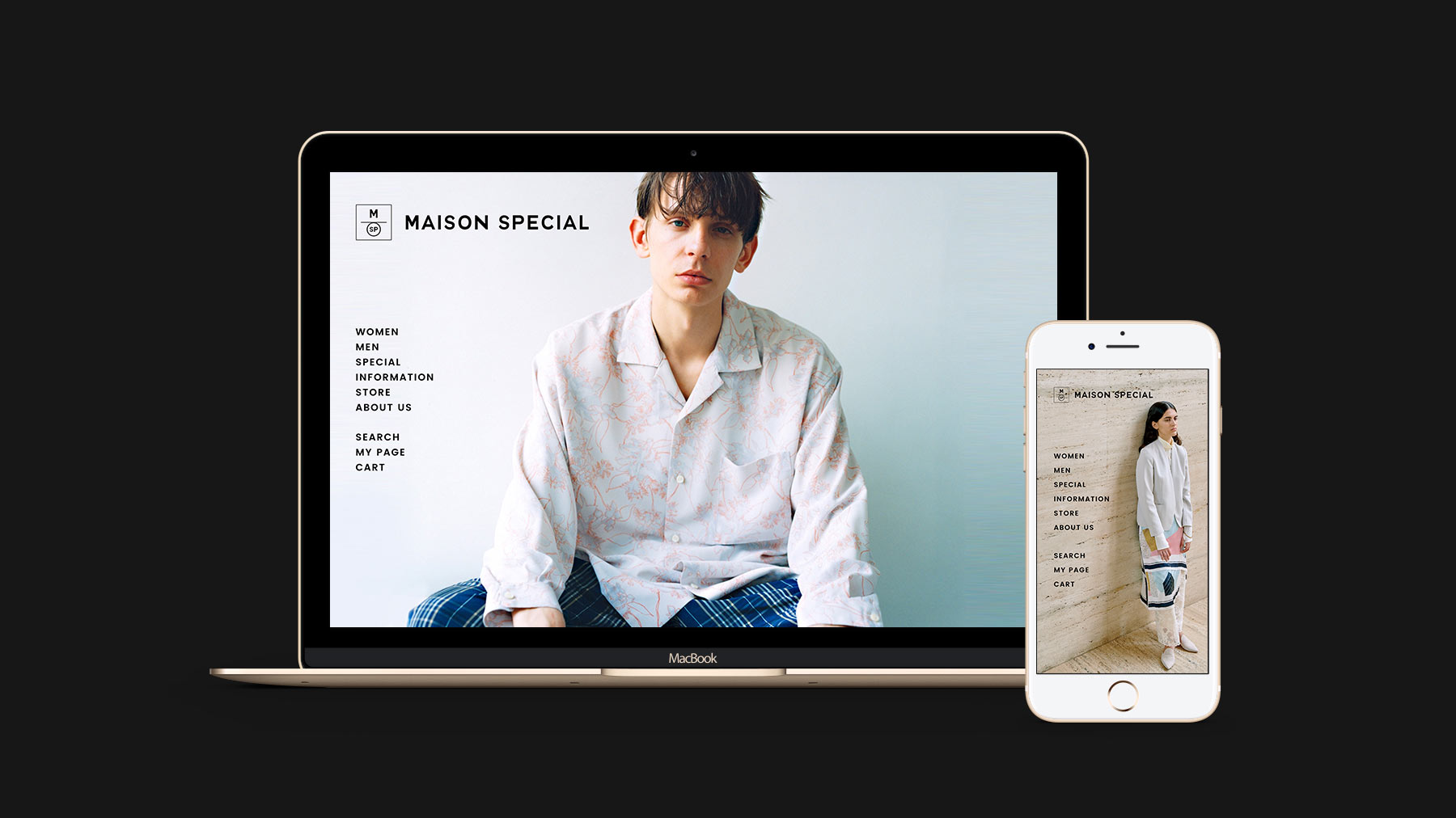
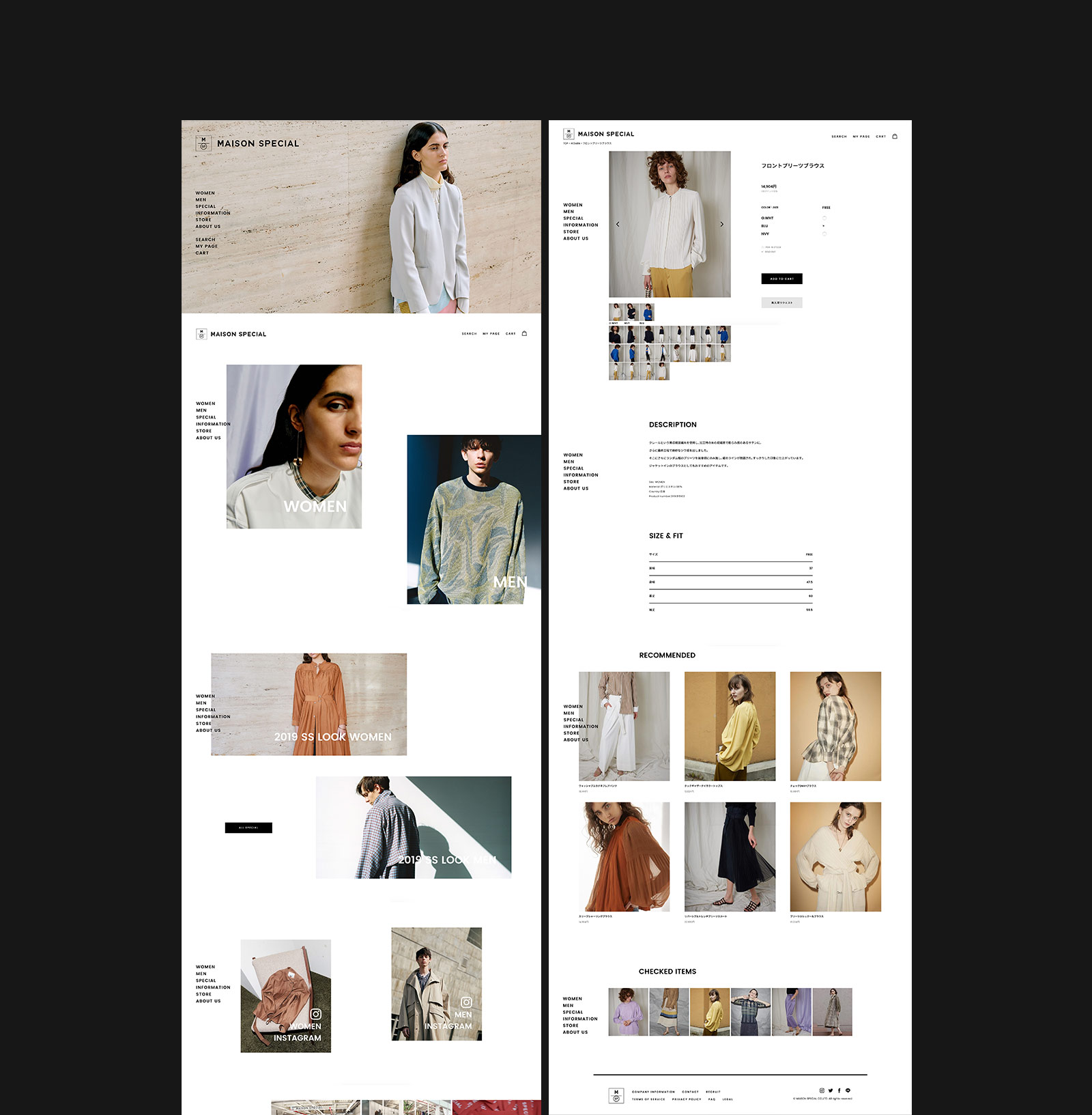
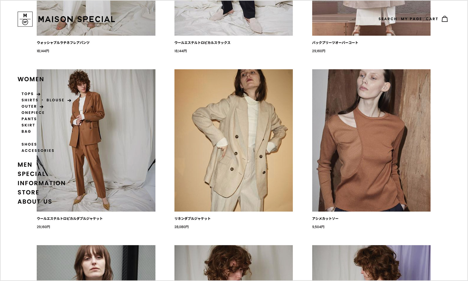
Together, we worked on defining the tone and manner: the website should be modern, cool and mode [mɔd] . Simple but special. Unique but minimal. Edgy but mature. Exciting but not crazy. We came up with a minimal design that plays with the grid and negative space to create an unusual layout.
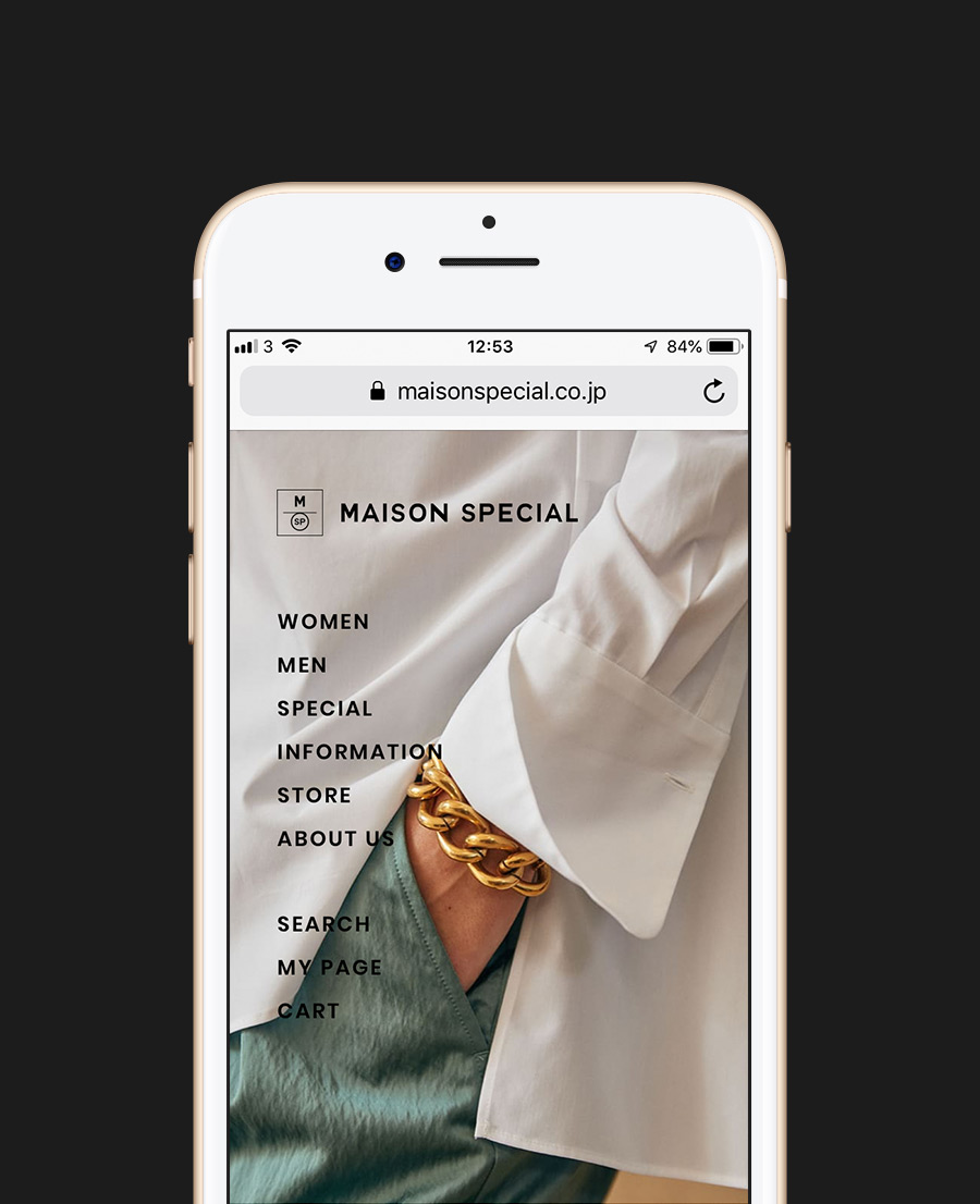
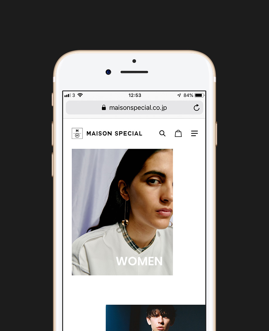
We also chose to use only black and white and bold typographies which convey an image of elegance and a hint of edginess at the same time. For a fashion website, as in fashion magazines, the power of visuals is key to draw attention to the products and grant personality to the brand. Our job was to create a layout and space to make the visuals shine. With a minimal design, animations were key to bring edginess to the website and make the user want to explore the pages and products for a long time.
E-commerce website based on Future Shop
We built the website with Future Shop and Omnichannel, which is a Japanese e-commerce system. This makes it easy for MAISON SPECIAL to create a link between the shop and its stock management. In terms of the front-end, our main challenge was to work within the limitations of the Future Shop system to create a fully-customized website with our own UI/UX and great animations.
CREDITS
- CLIENT
- MAISON SPECIAL
- ROLE
- Brand Positioning, Branding, Art Direction, UX/UI Design, Web Development
- THE TEAM
-
PRODUCTION
Producer
Yoshiyuki Sasakimonopo TokyoDirector & Project Manager
Tomoki Inagumamonopo TokyoBRANDING
Branding Creative Director
Lessa Chungmonopo TokyoGraphic Designer
Lessa Chungmonopo TokyoGraphic Designer
Tomoki Inagumamonopo TokyoGraphic Designer
Mirai Koyamamonopo TokyoWEBSITE
Digital Art Director
Mélanie Hubert-Crozetmonopo LondonUI Designer
Mélanie Hubert-Crozetmonopo LondonUI Designer
Tomoki Inagumamonopo TokyoUX Designer
Tomoki Inagumamonopo TokyoFront-end and Back-end Developer
Daichi Ooba


