- 日本語
- EN
STUDIO MARLMARL Creative
- ROLE
- UX/UI Design, Web Art Direction, Web Development, Print Design
- DELIVERABLE
- Responsive Website, Product Design
- DATE
- Nov 2018
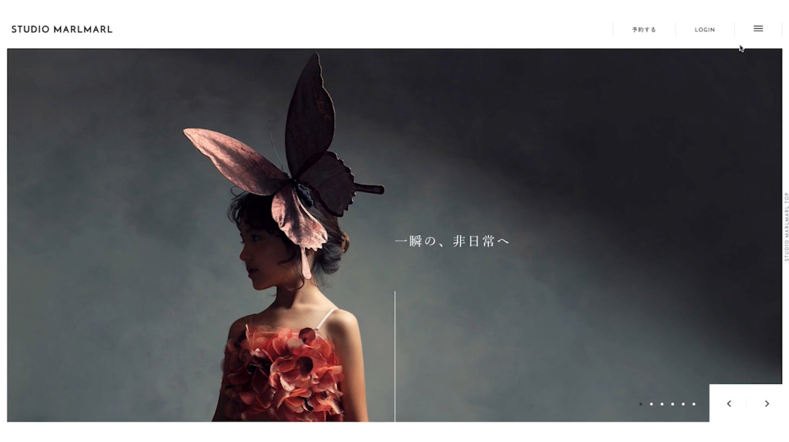
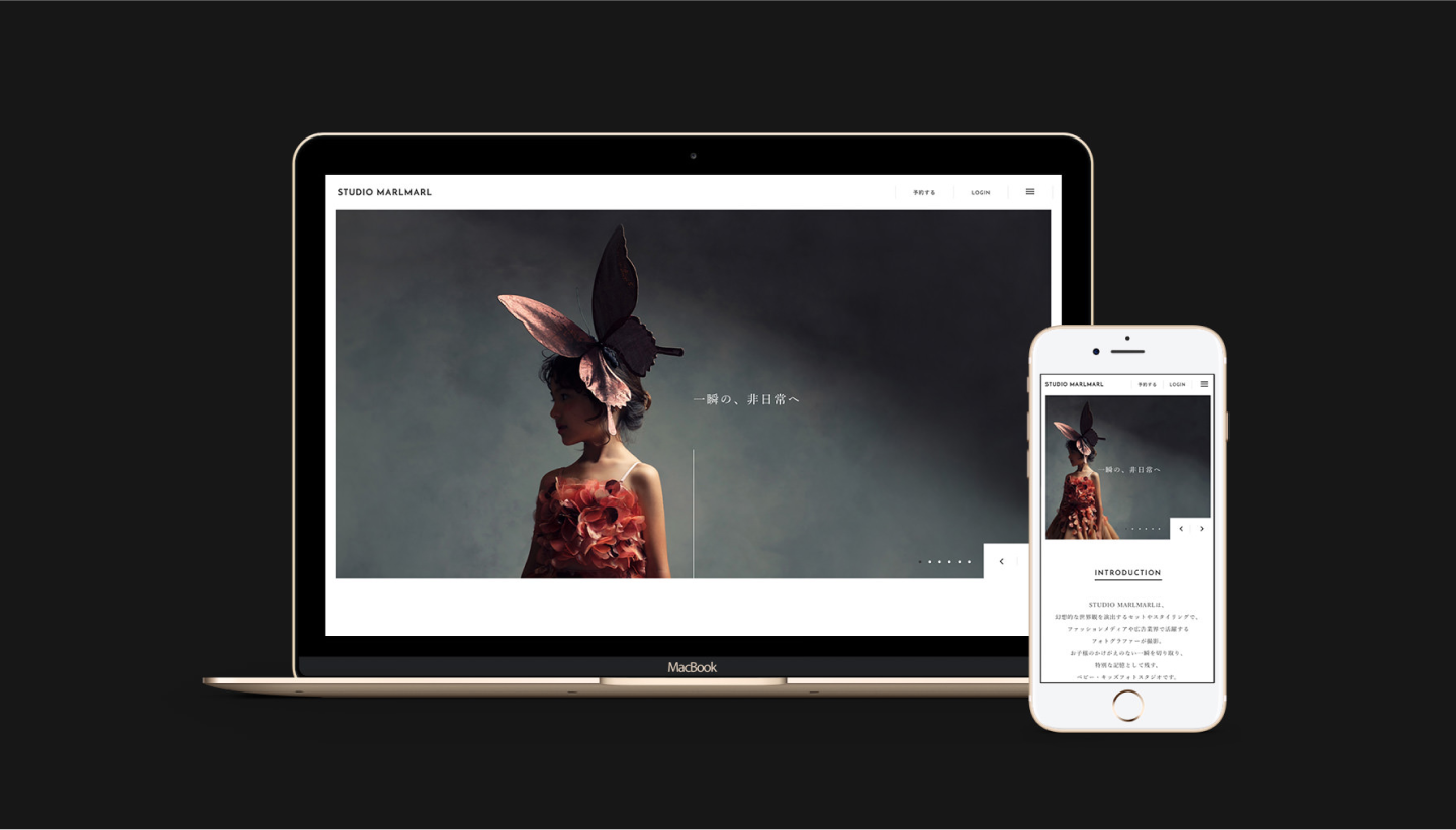
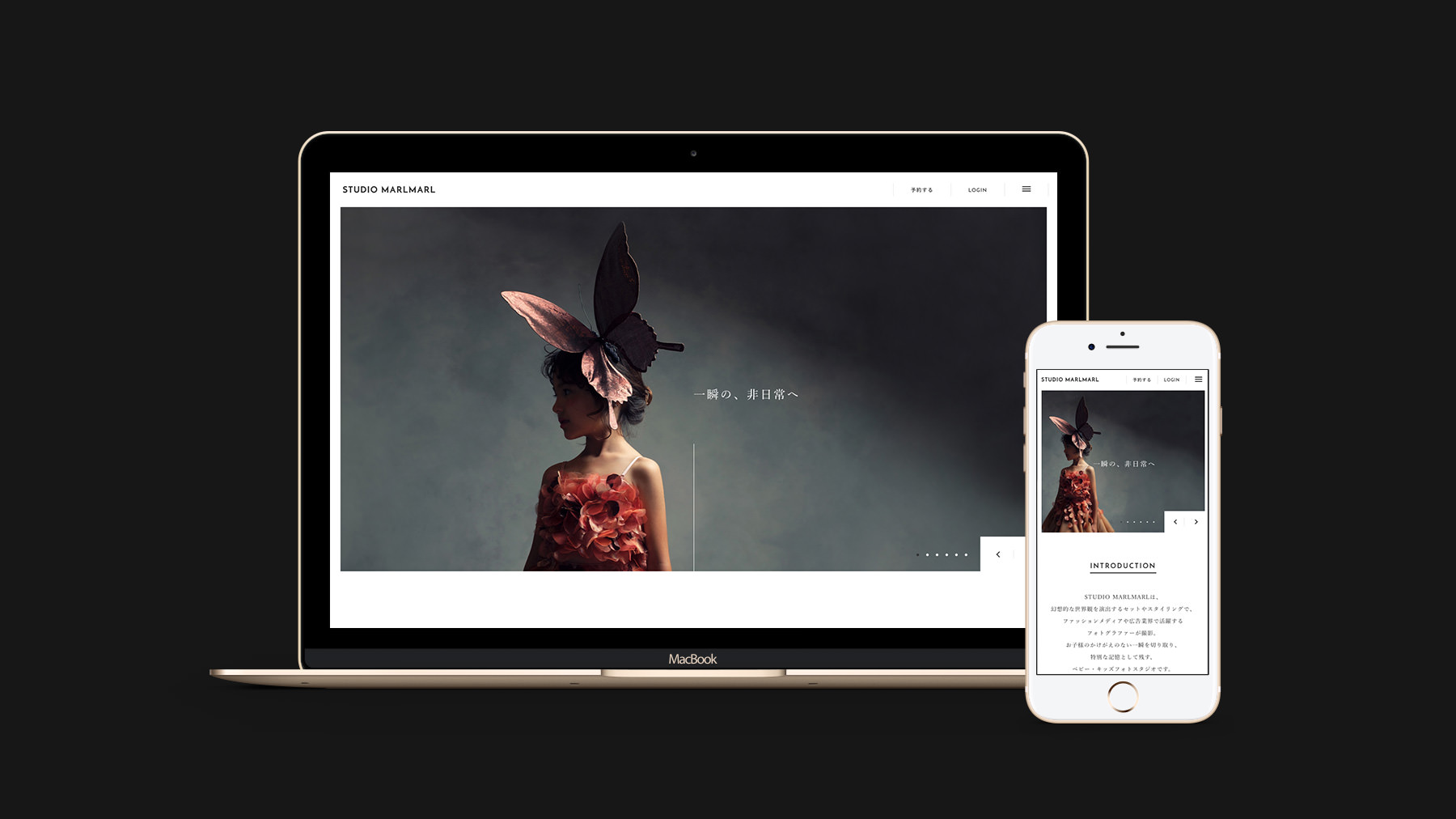
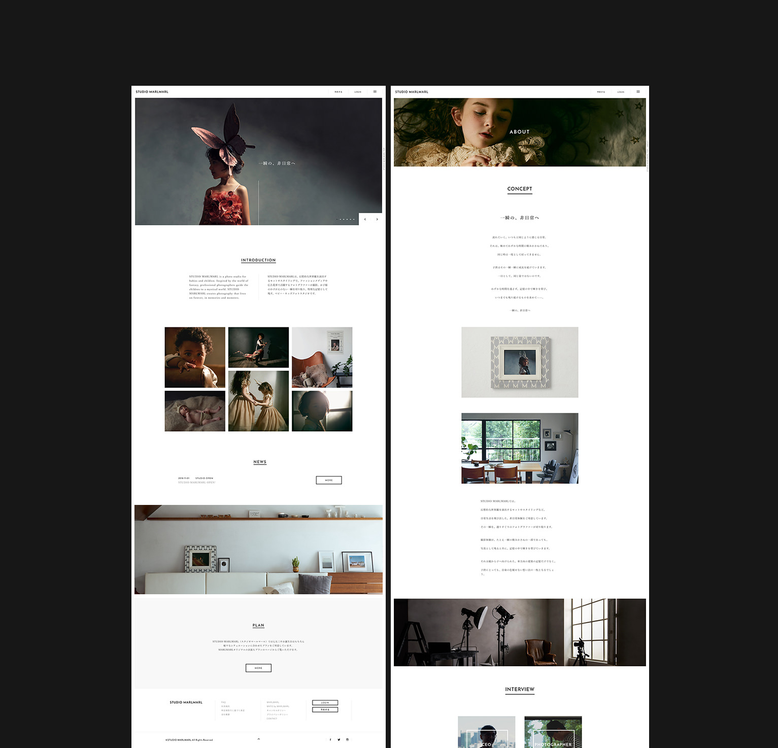
monopo Tokyo was responsible for developing the website for the baby and children’s clothing gift brand MARLMARL, and their new service, STUDIO MARLMARL, a baby and children’s photo studio.
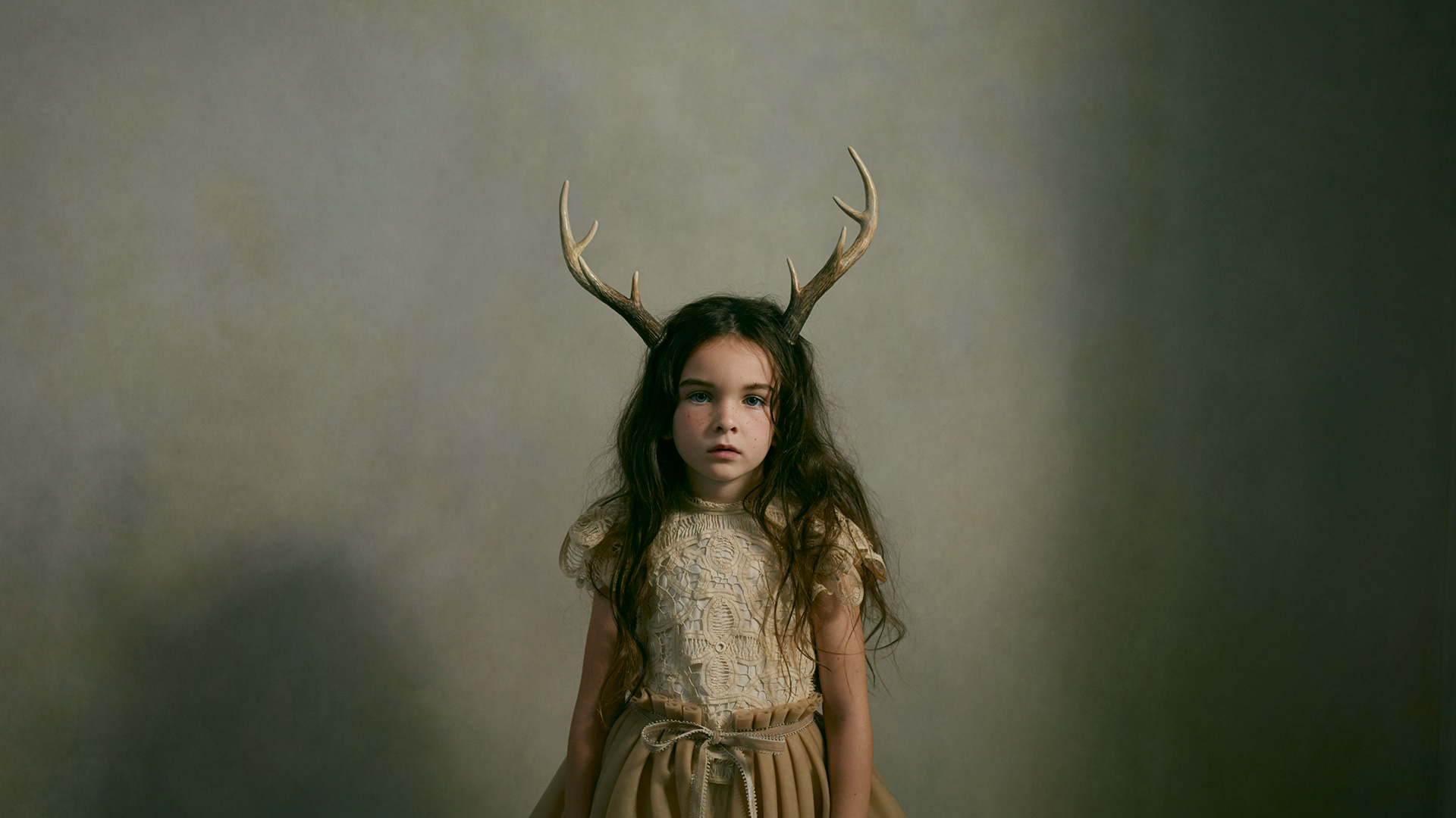
The world of MARLMARL recast inside a photo studio
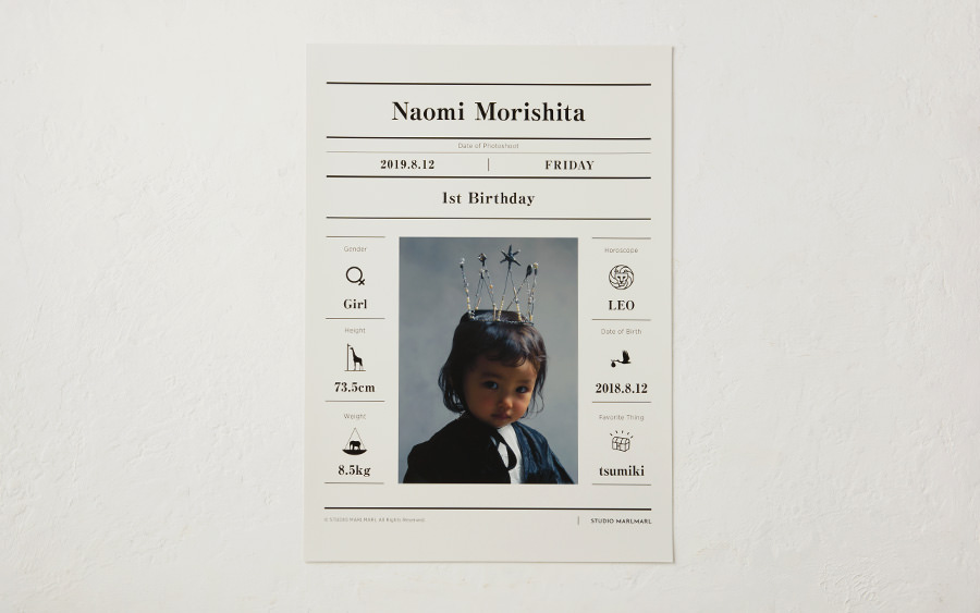
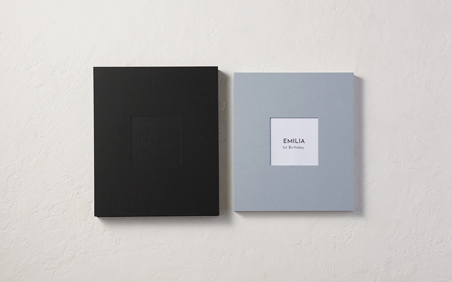
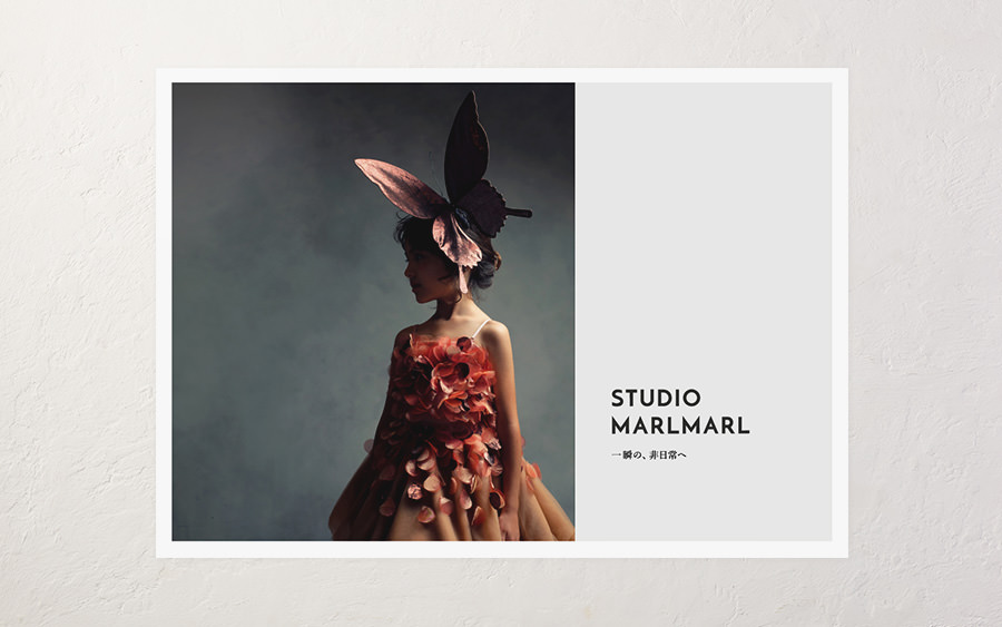
YOM, the company behind the “MARLMARL rounded bib”, a classic and popular baby shower gift, entrusted our team with developing the logo, copy, website, exterior shop design, digital signage, pamphlet, poster templates, and album design for their new service, baby and children’s photo studio STUDIO MARLMARL.
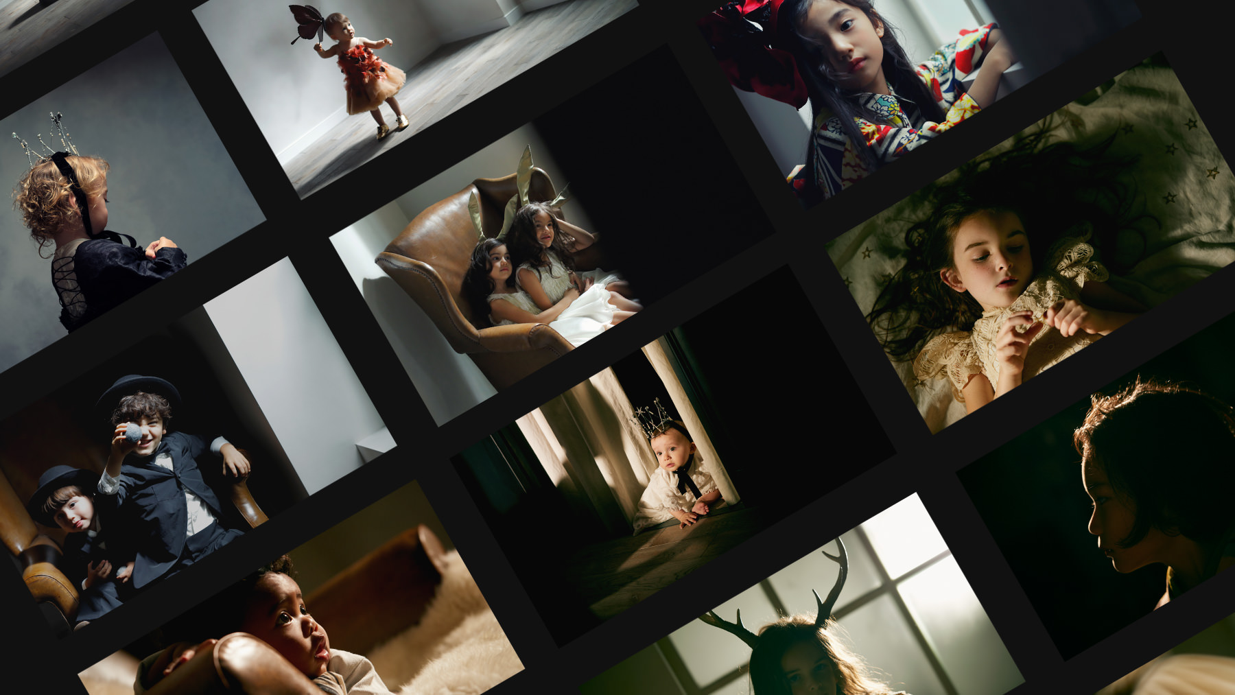
The quality of STUDIO MARLMARL that distinguishes it from others
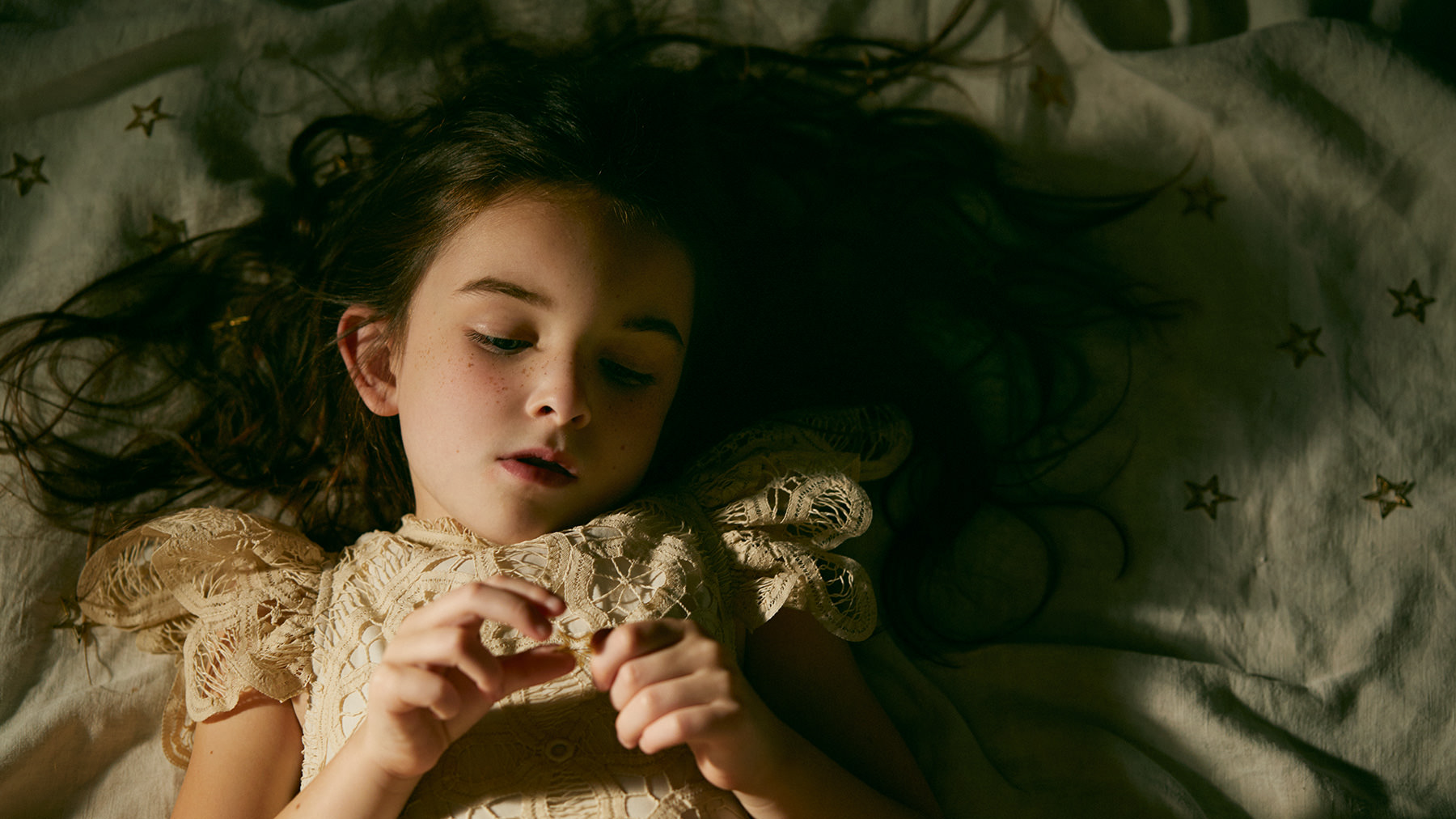
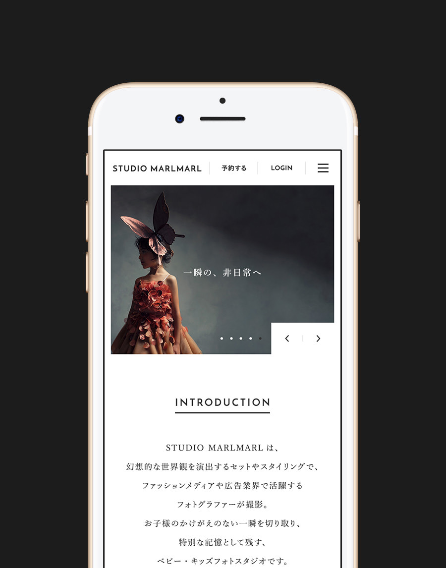
YOM’s corporate philosophy is “to make parenting exciting!”. STUDIO MARLMARL, in addition to services such as hair, makeup, and styling, provides an experience uniquely different from mainstream photo studios. At the discretion of professional photographers and specialists, STUDIO MARLMARL photo sessions are immersed in a unique atmosphere that allows not only children, but parents as well, to enjoy the shared bonding experience of capturing precious moments in photos. In order to properly convey these values, we were conscious of creating a message which would directly communicate how the quality of their work stands out against the rest. In addition, we were also very careful to design an effective UI which would streamline and simplify the online reservation process.
To make the service stand out, while prioritizing ease of use
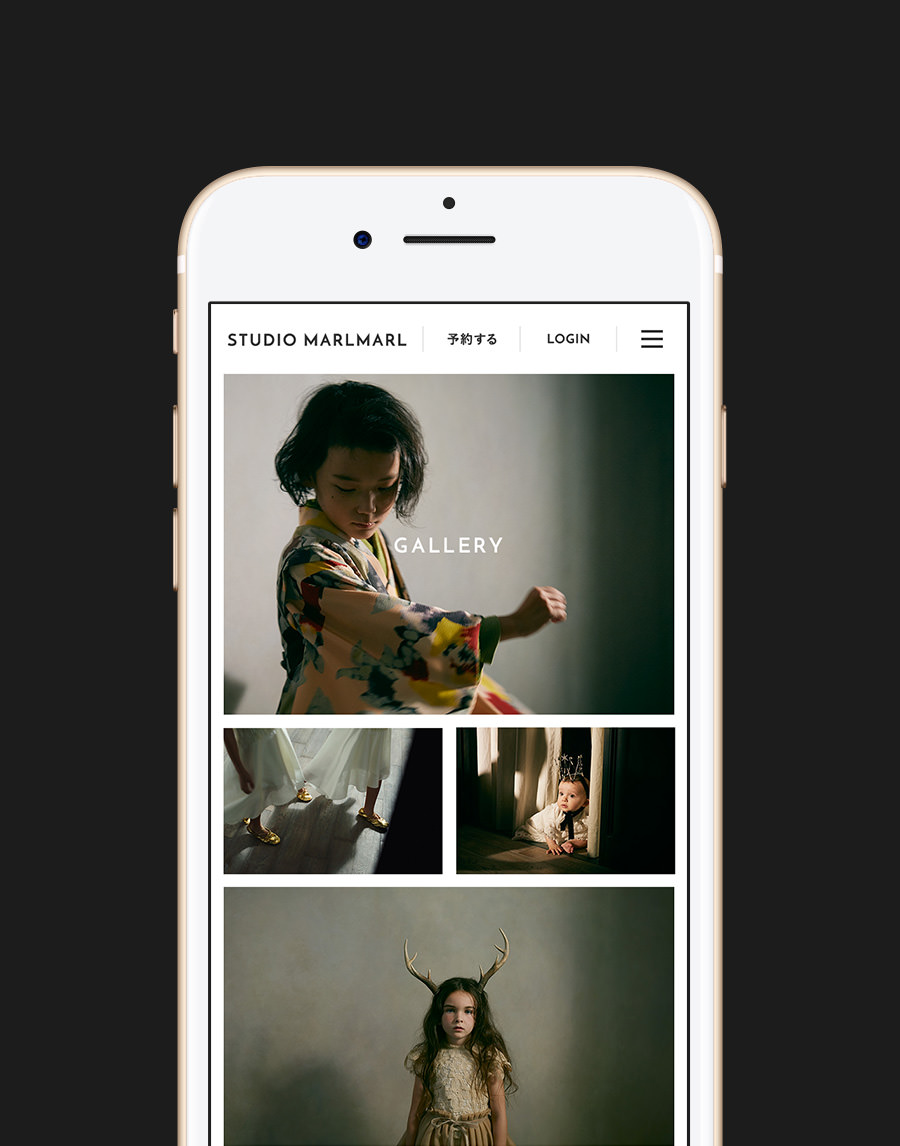
Because we were aware from the beginning that the clothing chosen for children’s photo shoots is unique and special to the customer, our team chose to keep a simple design and an easy-to-understand UI which wouldn’t conflict with the customer’s vision of what they wanted. We used large photo panels and pared down our design to a very minimal aesthetic to place more focus on the quality and finish of the photos.
Every photo studio needs a reservation form, but it can get complicated because of the various details the studio needs to know beforehand, such as number of people or clothing choices. To make the process feel less complicated and long, we carefully arranged the informational text and motion graphics, to maximize the intuitiveness of the UI. We included visuals of the finished framed photos decorating homes, so customers can see not just the photos, but imagine how their photos would look like inside their own homes.
Bringing together both sides into one team
By participating in the project from the early stages of developing the new photoshoot service, our team was able to execute a successful project with precision and accuracy, by communicating between what the client envisioned for their service and how monopo would translate those values through intuitive UI and creative design.
By allowing fluid communication between the photo studio’s cameramen, stylists, production managers and the monopo team, both sides were consistently engaged with each other throughout the production process, and it is this teamwork which has allowed us to pursue and create a service of high quality.
CREDITS
- CLIENT
- YOM
- ROLE
- UX/UI Design, Web Art Direction, Web Development, Print Design
- THE TEAM
-
Producer + Developer + Project Manager
Kenta Takahashimonopo TokyoArt Director + Web Designer + Shooting Director + Exterior Designer
Takayuki Yokoyamamonopo TokyoUI/UX Designer + Front-end Developer
Tsubasa Kamiokamonopo TokyoCopywriter
Tomoki Inagumamonopo TokyoDesigner
Mélanie Hubertmonopo TokyoDesigner
Lessa Chungmonopo TokyoBack-end Developer
Jolly Gene Inc.Front-end Developer
Office Nagase


