- 日本語
- EN
Cellular Agriculture Society Website Redesign
- ROLE
- Creative Direction, Art Direction, Strategy, Web Design, Copywriting, Development
- DELIVERABLE
- Website Redesign, Development
- DATE
- Sep 2020
CAS (the Cellular Agriculture Society) is an international non-profit founded to advance cellular agriculture, the process of creating animal products from cells rather than animals. In their quest to grow widespread understanding of cellular agriculture, CAS wanted to redesign cellag.org to become a global hub on the subject. monopo was tasked with building a truly engaging entry point for people that are new to cellular agriculture.
Open people’s minds to a future they hadn’t imagined before
Cellular agriculture has the potential to solve a lot of the world’s biggest problems. From the environmental pressures created by factory farming to the health risks of current food mass production, cellular agriculture can move the world forward without the need for mass behaviour change. Without much knowledge on the subject however, some people feel sceptical about the idea. It can seem too good to be true. Our challenge was to help people imagine what a future with cellular agriculture could look like and help them understand the science that makes it possible. The website had to match the level of innovation and craft of the industry it represents, while remaining simple, accessible and optimistic.
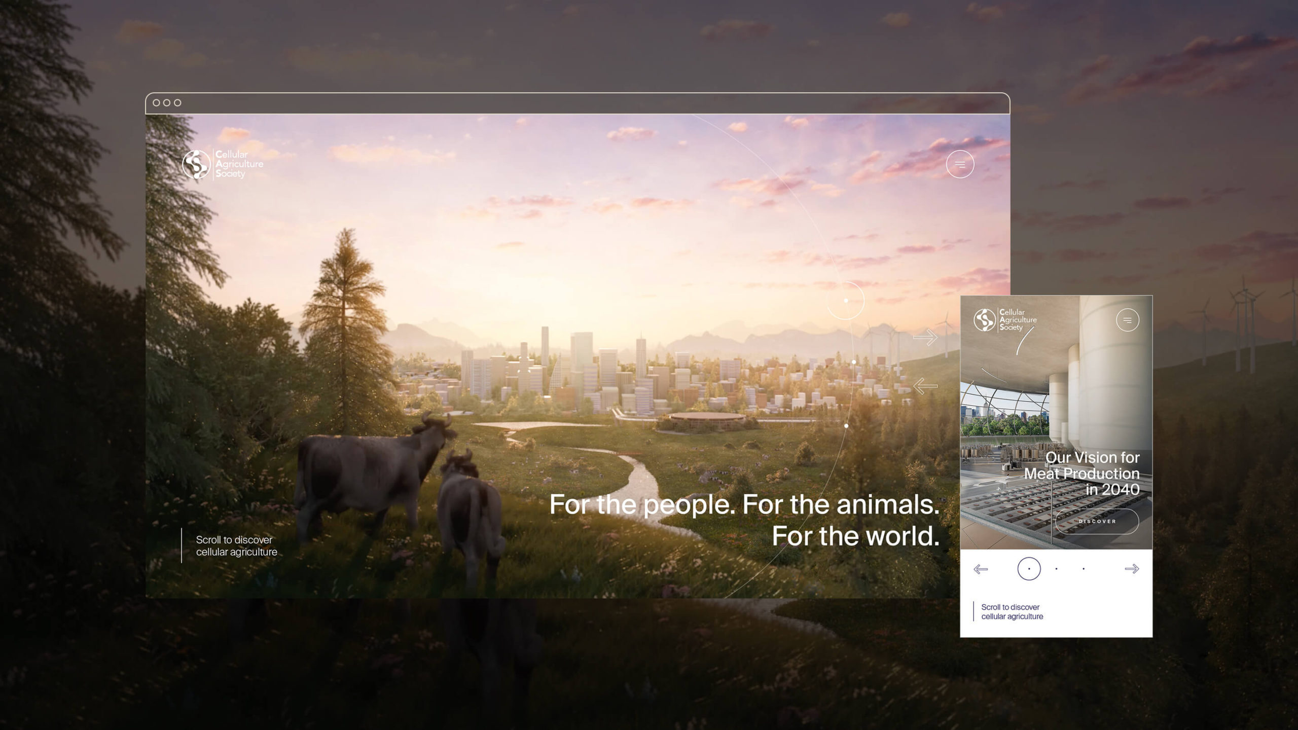
An optimistic vision for the future
Cellular Agriculture starts from a deep respect and understanding of nature’s magic. CAS isn’t in it for the science alone. We don’t fetishize petri dishes and labs. Nor is CAS naive about the realities of this planet and the human behaviour that shapes it. The art direction had to get the nuance right. It should feel visionary without becoming alienating. Optimistic without being naive. Powerful without looking threatening. Smart without looking artificial.
We reduced the colour palette to a combination of pure white, dark blue and several hues of gold, to reflect optimism, innovation and sophistication. The sans-serif font Suisse International adds an extra level of refinement and reassurance.
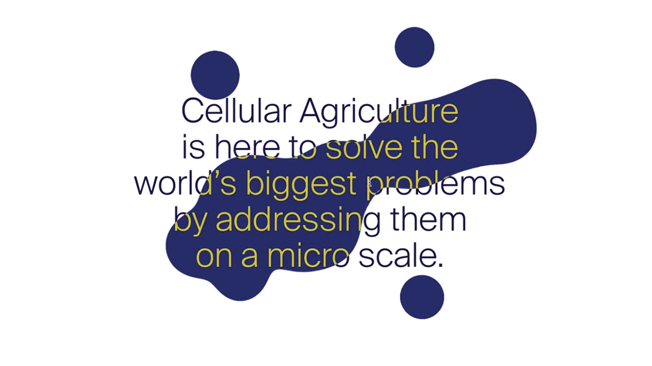
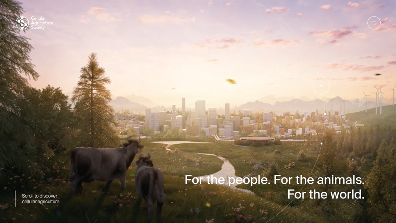
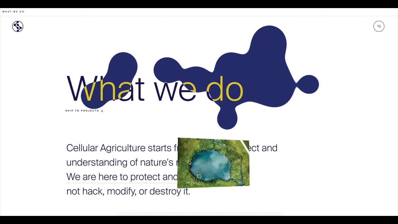
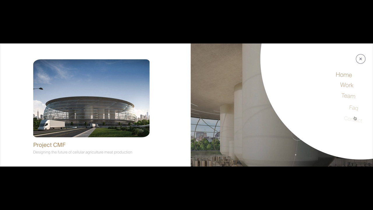
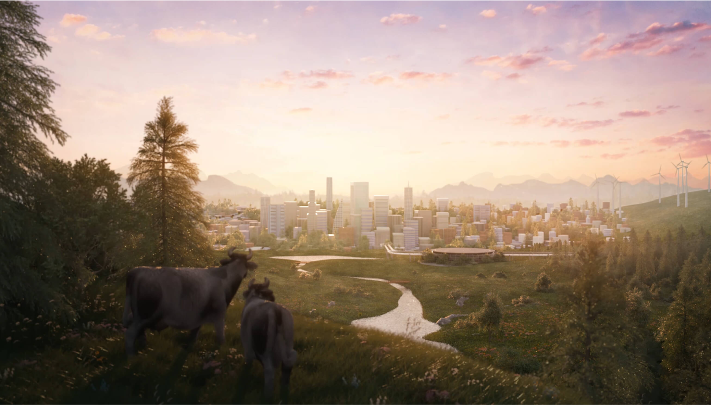
The paired-back colour palette was supported by strong graphic elements. The hero element is definitely the abstract cell shape which we see in different guises across the website. From strong animated header to preloader to animation between page transitions. The cell shape is both organic and scientific. Another strong visual element is the hero animation, created bespoke by WOVE studio to depict a future where people, animals and planet live in harmony.
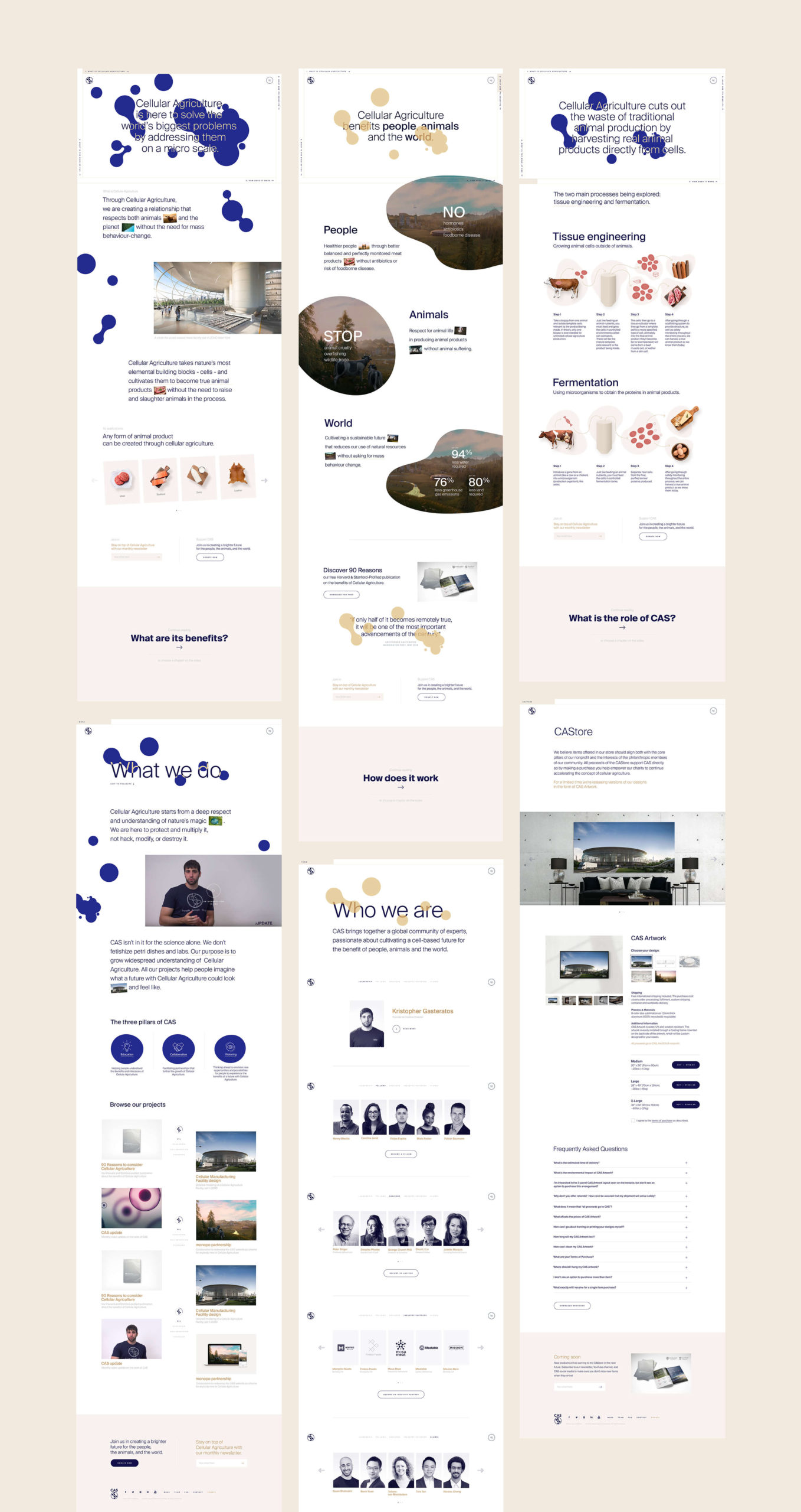
A four-chapter narrative homepage
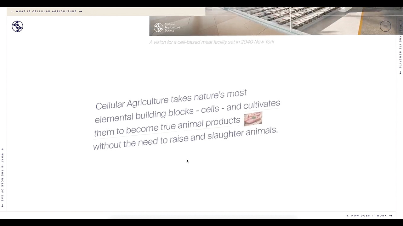
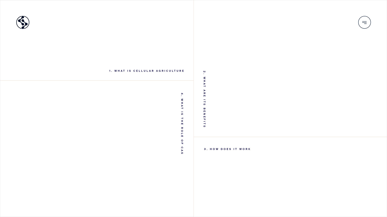
The homepage was designed to work as a one-page introduction to the subject of cellular agriculture and CAS. The perfect introduction for anybody new and interested in the subject. We didn’t want to overwhelm a new audience with an information-dump however. Instead, we created a navigation concept that tells the story of CAS in four simple chapters, capturing people’s attention and holding onto it as they go from chapter to chapter. People can follow the linear narrative or can skip around to the chapter they are most interested in by using the navigation spread across the four edges of the screen. The homepage then leads on to secondary pages that go into more depth on the work CAS has done as an organisation and the team that is working behind the scenes.
Smooth yet playful
We want people to engage with the subject of cellular agriculture. To play with it. A lot of effort went into crafting the interactivity of the different elements. Every interaction had to be crafted to leave people with a positive and innovative memory of cellular agriculture. Most pages start with a webGL render of cells that move subtly and interact with the mouse on hover. A similar level of interactivity is found across the website, with pictures moving on a 3D axis on hover and menu buttons magnetically sticking to the pointer. To add an extra level of polish, the transitions and appearance of elements were crafted to be extra soft and smooth.
One of the challenges with this build was to keep animations and transitions as unique and impactful as possible, while keeping the overall browsing experience smooth, light and reliable. The constant optimization of the WebGL part allowed us to reach satisfaction across all devices - even those with fairly low specs. While working on a WordPress build, the customization of the fields alongside the bespoke theme created exclusively for CAS both make for a great and simplistic way to experience the website on both sides.
Collective creativity across borders and client/agency relations
This project has been a cross-border labour of love between three different parties: CAS in San Francisco USA, monopo London in the UK (creative/art direction + design) and monopo Tokyo in Japan (digital development). Typically a tricky set of timezones to bring together, but a unique collaboration that enabled us to produce a website that could only be born out of these three very different perspectives coming together.
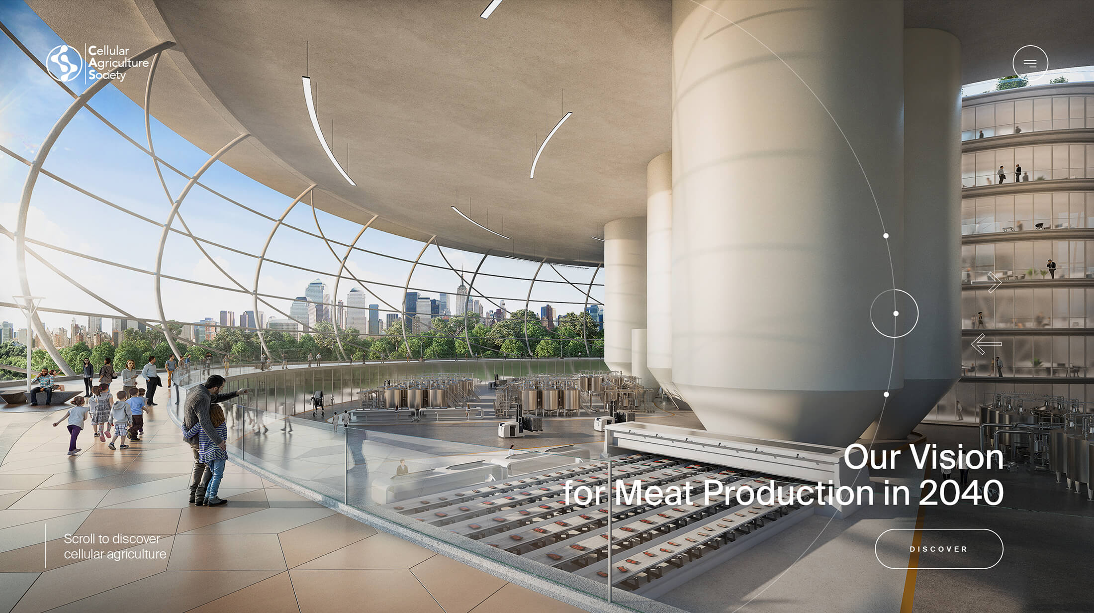
Project CMF - Main Interior
CREDITS
- CLIENT
- CELLULAR AGRICULTURE SOCIETY (CAS)
- ROLE
- Creative Direction, Art Direction, Strategy, Web Design, Copywriting, Development
- THE TEAM
-
Creative Direction / Art Direction
Melanie Hubert-Crozetmonopo LondonGraphic / Web Design
Melanie Hubert-Crozetmonopo LondonGraphic / Web Design
Mai Takanomonopo LondonStrategy / Account Management / Copywriting
Mattijs Devroedtmonopo LondonFront-end Development
Ryo Miyakawamonopo TokyoFront-end Development
Taisei Dofukumonopo TokyoBack-end Development
Kenta Takahashimonopo TokyoProducer
Kenta Takahashimonopo TokyoProducer
Fred Mouniguetmonopo LondonTechnical Direction
Kenta Takahashimonopo TokyoTechnical Direction
Shun Okadamonopo TokyoConcept Direction
Kristopher Gasteratos (CAS)Hero Visual Animation
WOVE studioVideo Production
Luminary visuals, Tim Hawk3D Artwork
Mihai Lacubovschi


