- 日本語
- EN
COMP Rebranding
- ROLE
- Branding, Art Direction, UX/UI Design, Planning, Development
- DELIVERABLE
- Logo, Package Design, Responsive Website
- DATE
- Feb 2018
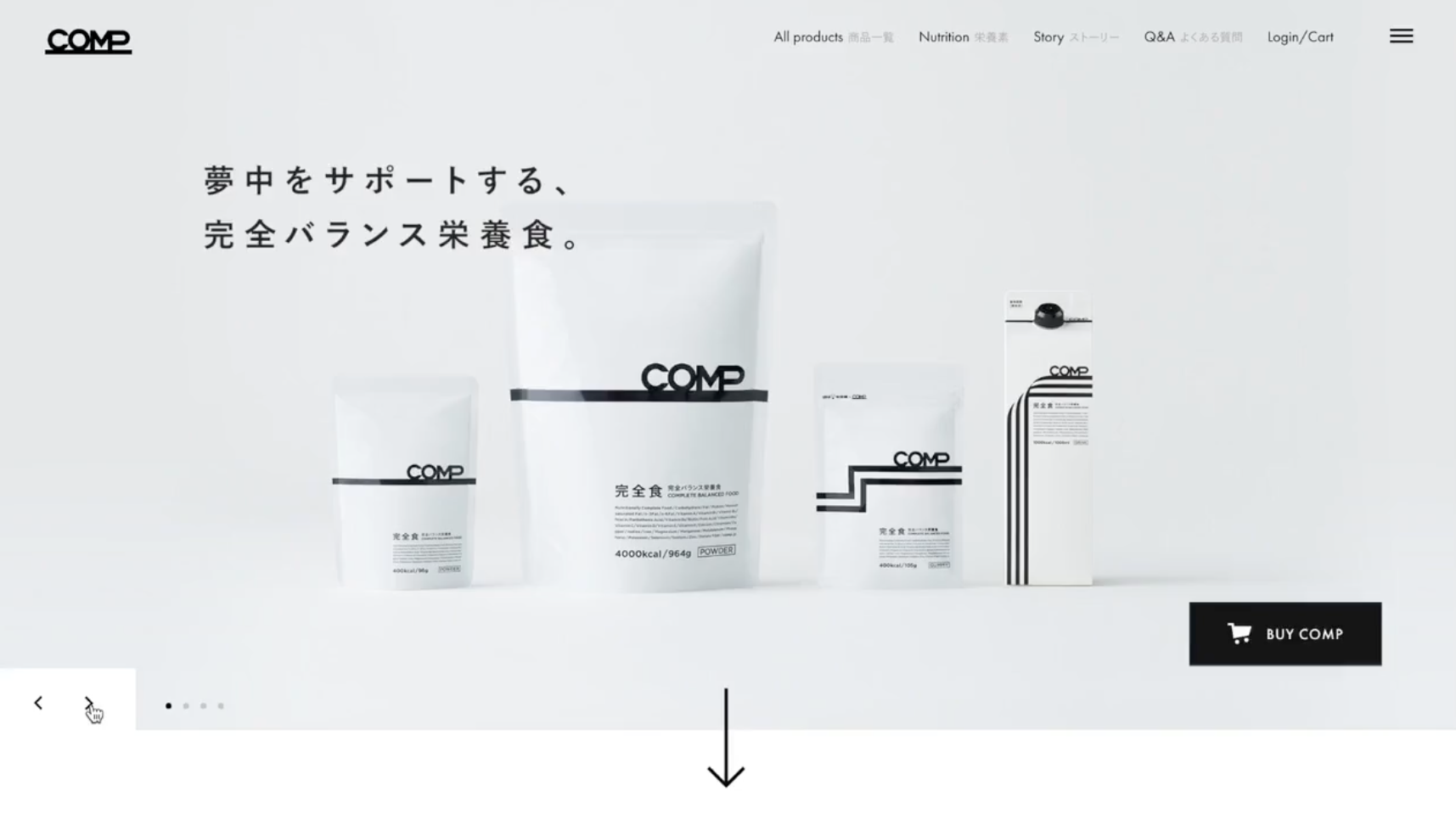
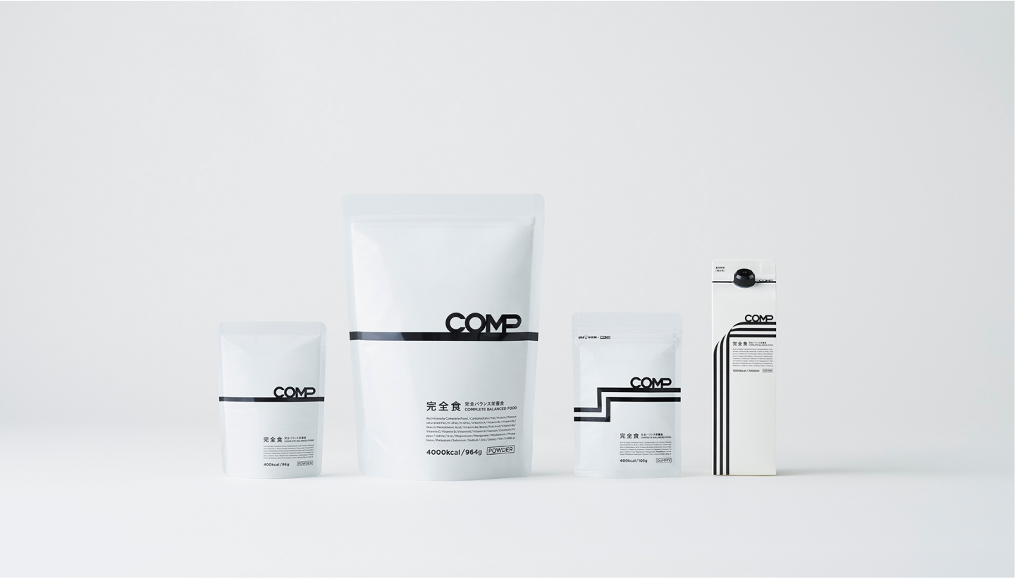
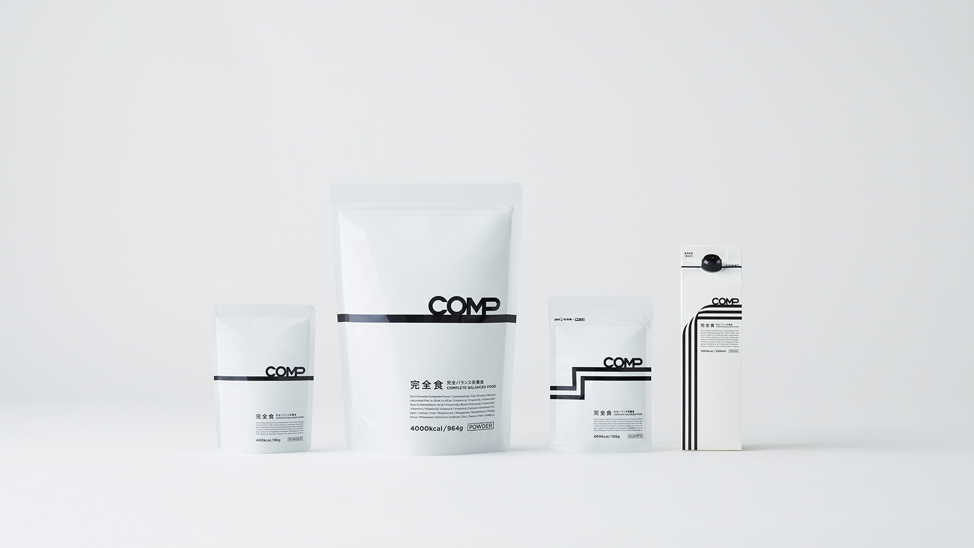
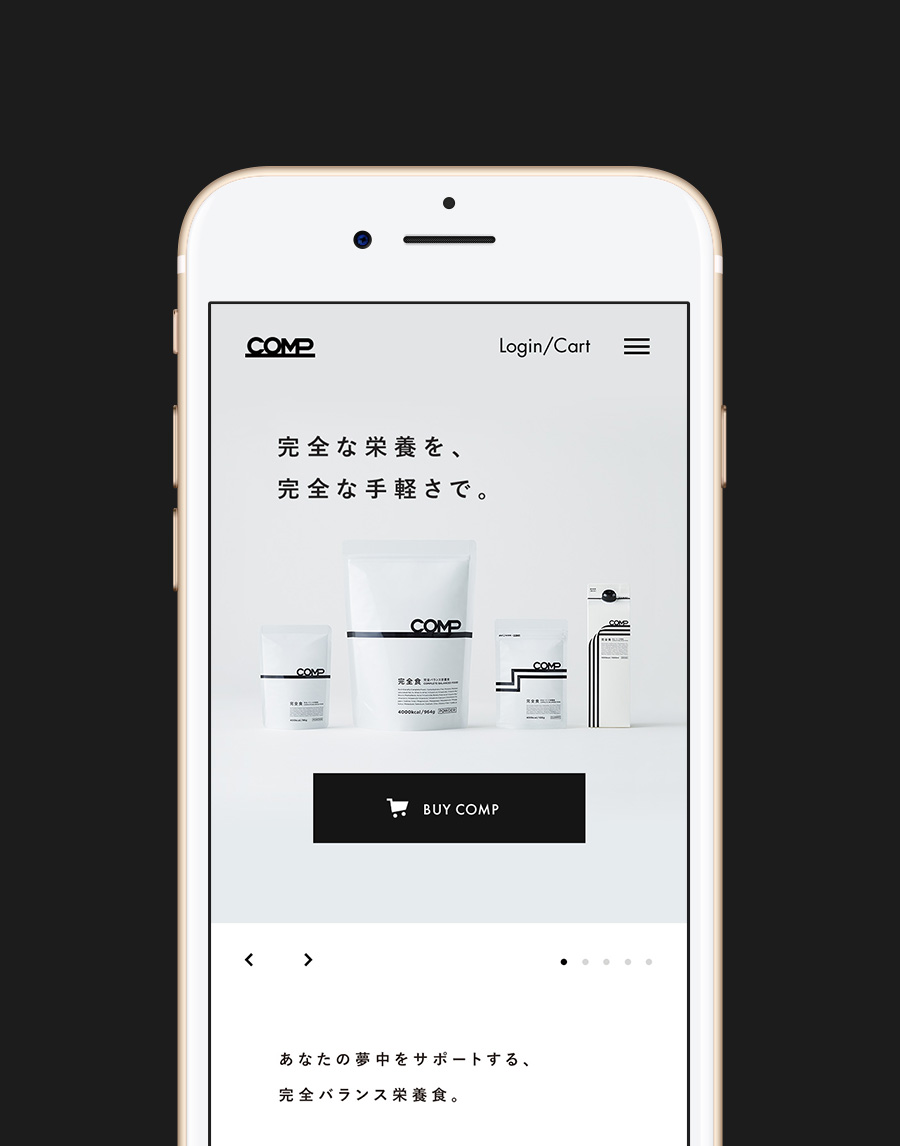
monopo Tokyo did a full rebranding project for COMP, a company based in Japan proposing a complete balance food nutrition product. We renewed their CI/ VI/ BI by developing a new concept, designing all the products packaging, creating a website and brand movies under the slogan "Completely obsessed ".
Branding as a management strategy
What COMP proposes is a product that contains all of the necessary nutrients for human bodies in one item called “complete balanced food”.
We were contacted by COMP in Spring 2017 about a rebranding project. The brand was becoming more and more popular gathering a cluster of creaters (mainly engineers and gamers) and a core community on Twitter. This was the base of the new branding strategy: to expand the community out of an already well-established community in order to become a major brand. Yuta Suzuki, COMP’s CEO, and Yoshi, monopo’s CEO, had several meetings to discuss the definition and the new direction of the brand strategy including long-term marketing perspectives, management strategy and PR development strategy.
“Why?”, functional and emotional significance of the product
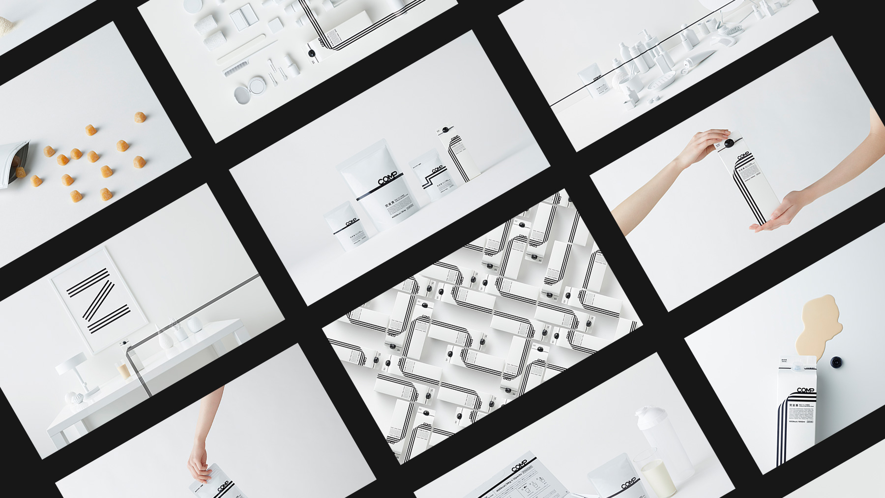
The creative team made a concept proposition with a more philosophical direction. Indeed, not only focused on the functional appeal, they wanted to highlight the emotional significance of the product, the reason why COMP exists for the customers. “Why?” having the biggest potential to make the brand special and unique in the future.
To do so, the creative director Tatsuya Ishikawa created a brand new concept “完全に夢中” (Perfectly obsessed), COMP expressing the tought of feeling supportive to the people absorbed into work and hobbies by providing them easy and complete balanced nutritional products. [In Japan, busy people often eat on the go and unhealthy food such as Cup-ramen or convenience store food… in front of their working desk.] COMP not only supports body health but also mind health of whom wants to be more conscious about their alimentation.
The COMP LINE
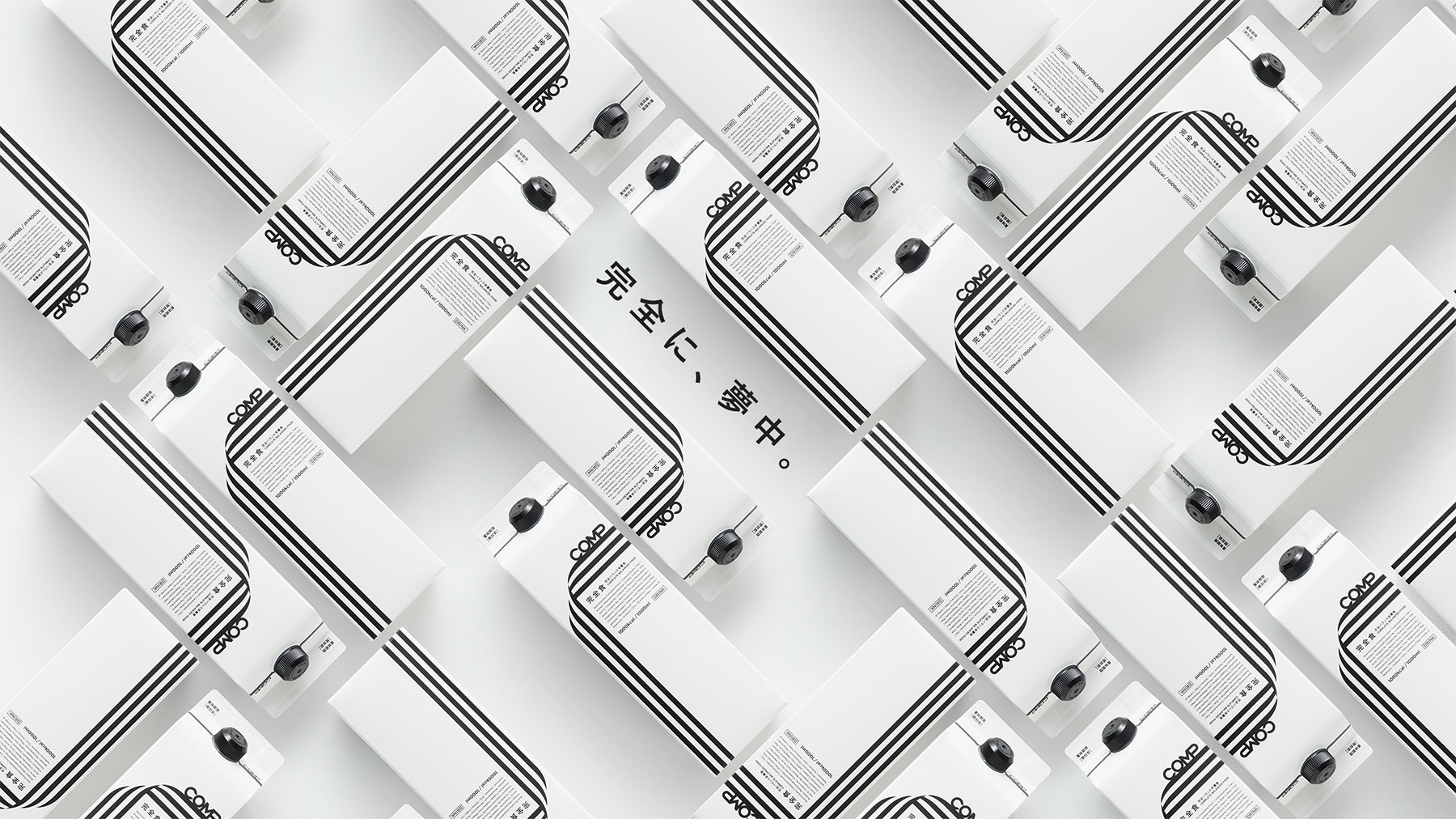
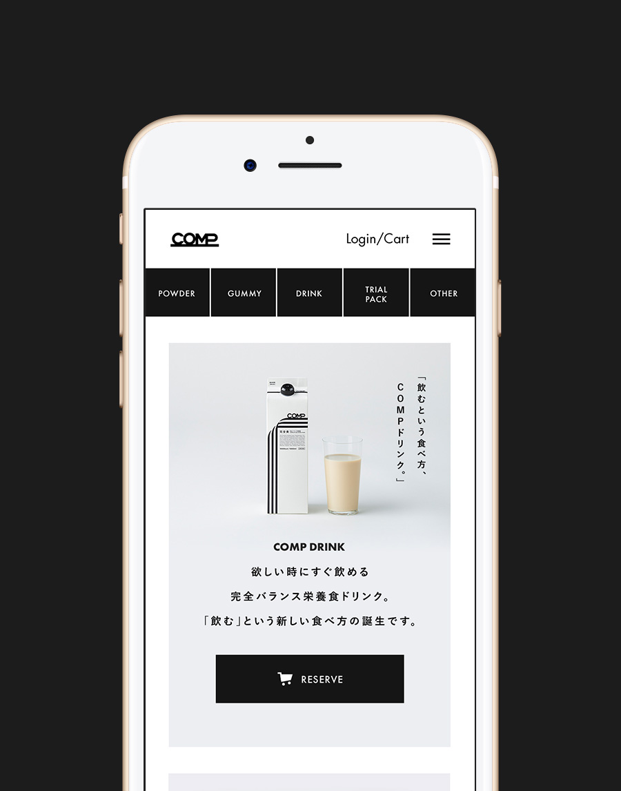
Based on this concept, Hami Matsunaga, an Art director developed ”COMP LINE”, a new visual identity based on two elements composing the brand. The first one is the function, easy perfect balanced food, and the second one being the emotion, completely into something you love. Both elements were represented with a line, the latter being an icon of perfection, completeness, energy and the idea of always going forward. We deployed the two lines in the COMP powder, gummy and drink packaging design but also in brand visual cuts, films, booklets and website. By designing everything with one very direction, it created a much stronger sense of unity for the brand.


Brand website with an e-commerce experience
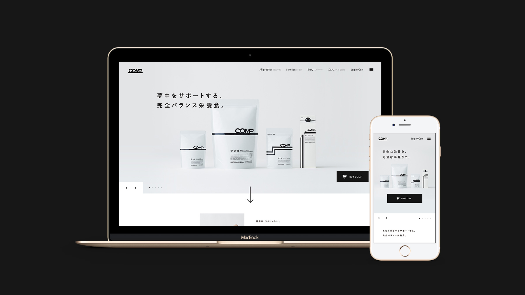
Two types of experience were needed for COMP: brand story and e-commerce. To do so, we developed UX design based on a e-commerce centered experience and then arranged UI design, emphasizing the brand story experience with the concept and the assets we made.
CREDITS
- CLIENT
- COMP
- ROLE
- Branding, Art Direction, UX/UI Design, Planning, Development
- THE TEAM
-
AGENCY
monopo TokyoGeneral Producer
Yoshiyuki Sasakimonopo TokyoCreative Director + Copywriter
Tatsuya Ishikawa (BSPK)Art Director
Miharu Matsunaga (DENTSU INC.)PACKAGE DESIGN
PLUGDesigner
Yoshihiro Yarita, Fuki WatanabeWEBSITE
monopo TokyoProducer + Technical Director
Yoshiyuki Kumemonopo TokyoDigital Art Director
Mélanie Hubertmonopo TokyoUI Designer
Mélanie Hubertmonopo TokyoUI Designer
Takuya Kenmokumonopo TokyoUI Designer
Takeshi YasuraUX Designer
Yoshiyuki Kumemonopo TokyoUX Designer
Takeshi YasuraFront-end Engineer
Shoichiro Kameda (PRMO)Back-end Engineer
Takahiro Hagino (COMP)PR
Midori Sugamamonopo TokyoBRAND STEEL
Photographer
志村賢一 (PAREDE)Producers
里見勇人/谷貝玲 (amana)Retoucher
首藤智恵 (RIZING)Art
SUIBRAND MOVIE
Director
Diogo KalilAnimation
Diogo Kalil, Bruno RonzaniAudio
Mairena (HeyHeyMyMy)Producer
Aline SouzaDirector
Diogo KalilAnimation
Diogo Kalil, Bruno RonzaniAudio
Mairena (HeyHeyMyMy)Producer
Aline Souza


