- 日本語
- EN
NESCAFE Hero Bottle Project Digital Experiences
- ROLE
- Art Direction, UX/UI Design, Web Design, Front-end Developing, Back-end Developing
- DELIVERABLE
- Responsive Website, Illustration, Package Design, Event Visual Assets
- DATE
- Jun 2024
monopo Tokyo provided illustration and art direction for the Nescafé Hero Bottle project. This included creating original label images, developing a label generator, and designing a campaign website for users to create custom labels.
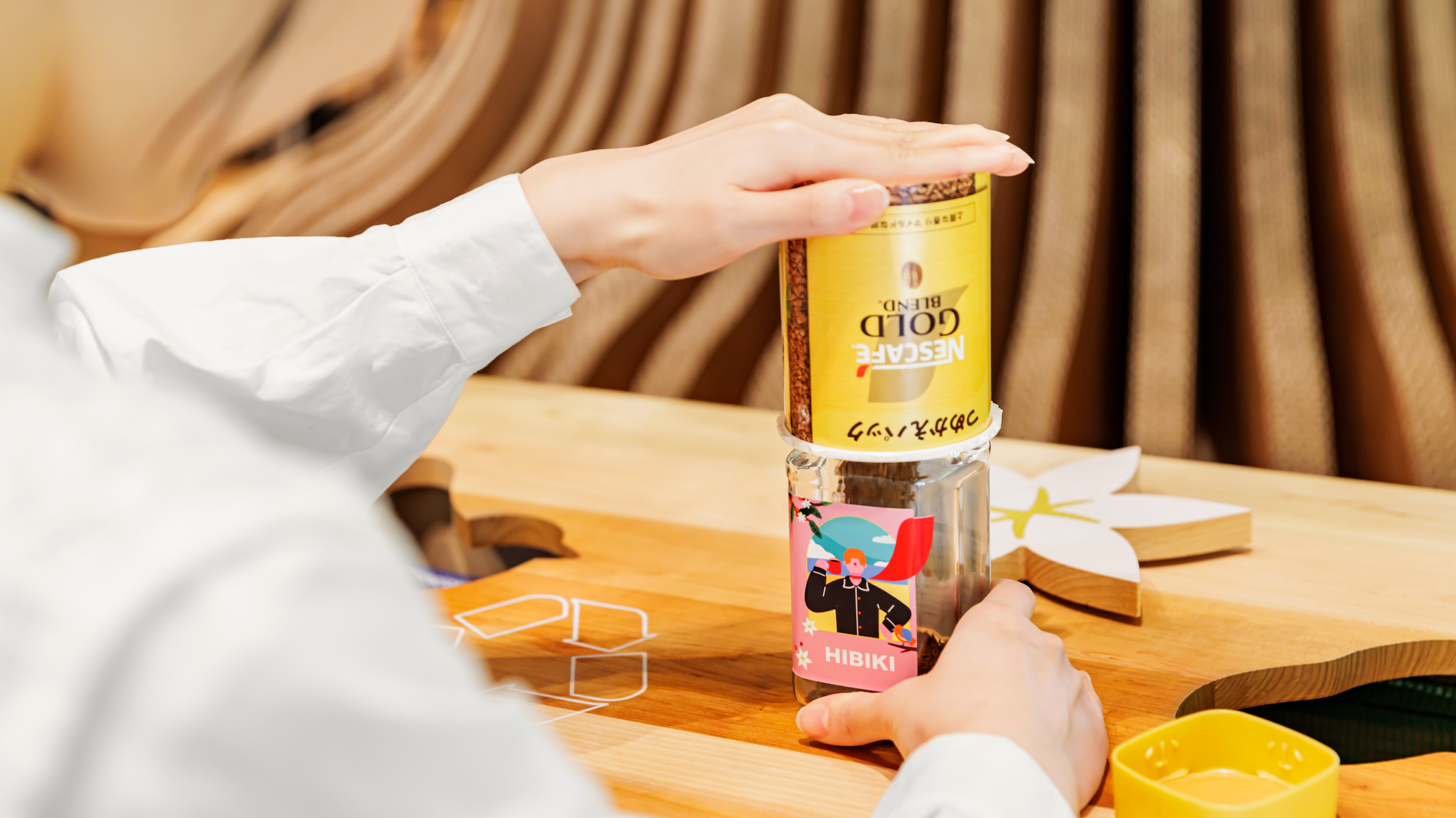
The campaign enables users to effortlessly design a personalized label for a unique "Nescafé" refill bottle featuring their own name, which they can then share on social media platforms.
CLIENT BRIEF
Creation of a campaign to communicate the new Nescafé brand message: “That coffee makes you a little bit of a hero.”
Generation of original labels with illustrations and creation of the campaign website
Design of visual materials for in-store merchandising
OUR PROPOSAL
Guidance through abstract illustrations that easily capture and reflect the user's ideas
Illustration and UI design that ensures both ease of use and number of variations
Image generation system optimized for easy sharing on social media
CONCEPT
You, too, can be a hero—even, for just a little while
The new brand message of Nescafé—a company that focuses on sustainability, is, “That coffee makes you a little bit of a hero.”
The message conveys the company's hope that positive change will spread worldwide as people choose their coffee with the future in mind.
The campaign aimed to show that by creating your own original refill bottle design, you can become a small hero in your own right. The main question we asked ourselves was “What kind of bottles could be made, to showcase the customer as a hero?”
ILLUSTRATION
Your favorite celebrity, your recipient and you can all become heroes
At the start of the project, there was a plan to create an original label using illustrations.
However, the direction was not yet solidified so we began by first proposing various tone and manner options.
Initially, we explored ideas like watercolor aesthetics and an American comic book style inspired by heroes. However, we ultimately opted for a simpler approach with a higher level of abstraction.
We assumed users would create characters for themselves, or as gifts, or their favorite characters. By keeping the design simple and not overly descriptive, we made it easier to reflect the selected image of the person.
Ultimately, we collaborated with motion graphic creator moi., to design numerous components.
We finalized the illustration components after evaluating them from multiple angles. Our considerations included: which poses would appear heroic, how much background to include without overshadowing the subject, the optimal number of parts to prepare, and the ideal shape and size for placement on the actual bottle.
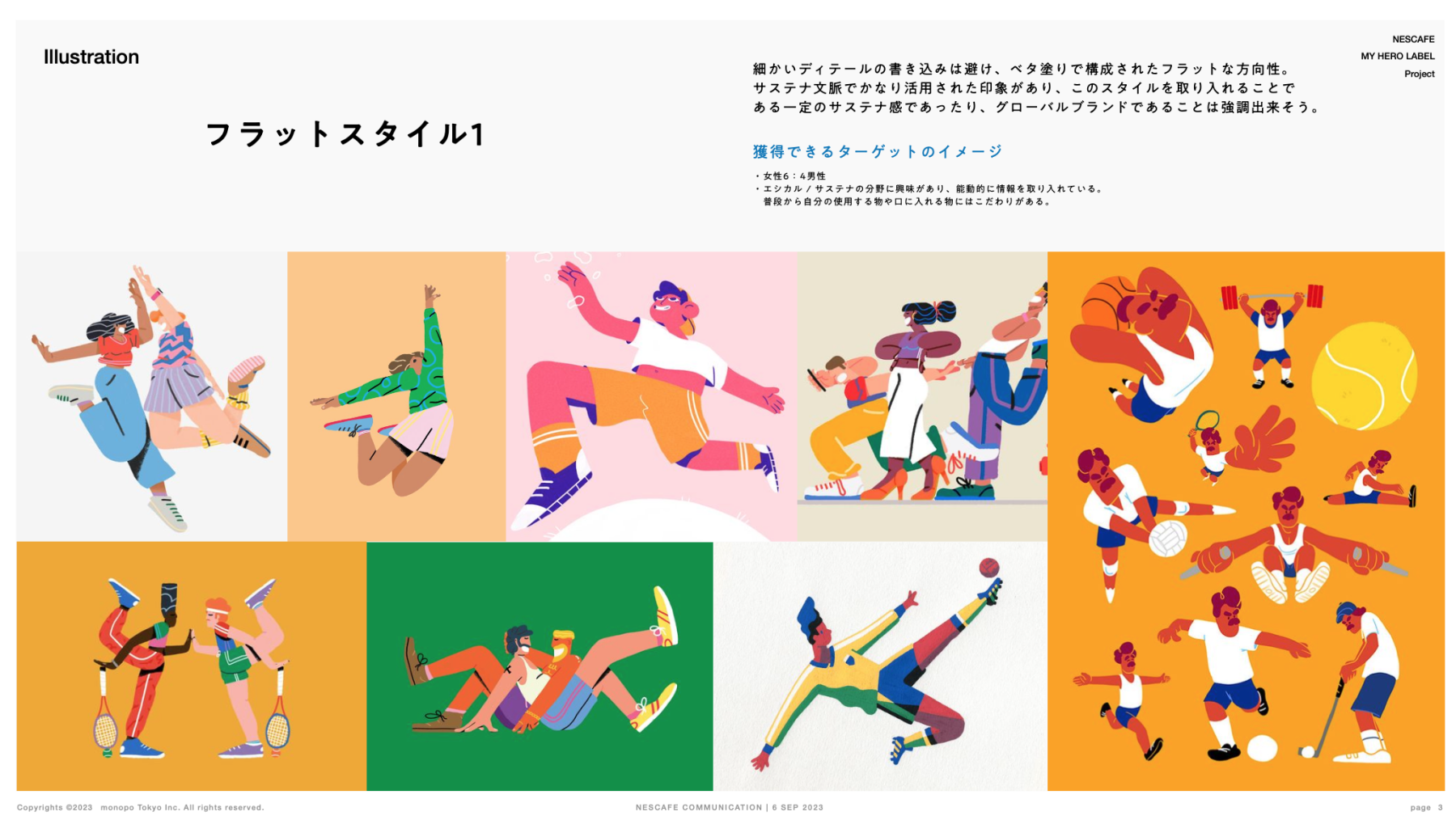
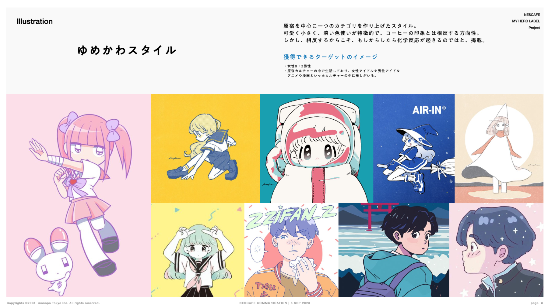
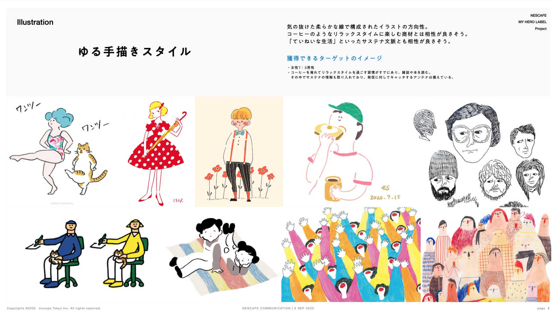
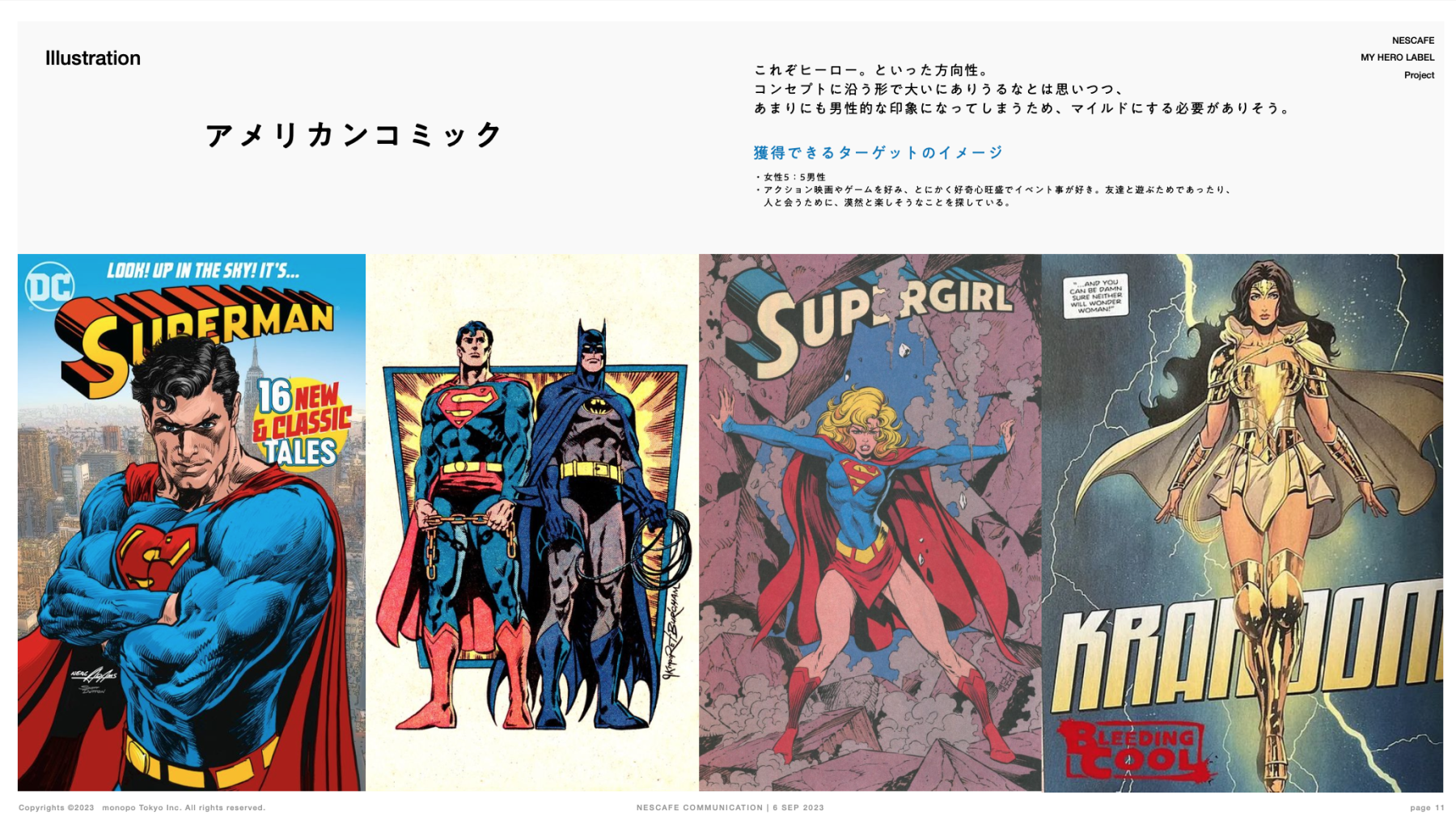
The image board from the initial proposal materials demonstrates how the project has evolved and paired down from various worlds.
GENERATOR
In total, there are more than 1,990,000 combinations of illustrations!
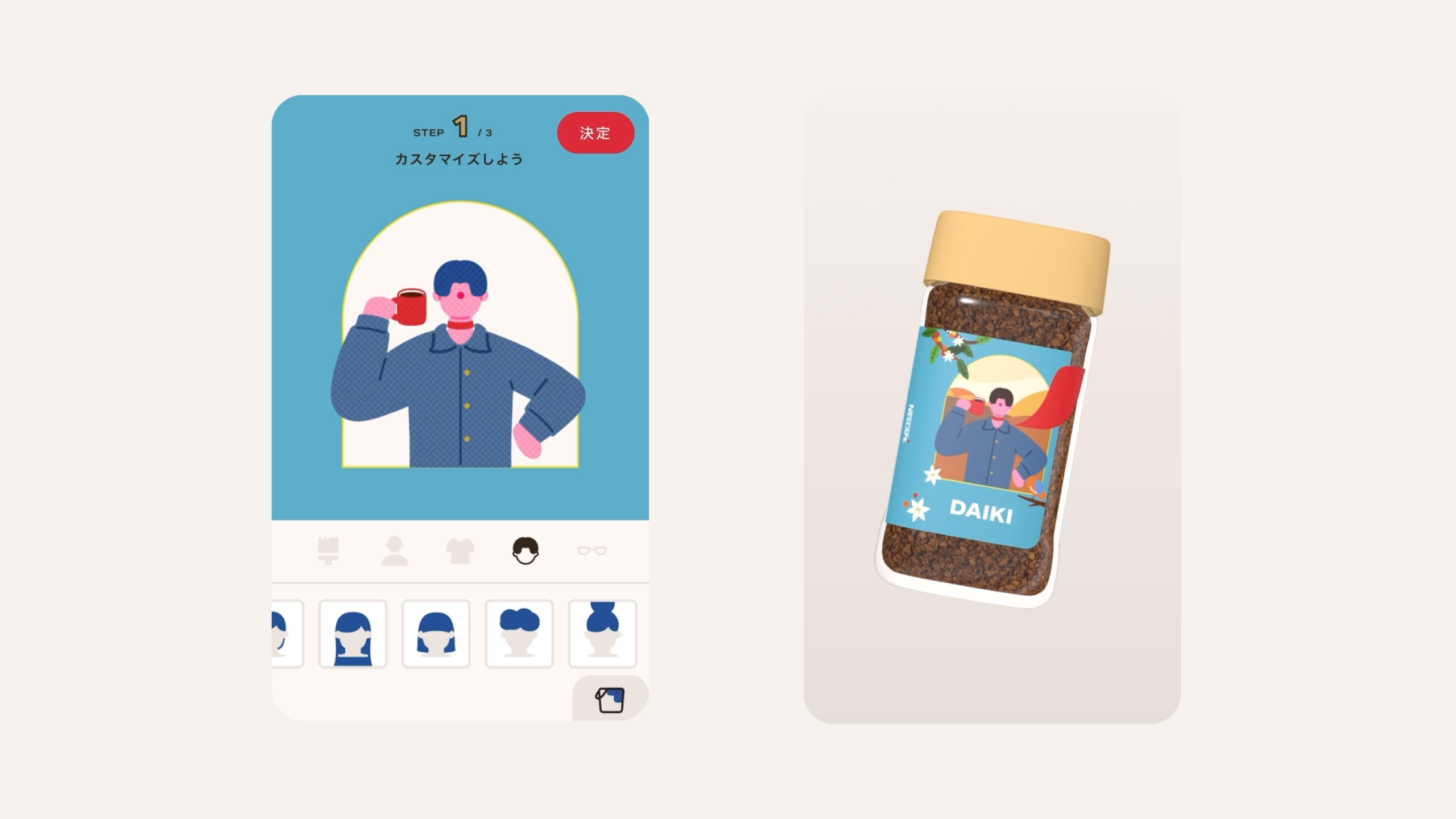
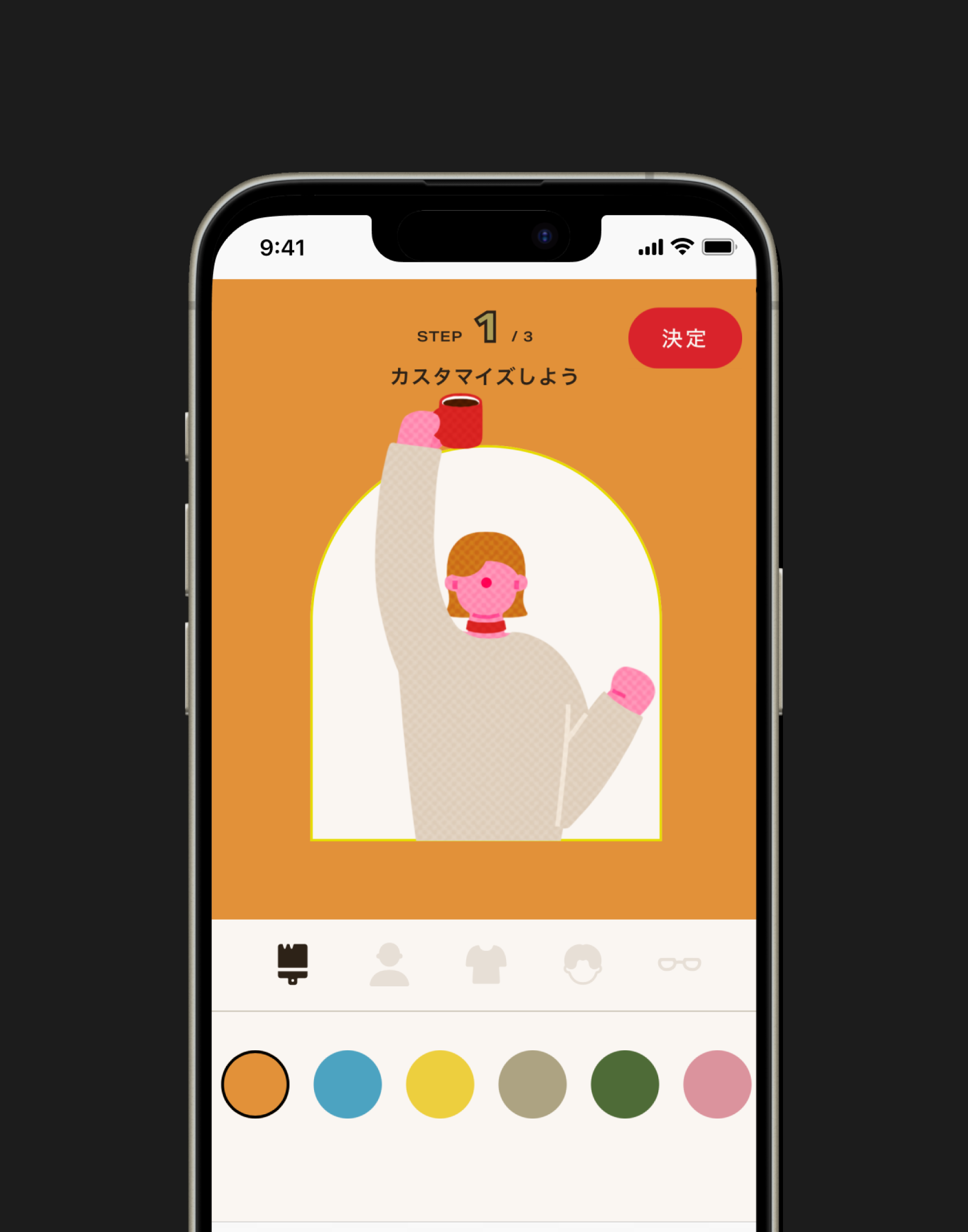
After evaluating the website's UI for generating illustrations, we determined that about eight variations per part could fit in a single scroll. This approach resulted in over 1,990,000 possible combinations. However, too many options and generation steps could discourage user participation. To create a sense of randomness, we added some behind-the-scenes rules to the background elements. We designed the game to be easily replayable, encouraging users to try again and again.
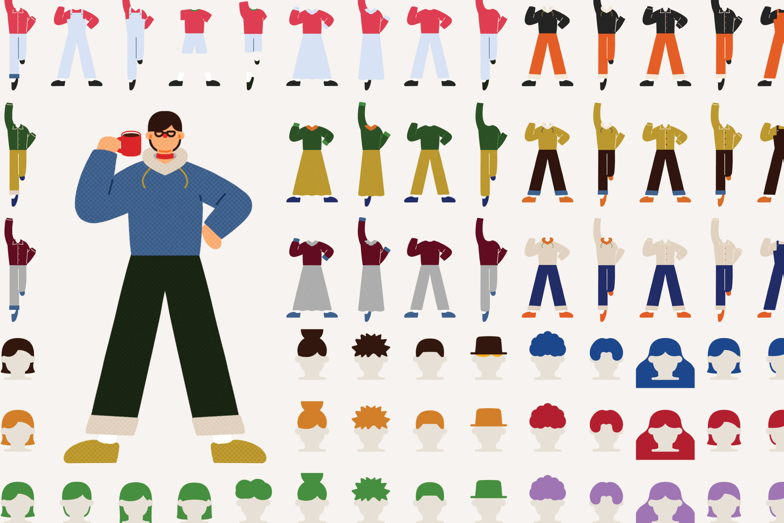
Final parts and materials
The website features numerous images of parts including: lightweight designs and animated designs—striking a balance between comfort and excitement in user interaction.
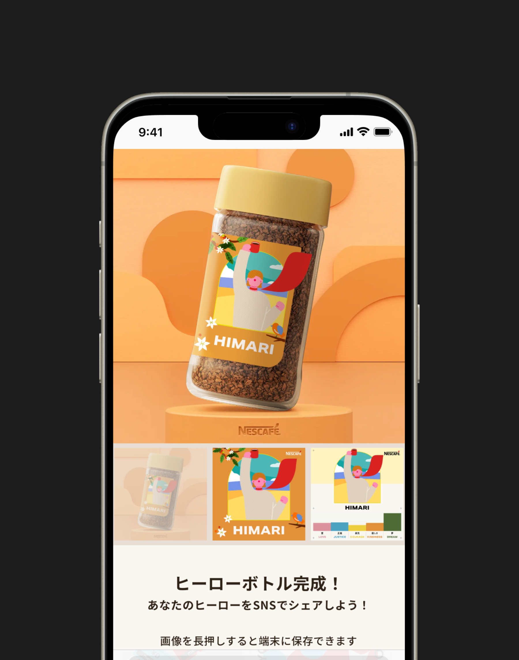
The preview screen showcases a generated illustration as a bottle label. The background uses computer-generated imagery (CGI), while the bottle is an illustration enhanced with shadows and highlights. This combination of layered images creates a realistic appearance.
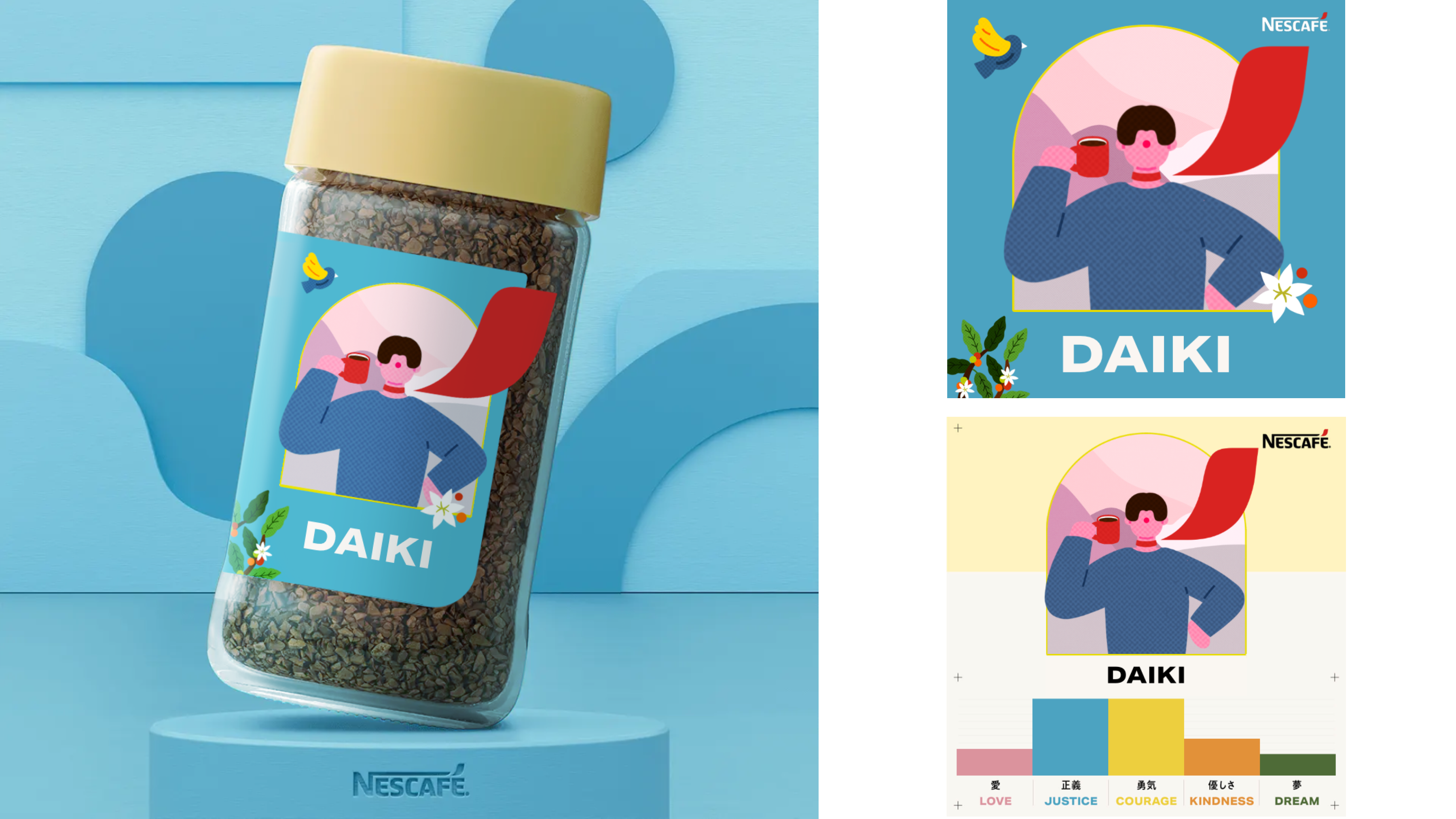
Three distinct types of images were generated. Additionally, a giveaway campaign was conducted to encourage sharing these images on X.
ACTUAL STORE
Bringing the world of illustration into the physical store
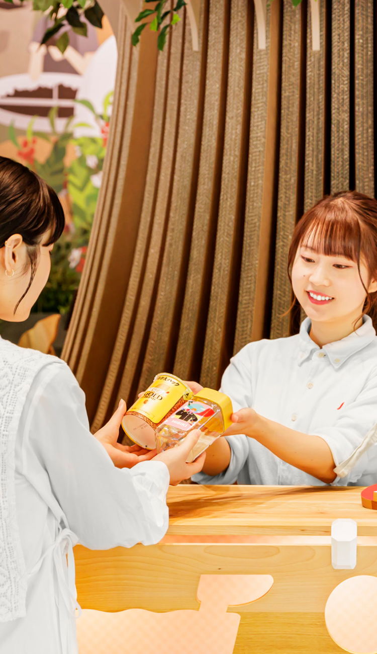
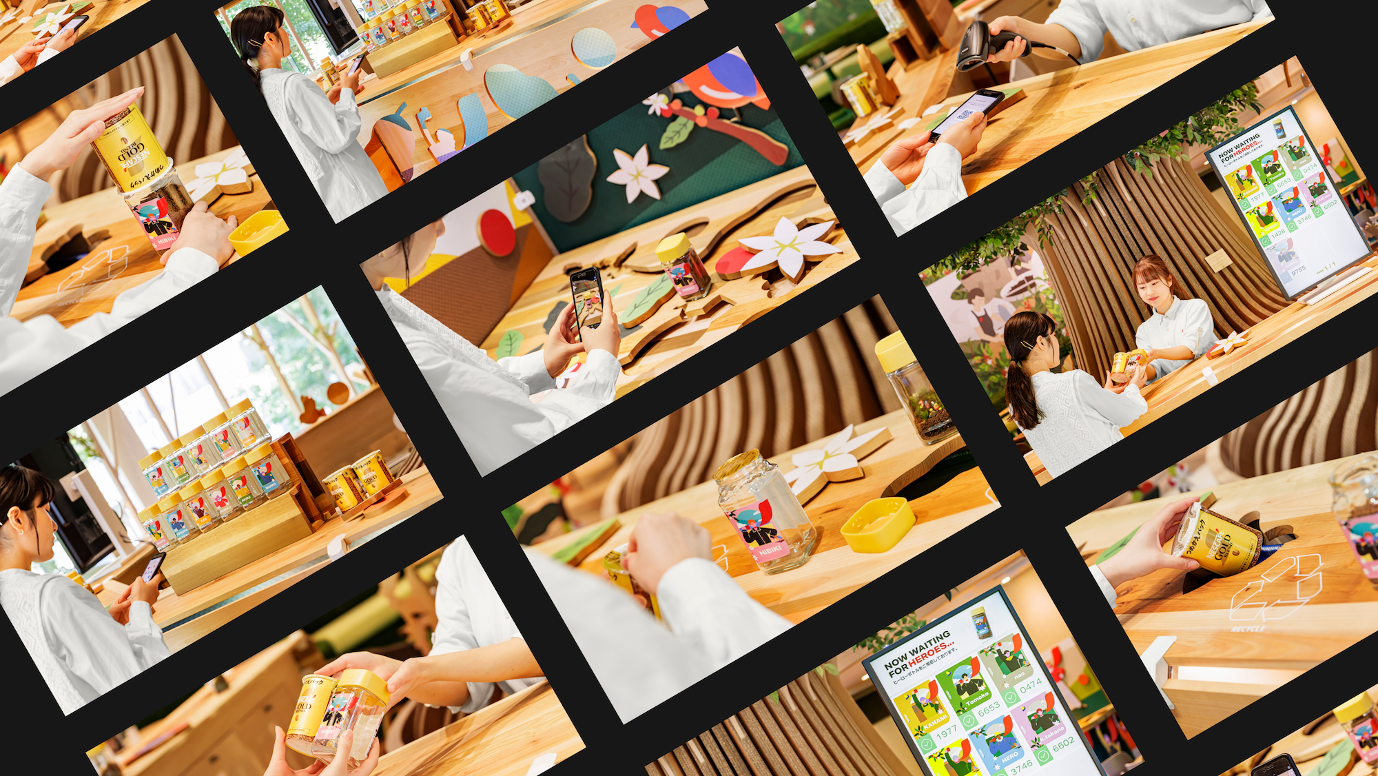
"Nescafé Harajuku" ran from June 28 (Friday) to September 1 (Sunday), 2024. Special pop-up stores opened at supermarkets and event spaces nationwide, where customers could design, obtain, and take home their personalized bottles.
monopo also directed and produced visual materials for the stores, including signage and storefront decorations.
To print the actual labels in the store, we generated different color data for monitor display and printing. We then conducted repeated color proofing to ensure the colors remained consistent when printed by guests.The system automatically generates parameters based on the elements chosen during the illustration creation process.
The hero “status”—LOVE, JUSTICE, COURAGE, KINDNESS, and DREAM—are also printed on the back of the bottle. This clever design allows people to compare these qualities with the portrait they create, which also added an enjoyable interactive element.
CREDITS
- CLIENT
- Nestlé Japan Ltd.
- ROLE
- Art Direction, UX/UI Design, Web Design, Front-end Developing, Back-end Developing
- THE TEAM
-
#Agency / PR Planning
株式会社電通Production / Experience Design
Project Director / Producer
Rumiko Nango (Bascule)Planner
Mayumi Sato (Bascule)Technical Director
Yoshikazu Iida (Bascule)Back-End Engineer
Kosuke Nojima (Bascule)Web Production
Creative Planner
Ryo Miyakawamonopo TokyoLead Designer
Takuya Kenmokumonopo TokyoDesigner
Kanae FukushimaCG Designer
SUNJUNJIE, Shun YazawaIllustrator
moi.Web Producer
Daiki Teraimonopo TokyoFront-End Engineer
Ibrahim Menzel#Venue Design
株式会社 博展


