- 日本語
- EN
ISETAN Leaf & ISETAN Seed
- ROLE
- Strategic Planning, Art Direction, Copywriting, Logo Design
- DELIVERABLE
- Concept and Strategy, Copywriting, Logo, Photo
- DATE
- Sep 2020
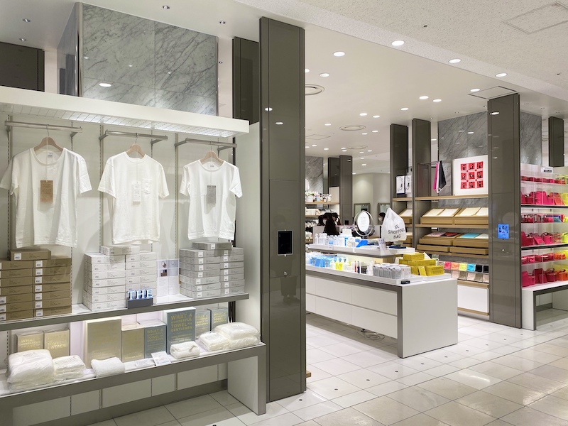
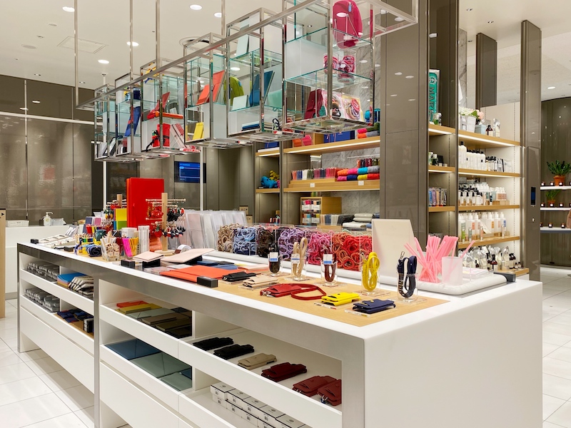
The Isetan Shinjuku store is remodeling the women’s merchandise area and opening a new promotional space on the 1st floor of the main building. It will be the “ISETAN Leaf Seasonal index” and a concept shop called “ISETAN Seed – Daily index”.
monopo Tokyo is responsible for the communication, concept design, catch copy, naming and logo graphic.
In recent years, the increase in internet shopping and inexpensive shops has brought into question the relevance of department stores. The size and many varieties of shops in a department store make it difficult for customers to find exactly what they need. On the other hand, we value the hands-on experience that customers get when they shop at an actual store and can interact with the products. In response to our customers’ needs we created this new space in the renovated area of the women’s merchandise section on the first floor of the Shinjuku store. The ISETAN Shinjuku store has brought together a special selection of venders and introduced monthly and seasonal changes in the shopping area. With different ideas and concepts in the two sections each shop incorporates a place that customers and buyers can rely on. At the same time, they serve as a guide for the entire area including the two sections.
The New Shops in the Store Reflect our Customers’ Requests
Some comments we’ve been hearing from our customers include, “The store is so huge I don’t know where things are”, “I can’t find the item I want”, “I don’t want to spend a long time in the store”, etc. We began a conversation focusing on the fact that department stores in general and specifically ISETAN is very large. We began examining the unique issues facing us at ISETAN by looking at the situation from the same vantage point as our customers.
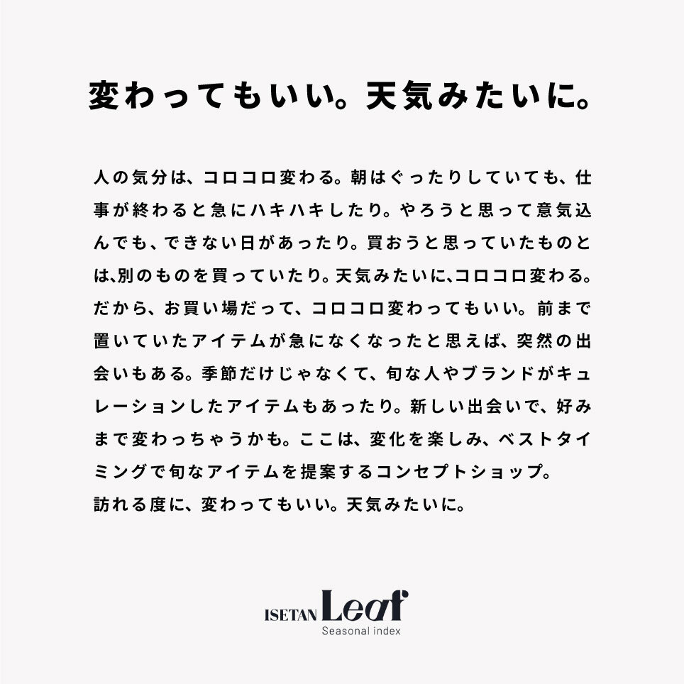
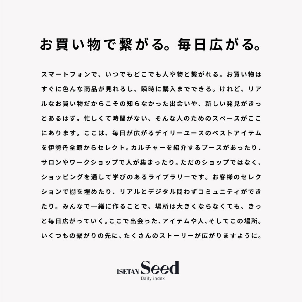
To help connect people we put guide maps in two areas. These two shops in ISETAN Shinjuku help convey the message that a new shopping experience and encounter are here. Like the leaves changing color with the seasons or a seed that holds the potential for the future, ISETAN Shinjuku is like a forest where brand items come together. When the “leaves” of life’s seasons change color, it becomes an occasion to grab a hand full of “seeds” and gather together. That is what gave birth to this shop’s name.
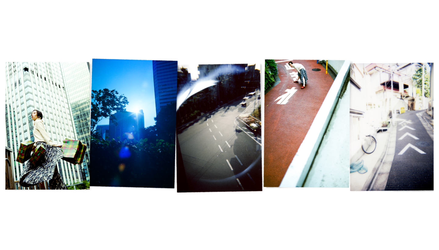
We revisited our mission as a department store and developed our logo design to express a new venture bringing together “challenge” while allowing for “flexibility” to welcome a large volume of customers. The main theme of “Daily Expanding Opportunities” is expressed in the visual photographed by Shun Komiyama.

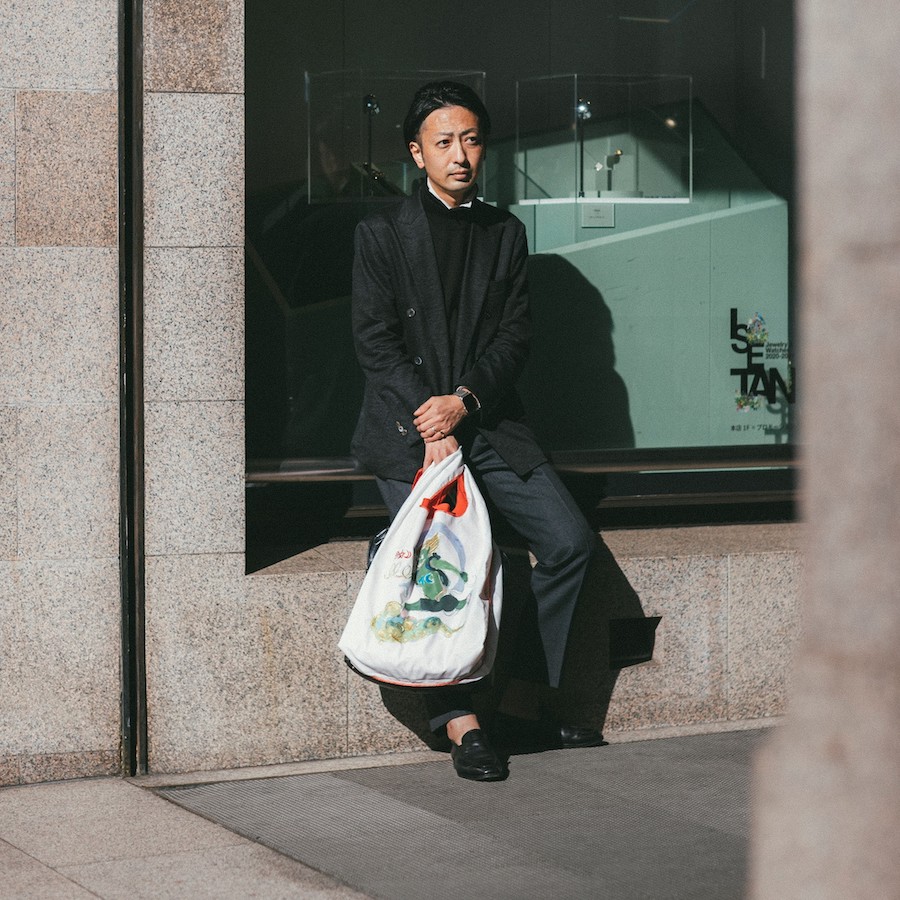
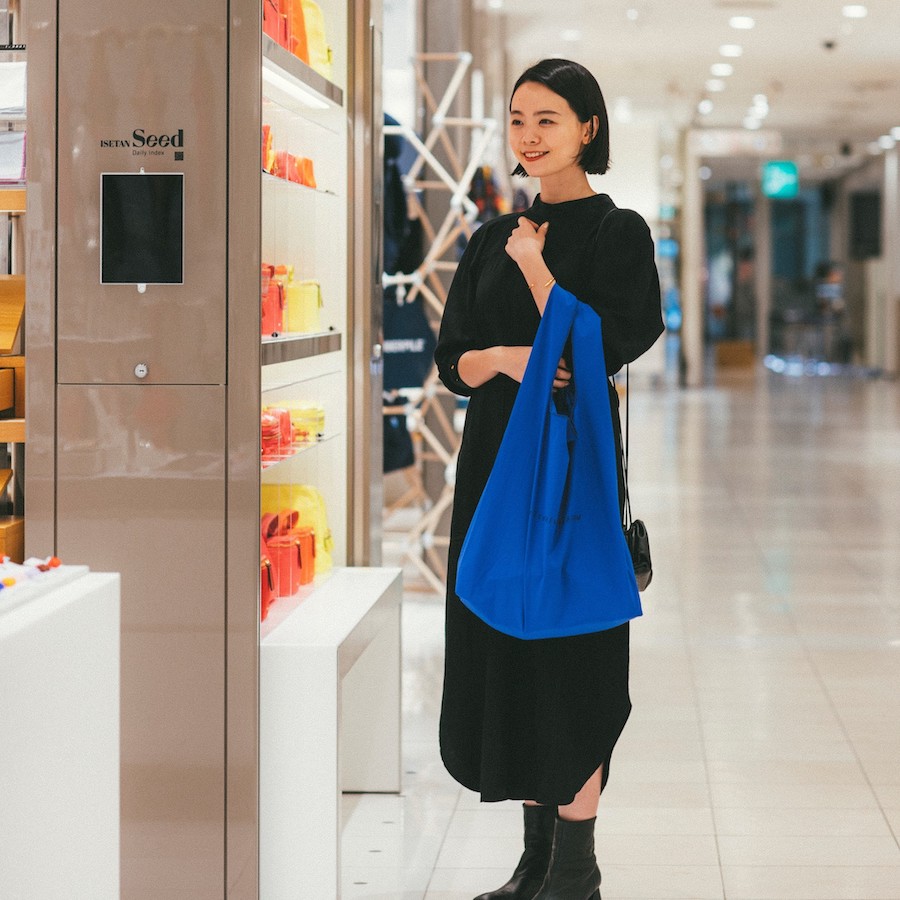
In addition, we took the lead in developing the concept and product design of the shopping bag, “#bag for everyone” that will be sold at Mitsukoshi ISETAN. We collaborated with many different brands and incorporated the concepts put forth by designers and artists of “we want you to always enjoy fashion and shopping” and “no matter how much the world changes we want to help make it a brighter place”. In that way we desire to incorporate our customers’ aspirations and make the shopping bag a hub for communication. The shopping bag was developed to bring customers together with the store, the designers and the digital world as well as to communicate ISETAN’s multifaceted message to our customers.
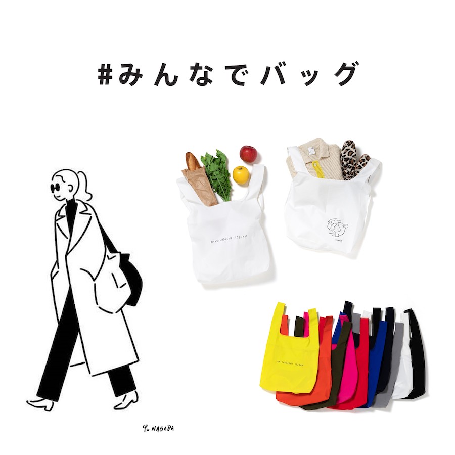
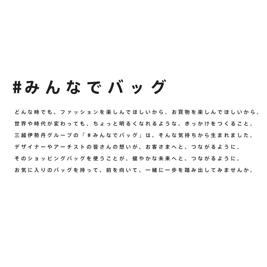
Our sustainable bag is both functional and is made in such a way as to leave the impression “I’ve seen that bag before”. By making it resemble an art canvas and collaborating with brands we made it into a one-of-a-kind shopping bag. It is a very fashionable bag and a suitable item for Mitsukoshi ISETAN. As an advertising tool for our campaign and thanks to the broad appeal of our collaboration with well-known brands, we will continue to communicate the Mitsukoshi ISETAN fashion and shopping experience to a wide audience.


CREDITS
- CLIENT
- MITSUKOSHI ISETAN
- ROLE
- Strategic Planning, Art Direction, Copywriting, Logo Design
- THE TEAM
-
Account Executive
Shun Okadamonopo TokyoProducer
Kensuke Tanakamonopo TokyoProject Manager
Tsubasa Kamiokamonopo TokyoCopywriter & Planner
Tomoki Inagumamonopo TokyoLogo Design
Takuya Kenmokumonopo TokyoPhotographer
Shun KomiyamaStylist
Nobuyuki IdaHair Makeup
Kika MakinoModel
inoriSpecial Thanks
POSTELEGANT, PERMINUTE, Paraboot, Maehara Kouei ShoutenPlanner
Tomoki InagumaArt Director
Joe Yanagita (Syncity)Art Director
Sumie Yamaguchimonopo TokyoPlanner
Clara Blinmonopo TokyoProject Manager
Tsubasa Kamiokamonopo TokyoProducer
Kensuke Tanakamonopo Tokyo
MONOPO TOKYO MEMBERS
ON THIS PROJECT


![]() LET’S COLLABORATE
LET’S COLLABORATE
TOGETHER 
Thank you for getting in touch with us.
You will receive a
confirmation email.